

How to Build a Competitive Landscape Grid Slide in PowerPoint
Pick the criteria, score every rival in glued grid cells, highlight your own company so it stands out, and know when a positioning map tells the story better. Includes the Text to Slide prompts that build it from one paragraph.
How to build a competitive landscape grid slide
To build a competitive landscape grid slide in PowerPoint, list the criteria that actually decide the comparison as rows, list the competitors as columns, score every row and competitor pair in a glued cell, and give your own company's column the accent color so it is the first thing a reader finds. PowerPoint has no built-in grid for this, so the manual route is a table converted to borderless cells. Oria's Text to Slide workflow can render the whole grid, criteria, scores, and the highlighted column, as an editable native slide from one paragraph of text.
This guide covers the grid build, when a positioning map is the better format instead, the exact prompts that build both, and the mistakes that make a landscape slide unreadable. Everything you need is here. You will not have to leave to get the substance.
Grid or positioning map: choosing the right competitive landscape format
A competitive landscape can be shown two ways, and picking the wrong one is the most common reason the slide falls flat. A grid scores every competitor against a fixed list of criteria, one row per criterion, one column per rival. It is the right choice when the comparison needs three or more dimensions, or when a reader needs a specific answer like pricing model or brand template handling, not just a general read on where a competitor sits.
A positioning map plots competitors on two independent axes instead, which is the better format when exactly two dimensions decide the story and you want the reader to see clustering and white space at a glance. For the full method on choosing and plotting those two axes, see how to build a 2x2 positioning matrix slide. Many decks use both: a positioning map up front for the summary, and the grid behind it for the detailed criterion-by-criterion comparison this guide walks.
The anatomy of a competitive landscape grid slide
Four parts carry the grid. Get these right and a reader can scan your position against every rival in one pass.
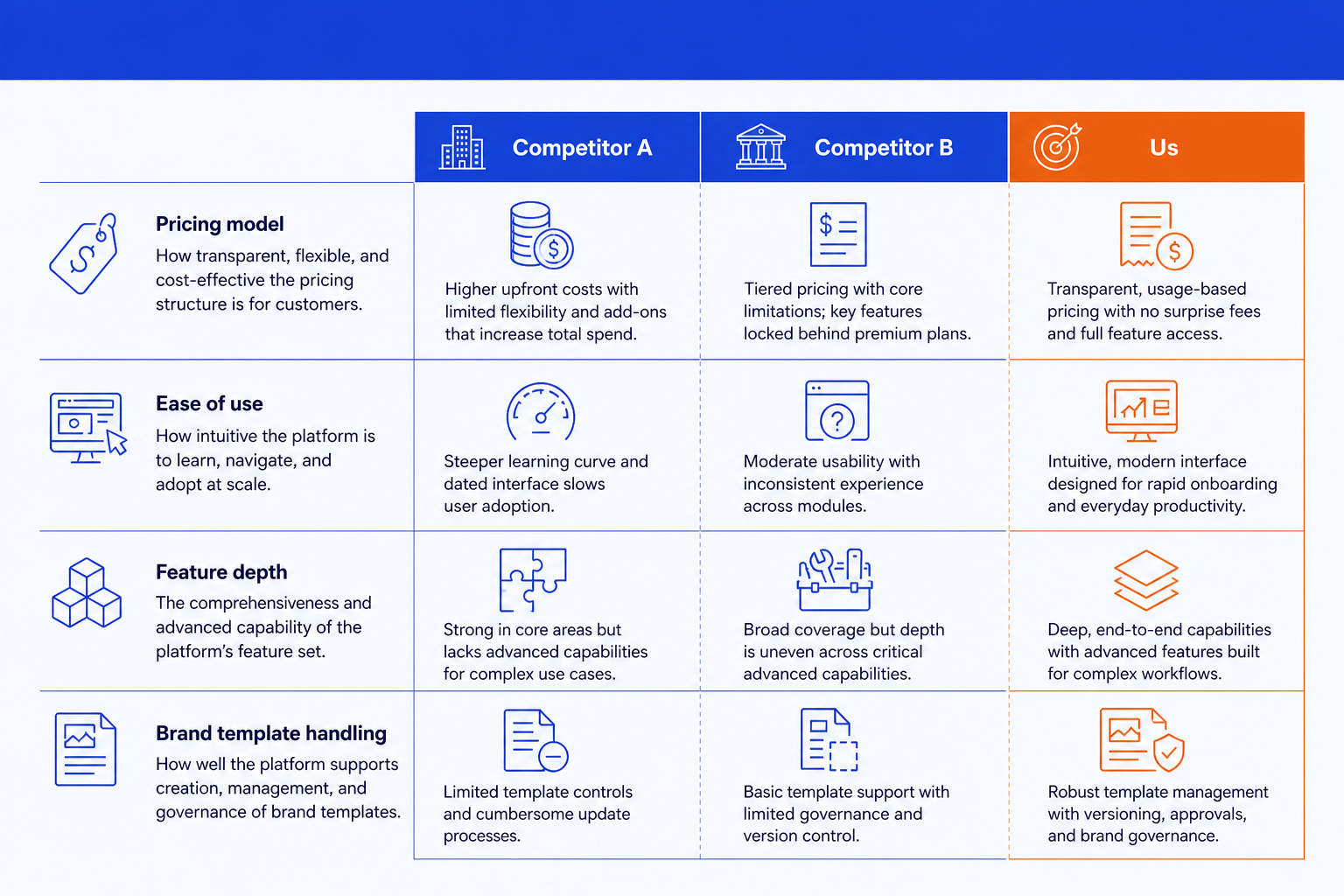
Criteria rows. The dimensions that actually decide the comparison, like pricing model, feature depth, or brand template handling. Write each as a short, specific label a reader can trust, not a vague theme.
Competitor columns. One column per rival plus one for your own company, in a consistent order across every grid you build. Four to six competitors keeps every column readable.
Scored cells. Every row and competitor pair gets a short rating or descriptor in a glued cell, no gaps, hairline borders. Keep the wording consistent so cells scan as a set.
Highlighted column. Your own company's column carries the accent color so the eye lands there first. This is the one design choice that turns a data table into a competitive landscape slide.
The step-by-step manual build, with the real gotcha
PowerPoint has no competitive-grid layout. The cleanest manual route is a table converted to borderless rectangles so the result reads as a designed exhibit, not a spreadsheet paste.
Pick the criteria. List the three to six dimensions that actually drive the reader's decision, for example pricing model, ease of use, and feature depth. Drop anything that does not discriminate between competitors.
List the competitors and set the order. Choose four to six rivals plus your own company, and keep the same left-to-right order across every landscape slide you build so readers build a mental map.
Build the grid and glue the cells. Insert a table sized to your rows and columns, remove the default borders, then add thin shared borders so cells read as one glued grid instead of separate boxes.
Score every cell. Fill each row and competitor pair with a short, consistent rating or descriptor. Keep the wording pattern the same across a row so a reader can compare left to right without re-reading.
Highlight your column and write the title. Recolor your own company's column in the accent color, then replace the topic label with an action title that states where you actually stand.
Gotcha
Check your criteria for correlation before you build. If two criteria move together, for example price and perceived quality, every competitor lands in a predictable diagonal band and the grid stops telling the reader anything a single row would not. That is the signal to switch to a positioning map instead, plotting those two correlated dimensions directly.
The Text to Slide route: one paragraph, an editable grid
The table-to-rectangle conversion, the cell-by-cell scoring, and the column recolor are exactly the kind of mechanical work that eats an evening. Oria removes it through Text to Slide, the workflow that turns a rough paragraph into a custom-designed slide rather than forcing your content into a fixed template. You describe the criteria, the competitors, the scores, and which column to highlight in one paragraph, and Oria builds the competitive landscape grid slide for you.
Because the output is native PowerPoint, every criterion label, score, and the highlighted column stay fully editable afterward. You can reword a criterion, rescore a cell, or add a competitor without rebuilding the grid. The same Text to Slide workflow builds the positioning map version too, so switching formats does not mean starting over.
One-paragraph Text to Slide prompt
The prompts that make the competitive landscape slide sharp
These are the exact copy-paste prompts we use to build the grid, switch it to a positioning map, and score the competitors before either build. The first three are for Oria inside PowerPoint; the last two are for gathering and scoring the competitor data in Claude first. Replace the bracketed parts with your own competitors and criteria.
Build with Text to Slide in Oria
Spec the grid and the scores
Highlight your column and set the title
Switch the same data to a positioning map
Gather and score in Claude first
Score competitors against your criteria
Draft the one-line takeaway
Tip
Score and source the grid in Claude, then hand the clean criteria, scores, and takeaway straight to Text to Slide in Oria. For prompts that build the underlying competitor research first, see 10 Claude prompts for competitive analysis.
Common mistakes to avoid
For the share-of-market, bubble-chart style of competitive landscape instead of the criteria grid, see how to build a competitive landscape slide. Match the format to the comparison you actually need to make.
Frequently asked questions
What is a competitive landscape grid slide?
A competitive landscape grid slide is a matrix that scores a set of rivals against a fixed list of criteria, with one row per criterion and one column per competitor. Every cell carries a short rating or descriptor, and your own company's column is highlighted so a reader can see your position against every rival at once, criterion by criterion.
Grid or positioning map: which should I use for a competitive landscape slide?
Use the grid when you have three or more criteria that do not reduce to two clean axes, or when the reader needs to compare specific attributes like pricing model or feature depth. Use a positioning map when exactly two independent dimensions decide the story and you want the reader to see clustering and white space at a glance. Many decks use the grid for the detailed comparison and a positioning map for the summary slide that precedes it.
How many competitors and criteria should a competitive landscape grid include?
Keep it to four to six competitors and four to six criteria. Beyond that the grid stops reading as a comparison and starts reading as a data dump, and the column for your own company loses the visual weight it needs to stand out.
Does PowerPoint have a built-in tool for a competitive landscape grid?
PowerPoint has no native competitive-grid layout. The clean manual build is a table converted to borderless, glued rectangles so the grid reads as a designed exhibit rather than a spreadsheet paste. Oria's Text to Slide workflow can render the whole grid, criteria rows, competitor columns, scored cells, and the highlighted column, as an editable native slide from one paragraph of text.
What is the fastest way to build a competitive landscape grid slide?
List your criteria, list your competitors, and give Text to Slide one paragraph describing the scores and which column to highlight. You get a fully editable native PowerPoint slide in your template, with the grid, the scores, and the highlighted column already placed, so you skip the manual table-to-rectangle conversion entirely.