
How to Build a Waterfall Chart Slide in PowerPoint
What the bridge chart shows, the step-by-step manual build with the real gotchas, the prompts that make it sharp, and the one-line route that renders an editable native chart for you.
Free skills and prompts for Claude and strategy work
Templates for Claude, ChatGPT and Perplexity — from diagnostics to board-ready decks.

How to build a waterfall chart slide in PowerPoint
To build a waterfall chart slide in PowerPoint, lay out four columns of data: a start total, each labeled increase or decrease, and an end total. Use a stacked bar chart, make a base series invisible so the middle bars float to the right height, add thin connector lines between steps, and write an action title that states the so-what. Modern PowerPoint also has a native Waterfall chart type, and Oria can render the whole thing as an editable native chart from one line of text.
This guide walks the manual build and its real gotchas, gives you the exact prompts to spec the data and the title, and shows the faster one-prompt route. Everything you need is here. You will not have to leave to get the substance.
What a waterfall chart is and when to use it
A waterfall chart, also called a bridge chart, shows how a starting value becomes an ending value through a sequence of steps. It has four ingredients: a start value on the left, increases that push the running total up, decreases that pull it down, and an end value on the right. The floating bars in the middle are the movements; the eye reads the slide like a story from one total to the other.
Reach for it whenever the message is the bridge between two numbers, not the numbers alone. Revenue last year to this year. Budget to actual. Gross margin to net margin. Headcount at the start of the year to the end. It is the workhorse of finance and strategy decks because it makes the drivers of a change visible in one glance. For a structured framework slide instead of a numeric bridge, a 2x2 like a SWOT layout is the better fit; use the bridge when you are explaining a movement.
The anatomy of a waterfall chart slide
Five parts carry the whole slide. Get these right and the chart reads itself.
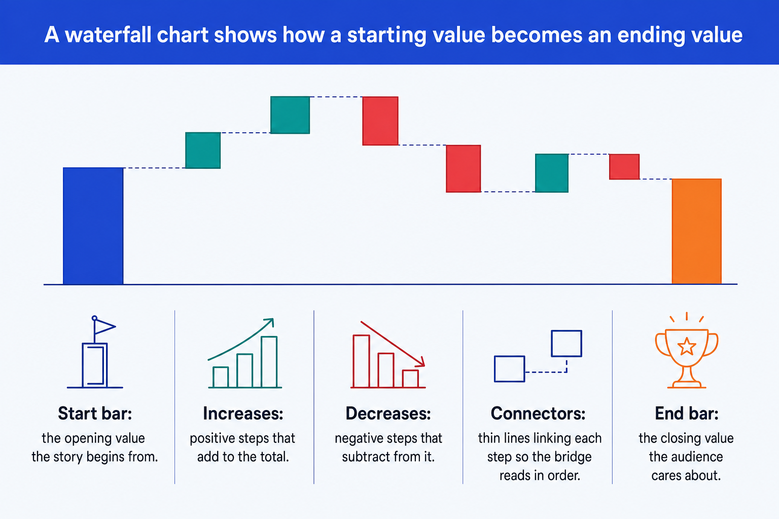
Start bar. The opening value the story begins from, anchored to the baseline so the audience knows where the bridge starts.
Increases. Positive steps that add to the running total. Hold them to one consistent color so the eye groups them instantly.
Decreases. Negative steps that subtract from the total, in a second consistent color so up and down are never ambiguous.
Connectors. Thin lines linking the top of each step to the base of the next, so the bridge reads in order without gaps.
End bar. The closing value the audience actually cares about. Give it the emphasis color so the slide lands on the answer.
The step-by-step manual build, with the real gotchas
The classic method uses a stacked bar chart and an invisible base series to make the middle bars float. Modern PowerPoint has a native Waterfall type under Insert, Chart, Waterfall, which is quicker for a rough internal view. Use the manual method when you need full control over connectors, subtotals, and color emphasis.
Lay out the data with a base column. Put your categories in column A and your step values in column B. Add a column C, the invisible base, that holds the running total each floating bar should sit on top of. The start and end bars sit on a base of zero.
Insert a stacked bar (column) chart. Select the base column and the value column together and insert a stacked column chart so each category shows the base stacked under the visible step.
Make the base series invisible. Click the base series, set its fill to No Fill and its border to None. The visible bars now float at the right height, which is the whole trick of a manual waterfall.
Color increases, decreases, and totals. Give increases one color, decreases a second, and the start and end totals the emphasis color. Consistency here is what makes the chart legible at a glance.
Add the connector lines. Draw thin lines from the top of each bar to the base of the next, or turn on the chart's connector option if you used the native Waterfall type. They are what make it a bridge rather than a row of floating blocks.
Write the action title. Replace the topic label with a full-sentence so-what, like the closing total and the one driver that moved it most. The title is the slide; the chart is the proof.
Gotcha
A subtotal bar must start from the baseline, not float on the invisible base. Set its base value to zero so it grows from the axis, then color it like a total. In the native Waterfall chart, right-click the point and choose Set as Total.
The one-prompt route: describe the bridge, get an editable chart
The invisible base series and the hand-drawn connectors are exactly the kind of mechanical work that eats an evening. Oria removes it. It is an AI add-in that runs in the PowerPoint task pane and produces fully editable native PowerPoint elements, including real charts, in your corporate template. You describe the bridge in one line and Oria renders the waterfall chart slide for you.
Because the output is a native chart, every bar, label, and connector stays editable afterward. You can recolor the emphasis, rename a step, or adjust a value without rebuilding anything. The same approach works for any complex slide, from a bridge to a process flow, which is why Oria suits the dense decks consultants and bankers actually ship. See the Claude skill for slide design for the storyline side of the workflow.
One-line waterfall prompt for Oria
The prompts that make the waterfall chart slide sharp
These are the exact copy-paste prompts we use to spec the data, write the title, and set the color emphasis. The first three are for Oria inside PowerPoint; the last two are for drafting the numbers and the title in Claude before you build. Replace the bracketed parts with your own bridge.
Build the chart in Oria
Spec the waterfall data and labels
Choose the color emphasis
Write the action title on the slide
Draft the numbers and title in Claude first
Build the bridge from raw figures
Sharpen the action title
Tip
Draft the bridge in Claude, then hand the clean start, steps, and end straight to Oria. For the full draft-to-deck pattern under deadline, see the fastest way to build a 15-slide deck.
Common mistakes to avoid
For the wider habits that make AI-built slides look board-ready rather than generic, the consultant's guide to Claude covers the end-to-end method from analysis to deck.
Frequently asked questions
What is a waterfall chart slide used for?
A waterfall chart slide shows how a single starting value moves to an ending value through a sequence of increases and decreases. Finance and strategy teams use it for bridges: revenue from last year to this year, budget to actual, gross to net margin, or headcount opening to closing. The point of the chart is the story between the two totals, not the totals themselves.
Why is it also called a bridge chart?
Because it bridges two numbers. The eye starts on the opening total, walks across each step that adds or subtracts, and lands on the closing total. In banking and corporate finance the terms waterfall chart and bridge chart are used interchangeably, so you will hear a partner ask for either.
Does PowerPoint have a built-in waterfall chart?
Modern PowerPoint has a native Waterfall chart type under Insert, Chart, Waterfall. It is fine for a quick internal view, but it gives you limited control over connectors, subtotal placement, and the exact color emphasis a board deck needs. The stacked-bar method in this guide gives you full control; Oria gives you a clean editable native chart from one line of text.
How do I make a subtotal bar in a waterfall chart?
A subtotal is a bar that starts from the baseline rather than floating on top of the invisible base series. Set its base value to zero so it grows from the axis, then color it like a total bar. In the native PowerPoint waterfall, right-click the data point and choose Set as Total.
What is the fastest way to build a waterfall chart slide?
Describe the bridge in one line and let Oria render it. You give the start value, each labeled step, and the end value, and Oria builds a fully editable native PowerPoint chart in your template, including the connectors and the color emphasis. You skip the invisible base series and the manual connector lines entirely.