
How to Build a BCG Growth-Share Matrix Slide in PowerPoint
What the four quadrants mean, the step-by-step manual build with the real gotchas, the prompts that classify the portfolio and plot it, and the one-line route that renders an editable native matrix for you.
Free skills and prompts for Claude and strategy work
Templates for Claude, ChatGPT and Perplexity — from diagnostics to board-ready decks.

How to build a BCG growth-share matrix slide in PowerPoint
To build a BCG growth-share matrix slide in PowerPoint, plot each part of your portfolio on a 2x2: the vertical axis is market growth rate and the horizontal axis is relative market share. Use a bubble or scatter chart so bubble size can carry revenue, split the plot into four quadrants, and label them Stars, Cash Cows, Question Marks, and Dogs. Write an action title that states the allocation call. Oria can render the whole matrix as an editable native slide from one line of text.
This guide walks the manual build and its real gotchas, gives you the exact prompts to classify the portfolio and plot it, and shows the faster one-prompt route. Everything you need is here. You will not have to leave to get the substance.
What the growth-share matrix is and when to use it
The growth-share matrix is a portfolio framework that maps each business unit, product line, or brand against two dimensions: how fast its market is growing and how strong its position is relative to the largest competitor. The plot splits into four quadrants, and where a unit lands suggests how you should treat it. Bubble size adds a third dimension, usually revenue, so the slide shows scale as well as position.
Reach for it when the decision is about allocation across a portfolio, not the merits of a single product. Where do you invest to win, where do you milk the cash, where do you place or pull a bet, and where do you exit. It is a staple of corporate strategy and private equity reviews because it forces a clear stance on every unit at once. For a single-unit assessment instead of a portfolio sort, a SWOT analysis slide is the better fit; use the matrix when you are weighing many units against each other.
The four quadrants of the growth-share matrix
Two axes and four quadrants carry the whole slide. The vertical axis is market growth rate, low to high. The horizontal axis is relative market share, conventionally high on the left to low on the right. Get the axes right and every bubble lands in the quadrant that implies its strategy.
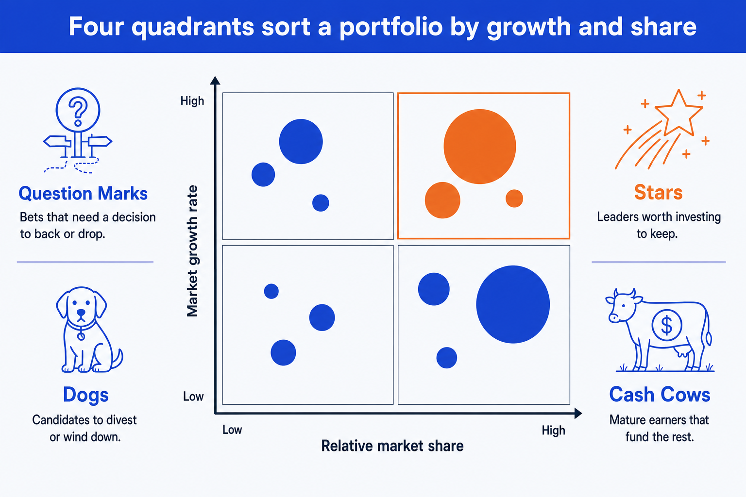
Stars. High growth, high share. The leaders in fast markets. Fund them to defend the position, because today's Star can become tomorrow's Cash Cow as its market matures.
Cash Cows. Low growth, high share. Mature, dominant earners. Harvest the cash they throw off and use it to fund Stars and selected Question Marks rather than over-investing here.
Question Marks. High growth, low share. Bets in attractive markets where you are not yet winning. Each one needs an explicit decision to back hard or drop, not a hold.
Dogs. Low growth, low share. Weak positions in slow markets. Usual candidates to divest, wind down, or keep only if they support a larger unit strategically.
The step-by-step manual build, with the real gotchas
The classic method uses a bubble chart so a third value can drive bubble size, plus shapes for the quadrant frame and labels. PowerPoint has a native Bubble chart under Insert, Chart, X Y (Scatter), Bubble. Use it when you need full control over the axis scale, the quadrant split, and the color emphasis.
Lay out the data in three columns. For each unit, record its relative market share (your share divided by the largest competitor's), its market growth rate, and its revenue. Relative share goes on the X axis, growth on the Y axis, revenue drives bubble size.
Insert a bubble chart. Select the three columns and insert a bubble chart so X is relative share, Y is growth rate, and the third value sizes each bubble. Each unit becomes one labeled bubble in the plot.
Reverse the X axis. Relative market share runs high on the left to low on the right by convention, so reverse the horizontal axis. This is the step most people miss, and it flips Stars and Question Marks to the wrong side if you skip it.
Add the quadrant split. Draw a vertical and a horizontal divider through the midpoints to create four equal quadrants, then place the labels Stars, Cash Cows, Question Marks, and Dogs in their corners.
Size and color the bubbles. Keep one consistent bubble scale so revenue reads honestly, label each bubble with its name, and reserve the emphasis color for the quadrant your recommendation hinges on.
Write the action title. Replace the topic label with a full-sentence so-what, naming the allocation call, for example fund the Stars and harvest the Cows to fund the next bet. The title is the slide; the matrix is the proof.
Gotcha
Bubble size must encode revenue, not a random radius, and the X axis for relative market share is reversed high to low. Set the bubble scale once and apply it to every unit, and reverse the horizontal axis in Format Axis so the strongest positions sit on the left where the Stars and Cash Cows belong.
The one-prompt route: describe the portfolio, get an editable matrix
The reversed axis, the bubble scaling, and the quadrant frame are exactly the kind of mechanical work that eats an evening. Oria removes it. It is an AI add-in that runs in the PowerPoint task pane and produces fully editable native PowerPoint elements, including real charts, in your corporate template. You describe the portfolio in one line and Oria renders the BCG growth-share matrix slide for you.
Because the output is native, every bubble, axis, and quadrant label stays editable afterward. You can move a unit, rename a quadrant, or adjust a value without rebuilding anything. The same approach works for any complex framework slide, which is why Oria suits the dense decks consultants and bankers actually ship. See the Claude skill for slide design for the storyline side of the workflow.
One-line growth-share matrix prompt for Oria
The prompts that make the matrix slide sharp
These are the exact copy-paste prompts we use to classify the portfolio, plot it, and set the emphasis. The first three are for Oria inside PowerPoint; the last two are for doing the classification in Claude before you build. Replace the bracketed parts with your own portfolio.
Build the matrix in Oria
Plot the portfolio on the matrix
Draw the quadrants and labels
Set the color emphasis and title
Classify the portfolio in Claude first
Classify each unit into a quadrant
Draft the allocation recommendation
Tip
Classify the portfolio in Claude first, then hand the clean quadrant list and the chosen title straight to Oria to plot. For the full analysis-to-deck method, see the consultant's guide to Claude.
Common mistakes to avoid
For a numeric bridge between two totals rather than a portfolio sort, the waterfall chart slide guide covers the build and the same gotchas in that format.
Frequently asked questions
What is a BCG growth-share matrix slide used for?
A BCG growth-share matrix slide sorts a portfolio of products, business units, or brands into four quadrants by market growth rate and relative market share. Strategy and corporate development teams use it to decide where to invest, where to harvest cash, and where to divest. The point of the slide is the allocation call across the portfolio, not the position of any single bubble.
What do the four quadrants mean?
Stars are high growth and high share, the leaders worth funding to defend. Cash Cows are low growth and high share, mature earners that generate the cash to fund the rest. Question Marks are high growth and low share, bets that need a clear decision to back or drop. Dogs are low growth and low share, candidates to wind down or divest.
What goes on each axis of the matrix?
The vertical axis is market growth rate, low at the bottom and high at the top. The horizontal axis is relative market share, usually your share divided by the largest competitor's share. By convention this axis runs high on the left to low on the right, so the strongest positions sit on the left. Many people get the reversed axis wrong on the first build.
What does the size of each bubble represent?
Bubble size encodes a third variable, almost always revenue or the share of total portfolio sales. A large Cash Cow bubble and a small Question Mark bubble tell the audience at a glance where the money is today versus where the future bets sit. Keep the sizing consistent and label each bubble so the scale is never ambiguous.
What is the fastest way to build a BCG growth-share matrix slide?
Describe the portfolio in one line and let Oria render it. You give each unit its growth rate, relative share, and revenue, and Oria builds a fully editable native PowerPoint matrix in your template, with the four quadrant labels and sized bubbles in place. You skip the manual axis setup, the reversed scale, and the bubble math entirely.