
How to Build a Customer Journey Map Slide in PowerPoint
The phases across the top, the touchpoints and pain points beneath them, the step-by-step manual build with the real gotcha, the prompts that make it sharp, and the one-line route that renders an editable native slide for you.
Free skills and prompts for Claude and strategy work
Templates for Claude, ChatGPT and Perplexity — from diagnostics to board-ready decks.

How to build a customer journey map slide in PowerPoint
To build a customer journey map slide in PowerPoint, lay the phases across the top, such as Awareness, Consideration, Purchase, Onboarding, and Advocacy. Add rows beneath them for touchpoints, pain points, and opportunities, then trace a simple emotion line that rises and dips across the phases. Write an action title that names where the friction is, and align everything to a tidy grid. Oria can render the whole slide as editable native PowerPoint from one line of text.
This guide walks the manual build and its real gotcha, gives you the exact prompts to spec the phases and the rows, and shows the faster one-prompt route. Everything you need is here. You will not have to leave to get the substance.
What a customer journey map is and when to use it
A customer journey map is a single slide that follows a customer through the phases of their relationship with you and shows what happens at each one. The phases run left to right across the top. Beneath them sit the touchpoints where the customer interacts with you, the pain points they feel, and the opportunities that fix those pains. An emotion line traces the highs and lows so the room sees where the experience breaks.
Reach for it when the message is the experience, not a structure or a number. Use it to align a team on where friction lives, to prioritise initiatives, or to brief a redesign. It is a staple of strategy, product, and customer-experience decks because it turns a fuzzy sense of "onboarding is rough" into a specific, visible map. For a pure framework slide instead, a four-quadrant layout like a SWOT analysis slide is the better fit; use the journey map when you are walking a sequence of experiences.
The anatomy of a customer journey map slide
Four parts carry the whole slide. The phases anchor the columns; three rows fill them in. Get these right and the map reads itself.
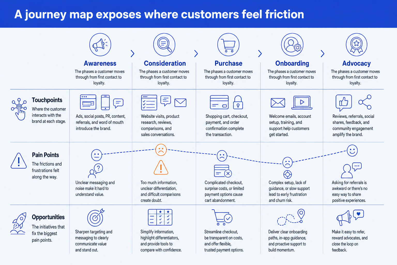
Phases. The stages a customer moves through, set across the top as the column headers. Keep them to four to seven, named for your business, not a generic template.
Touchpoints. The row showing where the customer interacts with you at each phase, such as an ad, a sales call, the pricing page, or the onboarding email.
Pain points. The row capturing the friction felt at each phase. This is the heart of the slide, so give the worst pain point the emphasis color.
Opportunities. The row that turns each pain point into an initiative, so the map ends on action rather than complaint. Pair it with the emotion line tracing the highs and lows.
The step-by-step manual build, with the real gotcha
The classic method builds the map from a grid of aligned shapes and text boxes. It is slow because every cell has to align, but it gives you full control over the layout, the emotion line, and the emphasis. Work top down: phases first, then the rows.
Set the phases across the top. Add a row of equal-width boxes for your phases, for example Awareness, Consideration, Purchase, Onboarding, and Advocacy. These columns anchor every row beneath them, so lock their widths before you add anything else.
Add the row labels down the left. Place three labels, Touchpoints, Pain Points, and Opportunities, in a narrow left-hand column. This is what turns a grid of boxes into a readable map.
Fill the grid cell by cell. Under each phase, write the touchpoint, the pain point, and the opportunity. Keep each cell to a short phrase, not a sentence, so the slide stays scannable across the row.
Draw the emotion line. Trace a single line across the phases that rises at the good moments and dips at the painful ones. It gives the eye the emotional shape of the journey in one glance.
Emphasize the worst pain point. Color the single biggest friction in the emphasis color so the room knows where to act. Hold everything else to one neutral color so the accent lands.
Write the action title. Replace the topic label with a full-sentence so-what, naming where the journey breaks and what to fix. The title is the slide; the map is the proof.
Gotcha
Map the customer's experience, not your internal process. The phases should be the stages the customer actually lives through, named in their words, not your handoff stages or org chart. A map that mirrors your funnel diagram hides the friction the slide exists to expose.
The one-prompt route: describe the journey, get an editable slide
Aligning a grid of phase columns and three labeled rows by hand is exactly the kind of mechanical work that eats an evening. Oria removes it. It is an AI add-in that runs in the PowerPoint task pane and produces fully editable native PowerPoint elements, in your corporate template. You describe the phases, touchpoints, and pain points in one line and Oria renders the customer journey map slide for you, with the emotion line and the emphasis built in.
Because the output is native, every box, label, and line stays editable afterward. You can rename a phase, recolor the emphasis, or add a row without rebuilding anything. The same approach works for any dense layout, from a journey map to a process flow, which is why Oria suits the slides consultants and strategy teams actually ship. See the Claude skill for slide design for the storyline side of the workflow.
One-line customer journey map prompt for Oria
The prompts that make the customer journey map slide sharp
These are the exact copy-paste prompts we use to spec the phases, fill the rows, set the emphasis, and write the title. The first three are for Oria inside PowerPoint; the last two are for drafting the journey in Claude before you build. Replace the bracketed parts with your own customer.
Build the map in Oria
Spec the phases and the three rows
Add the emotion line and the touchpoint icons
Set the color emphasis on the worst pain point
Draft the journey in Claude first
Turn research notes into a journey map
Sharpen the action title
Tip
Draft the phases and rows in Claude, then hand the clean structure straight to Oria to render. For the wider end-to-end method from analysis to deck, see the consultant's guide to Claude.
Common mistakes to avoid
For a related structural slide that maps people instead of experiences, the guide to building an org chart slide covers the same tidy-grid discipline applied to reporting lines.
Frequently asked questions
What is a customer journey map slide?
A customer journey map slide lays out the phases a customer moves through, from first awareness to loyalty, and shows what happens at each phase. The stages run across the top; rows beneath them capture the touchpoints, the pain points, and the opportunities to fix them. The point of the slide is to make friction visible so the room can decide where to act.
What phases should a customer journey map have?
Most B2B and B2C maps use five generic phases: Awareness, Consideration, Purchase, Onboarding, and Advocacy. Adjust them to your business rather than forcing a template, but keep the count between four and seven. Fewer than four hides the detail that matters; more than seven crowds the slide and blurs the story.
What is the difference between touchpoints and pain points?
A touchpoint is where the customer interacts with you at a given phase, such as an ad, a sales call, or the onboarding email. A pain point is the friction felt at that interaction, such as a confusing pricing page or a slow handoff. Touchpoints describe the contact; pain points describe the frustration, and the opportunities row turns each pain point into an initiative.
Should a journey map slide use a table?
Avoid a literal spreadsheet table. A journey map reads best as a banded grid where the phases anchor the columns and each row is clearly labeled, with an emotion line tracing the highs and lows across the phases. That layout keeps the eye moving left to right through the story rather than scanning cells.
What is the fastest way to build a customer journey map slide?
Describe the phases, touchpoints, and pain points in one prompt and let Oria render the slide. Oria is an AI add-in inside PowerPoint that produces a fully editable native slide in your template, with the phase columns, the labeled rows, and the emotion line built for you. You skip the manual grid and the alignment work entirely.