
How to Build a Gantt Chart Slide for Project Timelines
What a board Gantt shows, the step-by-step manual build with the real gotchas, the prompts that make it sharp, and the one-line route that renders an editable native timeline for you.
Free skills and prompts for Claude and strategy work
Templates for Claude, ChatGPT and Perplexity — from diagnostics to board-ready decks.
How to build a Gantt chart slide for project timelines
To build a Gantt chart slide, put each task or workstream on its own row, run an evenly scaled time axis across the top, and draw a horizontal bar for each task from its start period to its finish. Group the tasks into two or three phases, add diamond markers for the milestones, and use thin arrows for the few dependencies that drive the critical path. A board Gantt should be a clean simplified timeline, not a project export, and Oria can render the whole thing as an editable native slide from one line of text.
This guide walks the manual build and its real gotchas, gives you the exact prompts to spec the tasks, the milestones, and the dependencies, and shows the faster one-prompt route. Everything you need is here. You will not have to leave to get the substance.
What a Gantt chart is and when to use it
A Gantt chart is a project plan drawn as a timeline. Each task or workstream sits on its own row, time runs across the top, and a horizontal bar shows when each task starts and finishes. Diamond markers flag the milestones, and thin arrows show dependencies, the cases where one task cannot begin until another ends. Read across a row to see a task's duration; read down a column to see what runs in parallel.
Reach for it whenever the message is the shape of a plan over time: a transformation roadmap, a workstream schedule, an integration plan, a launch sequence. It is the workhorse of strategy and PMO decks because it makes phasing, overlap, and the critical path visible in one glance. Keep the board version simplified. A few phases, the milestones that matter, and the dependencies that move the date, not every line from the underlying project plan. For a reporting-line picture instead of a schedule, an org chart slide is the better fit; use the Gantt when you are explaining time.
The anatomy of a Gantt chart slide
Five parts carry the whole slide. Get these right and the timeline reads itself.
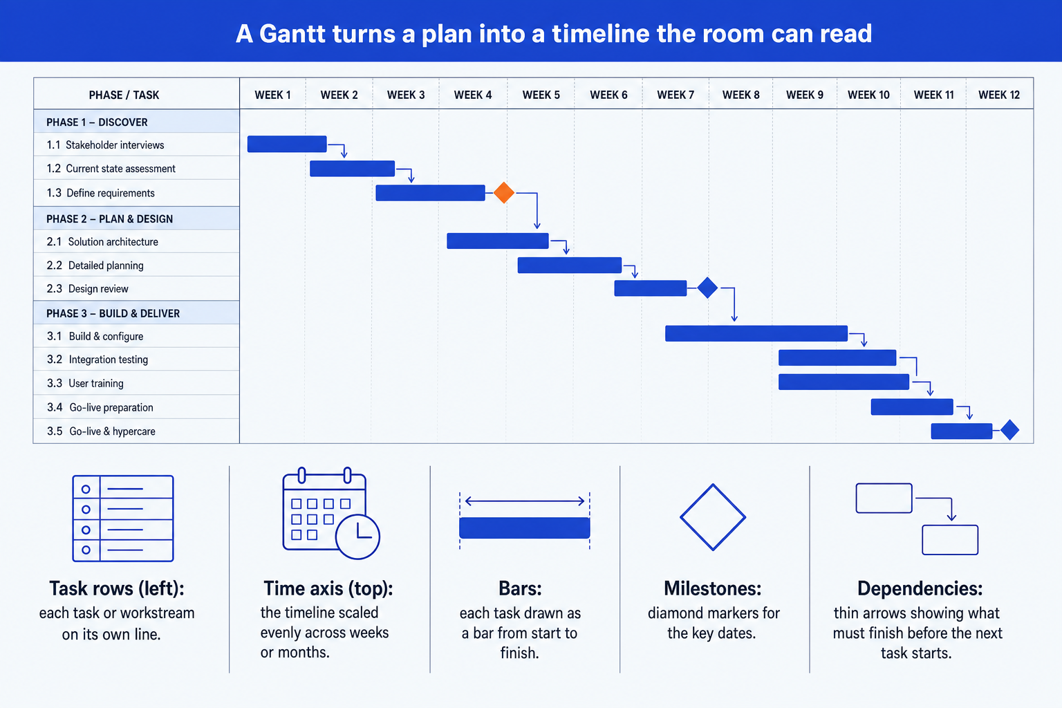
Task rows. Each task or workstream on its own line down the left, grouped into phases so the eye reads the plan in chunks rather than as a long list.
Time axis. The timeline across the top, scaled evenly in weeks, months, or quarters. Even spacing is what lets the audience judge duration by eye.
Duration bars. One horizontal bar per task, drawn from its start period to its finish. The length is the duration; overlapping bars show parallel work.
Milestone diamonds. Diamond markers on the key dates: a go-live, a board approval, a phase gate. They are the points the audience actually tracks toward.
Dependency arrows. Thin arrows from the end of one bar to the start of the task it gates. Keep them sparse, only the links that drive the critical path.
The step-by-step manual build, with the real gotchas
The reliable method builds the Gantt from native shapes so it stays on brand and fully editable. You can also coerce a stacked bar chart into a Gantt by making a base series invisible, but for a board slide a row of clean shapes is easier to control. Avoid pasting a raw export from MS Project or Smartsheet; it drops in too many rows.
List the tasks and group them into phases. Write each task on its own row and cluster the rows into two or three phases, like Discover, Design, and Deliver. Phases give the audience a structure before they read a single bar.
Lay the time axis across the top. Add evenly spaced columns for your periods, whether weeks, months, or quarters. Keep the scale uniform so equal widths always mean equal time.
Draw a duration bar for each task. Place a horizontal bar on each row spanning from its start period to its finish. Use one consistent color for normal tasks so the eye groups them instantly.
Mark the milestones with diamonds. Drop a diamond on each key date, a go-live, a sign-off, a phase gate. Give the one milestone on the critical path the emphasis color so the slide lands on what matters.
Add the dependency arrows, sparingly. Draw thin arrows from the end of a bar to the start of the task it gates, but only for the few links that drive the critical path. Every extra arrow costs legibility.
Write the action title. Replace the topic label with a full-sentence so-what, like the date the plan lands and the one phase that gates it. The title is the slide; the timeline is the proof.
Gotcha
Group tasks into phases, keep the time axis evenly scaled, and show the critical path. Uneven columns make durations lie to the eye, and an ungrouped wall of rows reads like a spreadsheet. Highlight the one dependency chain that sets the end date so the audience sees the constraint, not just the schedule.
The one-prompt route: describe the plan, get an editable timeline
Laying out evenly spaced columns and nudging bars to the right widths is exactly the kind of mechanical work that eats an evening. Oria removes it. It is an AI add-in that runs in the PowerPoint task pane and produces fully editable native PowerPoint elements, including timelines and roadmap visuals, in your corporate template. You describe the plan in one line and Oria renders the Gantt chart slide for you.
Because the output is native, every bar, diamond, and arrow stays editable afterward. You can shift a phase, rename a task, or move a milestone without rebuilding anything. The same approach works for any complex slide, from a timeline to a process flow, which is why Oria suits the dense decks consultants and bankers actually ship. See the Claude skill for slide design for the storyline side of the workflow.
One-line Gantt prompt for Oria
The prompts that make the Gantt chart slide sharp
These are the exact copy-paste prompts we use to lay out the timeline, place the milestones, and set the dependencies. The first three are for Oria inside PowerPoint; the last two are for drafting the plan in Claude before you build. Replace the bracketed parts with your own project, and use placeholder periods rather than inventing real dates.
Build the timeline in Oria
Spec the tasks, phases, and time axis
Place the milestones and emphasis
Add the dependencies and critical path
Draft the plan in Claude first
Turn raw notes into a phased plan
Sharpen the action title
Tip
Draft the phased plan in Claude, then hand the clean phases, tasks, and dependencies straight to Oria. For the full draft-to-deck pattern under deadline, see the fastest way to build a 15-slide deck.
Common mistakes to avoid
For the wider habits that make AI-built slides look board-ready rather than generic, the consultant's guide to Claude covers the end-to-end method from analysis to deck. For a related numeric exhibit, the waterfall chart slide guide uses the same action-title discipline.
Frequently asked questions
What is a Gantt chart slide used for?
A Gantt chart slide shows a project plan as a timeline: each task or workstream is a row, time runs across the top, and a horizontal bar marks when each task starts and finishes. Strategy, transformation, and PMO teams use it to show a roadmap, the key milestones, and which tasks depend on others. The point is the shape of the plan over time, not a list of dates.
What is the difference between a Gantt chart and a project timeline?
A timeline is the broader idea: any visual that places events along a time axis. A Gantt chart is a specific kind of timeline where each task gets its own row and a bar showing its duration, so you can see overlap and dependencies. For a board slide you usually want a simplified Gantt: a few phases, the milestones that matter, and the critical path, not every line from the project plan.
Should I export a Gantt from MS Project or Smartsheet into PowerPoint?
A direct export tends to drop in dozens of tiny rows, broken fonts, and your brand colors lost. For a board or steering-committee slide you want a clean, simplified Gantt that groups tasks into phases and shows only the milestones that matter. Rebuild it natively instead, or describe the plan to Oria and get an editable native chart in your template.
How do I show dependencies on a Gantt chart slide?
Draw thin arrows from the end of one bar to the start of the task that cannot begin until the first finishes. Keep them sparse. On a board Gantt you only need the few dependencies that drive the critical path, not every link in the underlying plan. Too many arrows turn the slide into a wiring diagram.
What is the fastest way to build a Gantt chart slide?
Describe the plan in one line and let Oria render it. You give the phases, the tasks with their start and end periods, the milestones, and the key dependencies, and Oria builds a clean editable native Gantt in your template. You skip the manual table of bars and the hand-drawn dependency arrows entirely.