
How to Build a KPI Dashboard Slide in PowerPoint Decks
The metric tiles, deltas, sparklines, and RAG status that make the page readable in one pass, the step-by-step build with the real gotchas, the exact prompts, and the one-line route that renders an editable native slide for you.
Free skills and prompts for Claude and strategy work
Templates for Claude, ChatGPT and Perplexity — from diagnostics to board-ready decks.

Independent and unaffiliated. The skills and frameworks referenced on this page are not created by, endorsed by, or affiliated with McKinsey. They are built on publicly available frameworks and ways of working McKinsey is known for, and are inspired by how those approaches are used to tackle complex business problems.
How to build a KPI dashboard slide
To build a KPI dashboard slide, choose four to eight metrics that matter to the audience, lay them out as a grid of tiles, and give each tile a label, a large value, a period-over-period delta, and a small sparkline. Add a red, amber, or green status marker so the reader can triage the page at a glance, group related metrics together, then align everything to one clean grid. Oria can render the whole layout as an editable native slide from one line of text.
This guide walks the anatomy of a tile, the step-by-step build with the real gotchas, the exact prompts to select the right KPIs and lay out the slide, and the faster one-prompt route. Everything you need is here. You will not have to leave to get the substance.
What a KPI dashboard slide is and when to use it
A KPI dashboard slide puts the few numbers that matter on one editable page, each in a compact tile a reader can absorb in seconds. It is the page a leadership team opens to answer a single question: are we on track. The tiles carry the headline values, the deltas show direction, and the RAG status marks where attention is needed.
Reach for it on any recurring review: a monthly business review, a board update, a steering committee read-out, an operating cadence. It pairs well with a narrative page that states the so-what. For the page that opens the deck, see how to build an executive summary slide.
Anatomy of a KPI dashboard tile
Five parts make each tile readable. Get them right and the grid reads itself, even before anyone studies a single number.
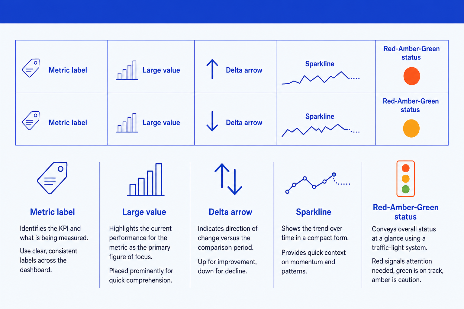
Metric label. The name of the KPI being measured, in a consistent style across every tile so the grid scans cleanly. Keep it short and unambiguous.
Large value. The headline figure for the current period, set as the most prominent element in the tile. This is the number the eye lands on first.
Delta. The change versus the prior period or the target, shown as an up or down arrow with a short figure. It tells the reader the direction of travel, not just the level.
Sparkline. A tiny line chart with no axes that shows the recent trend. It adds the context a single number cannot, so a steady value with a falling trend still gets noticed.
RAG status. A red, amber, or green marker against the target, given the emphasis color so the reader can triage the whole page in seconds before reading any detail.
The step-by-step build, with the real gotchas
Decide the metrics first, then the layout. Each step below opens with the action, then the detail that keeps the slide clean.
Choose four to eight KPIs the audience can act on. Start from the decision the review exists to support, then pick the metrics that move it. Park everything else on a backup slide; a dashboard that tries to show everything shows nothing.
Build a grid of metric tiles. Lay the chosen KPIs out as an even grid, two rows of three or four. Every tile gets the same four parts: a label, a large value, a delta, and a small sparkline, so the eye learns the pattern once and reads the rest fast.
Add the delta to each tile. Show the change versus the prior period or the target as an up or down arrow with a short figure. Pick one comparison basis and use it on every tile, so the reader never has to ask what the arrow is measured against.
Add a small sparkline where a trend matters. Drop a tiny no-axis line chart into each tile to show recent direction. Keep them the same size and scale style across tiles so the grid stays even and no single sparkline shouts louder than the rest.
Add RAG status against the target. Mark each tile red, amber, or green based on thresholds you define once. Give the markers the emphasis color and place them in the same spot on every tile, so a reader can triage the page before reading a number.
Group related metrics and align everything. Cluster KPIs that belong together, growth in one block, efficiency in another, and snap every tile, value, and marker to one grid. The discipline of alignment is what makes a dashboard look board-ready rather than busy.
Gotcha
Color is for status, not decoration. Reserve red, amber, and green for the RAG markers and keep the rest of the tiles neutral. If the values and the sparklines are also colored, the status markers lose all their meaning and the page reads as noise.
The one-prompt route: describe the tiles, get an editable slide
Aligning a grid of tiles, deltas, sparklines, and status markers by hand is exactly the kind of mechanical work that eats an evening. Oria removes it. It is an AI add-in that runs in the PowerPoint task pane and produces fully editable native PowerPoint elements in your corporate template. You describe the dashboard in one line and Oria renders the slide for you.
Because the output is native, every tile, value, arrow, and sparkline stays editable afterward. You can swap a metric, change a status, or restyle a tile without rebuilding the grid. For the wider workflow of turning analysis into slides, see the complete guide to McKinsey presentations with Claude.
One-line KPI dashboard prompt for Oria
The prompts that build the KPI dashboard slide
These are the exact copy-paste prompts we use to choose the right KPIs, turn a data table into tile content, and lay out the slide. The first two draft the content in Claude; the last three build and refine the slide in Oria inside PowerPoint. Replace the bracketed parts with your own metrics.
Select and draft the content in Claude
Select the right KPIs for an executive audience
Write the tile labels and deltas from a data table
Build the slide in Oria
Turn a metrics list into the dashboard layout
Add RAG status and group the metrics
Align and finish the dashboard
Tip
Draft the labels and deltas in Claude, then hand the clean content straight to Oria. If your dashboard needs a single metric that moves over time instead of a grid, see how to build a waterfall chart slide.
Common mistakes to avoid
For the full method behind board-ready decks, the complete guide to McKinsey presentations with Claude covers storyline, structure, and slide design end to end.
Frequently asked questions
What is a KPI dashboard slide?
A KPI dashboard slide is a single page that shows a handful of key metrics at a glance, each as a tile with a label, a headline number, a period-over-period change, and a small trend line. A red, amber, or green status marker tells the reader which metrics are on track and which need attention. It gives a senior audience the state of the business in one pass.
How many KPIs should a dashboard slide show?
Four to eight. Fewer than four looks thin for an executive review; more than eight turns the page into a wall of numbers no one reads. Pick the metrics the audience can actually act on, group the rest into a backup slide, and let the headline tiles carry the story.
What do RAG status colors mean on a dashboard?
RAG stands for red, amber, green. Green means the metric is on track against its target, amber means it needs watching, and red means it is off track and needs a decision. The colors let a reader triage the whole slide in seconds before reading any number in detail. Define the thresholds once and apply them consistently.
Should each KPI tile include a sparkline?
Yes, where you have a trend worth showing. A sparkline is a tiny line chart with no axes that shows the direction of a metric over recent periods. It adds context a single number cannot: a green metric that is trending down still deserves attention. Keep sparklines small and uniform so the tiles stay even.
What is the fastest way to build a KPI dashboard slide?
Describe the layout in one line and let Oria render it. You give the metric names, the deltas, and the RAG status, and Oria builds a fully editable native PowerPoint slide in your template, including the tile grid, the delta arrows, and the sparklines. You skip the manual alignment of every tile.