
How to Build a Clean P&L Summary Slide in PowerPoint
The line items that belong on the page, from Revenue to Net income, the margins and year-over-year change that give them meaning, how to format the numbers, the exact prompts, and the one-line route that renders an editable native slide for you.
Free skills and prompts for Claude and strategy work
Templates for Claude, ChatGPT and Perplexity — from diagnostics to board-ready decks.

Independent and unaffiliated. The skills and frameworks referenced on this page are not created by, endorsed by, or affiliated with McKinsey. They are built on publicly available frameworks and ways of working McKinsey is known for, and are inspired by how those approaches are used to tackle complex business problems.
How to build a P&L summary slide
To build a P&L summary slide, keep the line items that drive the story, Revenue, COGS, Gross profit, Operating expenses, EBITDA, D&A, and Net income, and lay them out as a clean vertical statement. Add a right-hand rail for the key margins and a year-over-year change column so each line has meaning, then format every number to one unit and align the digits. Bold the subtotal lines so the structure shows at a glance. Oria can render the whole layout as an editable native slide from one line of text.
This guide walks the anatomy of the slide, the step-by-step build with the real gotchas, how to format the numbers, the exact prompts, and the faster one-prompt route. Everything you need is here. The figures shown are illustrative placeholders, not a real company.
What a P&L summary slide is and when to use it
A P&L summary slide condenses a profit-and-loss statement into the few lines an executive audience needs. It runs from Revenue down to Net income, shows the margins that explain the gaps between them, and marks the year-over-year change. It is the page a board or investment committee reads to answer one question: how did the business perform, and why.
Reach for it in board packs, monthly business reviews, investment memos, and deal teasers. It pairs well with a narrative page that states the so-what. For the page that opens the deck, see how to build an executive summary slide.
Anatomy of the slide: line items, margins, and change
Three blocks make the page readable. A vertical line-item structure on the left, a margin and year-over-year rail on the right, and a clean number format throughout.
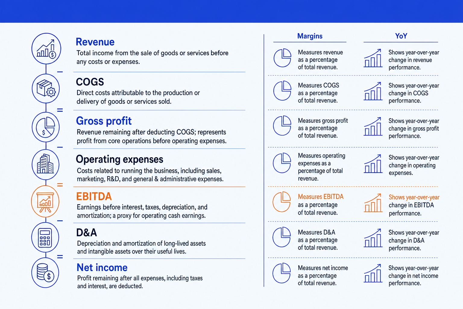
Revenue. The top line for the period, set as the anchor of the statement. Everything below is measured against it, so it leads the page.
Gross profit. Revenue less COGS, shown as a bold subtotal. It tells the reader how much the core product economics leave before running the business.
EBITDA. Earnings before interest, tax, depreciation, and amortization, the line most executive audiences anchor on for operating performance. Give it the emphasis color.
Net income. The bottom line after D&A and the rest, shown as the closing bold subtotal so the page resolves where the eye expects it to.
Margins and YoY. A right-hand rail with gross margin and EBITDA margin as percentages, plus a year-over-year change column, so each line carries meaning, not just a level.
The line names above are the standard structure. Any figures you place against them are illustrative placeholders until you drop in your own numbers.
The step-by-step build, with the real gotchas
Decide what to keep first, then the layout, then the formatting. Each step opens with the action, then the detail that keeps the slide clean.
Choose the line items that drive the story. Keep Revenue, COGS, Gross profit, Operating expenses, EBITDA, D&A, and Net income. Cut individual expense categories and one-off sub-lines; if the audience needs them, they belong on a backup slide, not the summary page.
Lay them out as a vertical statement. Stack the line items top to bottom in statement order, with the subtotal lines, Gross profit, EBITDA, and Net income, set in bold so the skeleton of the P&L is visible before anyone reads a figure.
Add a margin rail on the right. Show gross margin and EBITDA margin as percentages alongside the lines they describe. Margins are what an executive audience compares period to period, so give them their own clean column rather than burying them in a footnote.
Add a year-over-year change column. Place the prior period beside the current one, or show the change directly as a percentage. Pick one comparison basis, prior year or budget, and label it once so no reader has to ask what the change is measured against.
Format every number to one unit and align the digits. State the unit once, for example all figures in millions, right-align every value so the place values line up, and use the same decimal precision on every line. Consistent formatting is what separates a board-grade page from a draft.
Mark the one line that carries the message. Give the line your narrative hinges on, often EBITDA or the margin trend, the emphasis color or a short callout. Let the rest of the page stay neutral so the highlighted line actually stands out.
Gotcha
Do not paste the full income statement and shrink the font to fit. A summary slide earns its place by leaving lines out. If you find yourself at 8-point type to make everything fit, you are building a reference table, not a summary, and the page will not read from across a room.
Formatting the numbers so the page reads itself
Number formatting is where most P&L slides quietly fail. Get these conventions right and the reader trusts the page before reading a single figure.
One unit, stated once. Put all figures in the same unit, for example millions, and label it once in the header rather than appending a suffix to every cell.
Right-align values. Align numbers on the right so digits line up by place value. Left-aligned figures make a column impossible to compare down the page.
Consistent precision. Use the same number of decimals on every line. Mixing whole numbers and decimals reads as carelessness, even when the math is right.
Negatives in parentheses. Show negatives consistently, in parentheses or with a minus, and never both. Pick one convention and apply it to every line.
Bold the subtotals. Set Gross profit, EBITDA, and Net income in bold so the statement structure is legible at a glance, separate from the input lines.
Color for status only. Reserve color for the one line you want noticed or for adverse changes. A page where every number is colored has no emphasis at all.
The one-prompt route: describe the lines, get an editable slide
Aligning a column of figures, bolding the subtotals, and building a margin rail by hand is exactly the kind of mechanical work that eats an evening. Oria removes it. It is an AI add-in that runs in the PowerPoint task pane and produces fully editable native PowerPoint elements in your corporate template. You describe the statement in one line and Oria renders the slide for you.
Because the output is native, every line, number, and margin stays editable afterward. You can swap a figure, add a quarter, or restyle a row without rebuilding the table. If your story is about the bridge between two figures rather than a full statement, see how to build a waterfall chart slide.
One-line P&L summary prompt for Oria
The prompts that build the P&L summary slide
These are the exact copy-paste prompts we use to decide what to keep, turn a raw trial balance into summary lines, and lay out the slide. The first two draft the content in Claude; the last three build and refine the slide in Oria inside PowerPoint. Replace the bracketed parts with your own figures.
Decide and draft the content in Claude
Decide which lines belong on the summary
Roll a trial balance into summary lines and margins
Build the slide in Oria
Turn the summary lines into the slide layout
Add the margin rail and highlight the key line
Align and finish the slide
Tip
Draft and roll up the numbers in Claude, then hand the clean summary straight to Oria. If your dashboard needs a grid of metric tiles rather than a statement, see how to build a KPI dashboard slide.
Common mistakes to avoid
For the full method behind board-ready decks, the complete guide to McKinsey presentations with Claude covers storyline, structure, and slide design end to end.
Frequently asked questions
What is a P&L summary slide?
A P&L summary slide is a single page that condenses a profit-and-loss statement into the few lines an executive audience needs: Revenue down to Net income, the key margins, and the year-over-year change. It strips the full ledger to the line items that drive a decision, then formats them so the page reads in one pass rather than forcing the reader through a dense accounting table.
Which line items belong on a P&L summary slide?
Revenue, COGS, Gross profit, Operating expenses, EBITDA, D&A, and Net income cover most cases. Add gross margin and EBITDA margin as a right-hand rail, and a year-over-year change column. Cut sub-line detail like individual expense categories; if the audience asks, that detail lives in a backup slide or the appendix, not on the summary page.
How should numbers be formatted on a P&L slide?
Pick one unit and state it once, for example all figures in millions. Right-align every number so the digits line up by place value, use the same decimal precision on every line, and show negatives consistently in parentheses or with a minus sign. Bold the subtotal lines, Gross profit, EBITDA, and Net income, so the structure of the statement is visible before anyone reads a figure.
What is the difference between a P&L summary and a full income statement?
A full income statement lists every account, often dozens of lines, for the record. A P&L summary slide keeps only the lines that move the narrative, adds margins and year-over-year change as context, and is built to be read on a screen from across a room. The summary is a communication tool; the full statement is a reference document.
What is the fastest way to build a P&L summary slide?
Describe the structure in one line and let Oria render it. You give the line items, the figures, the margins, and the year-over-year change, and Oria builds a fully editable native PowerPoint slide in your template, with the numbers aligned, the subtotals bold, and the margin rail in place. You skip the manual alignment of every row.