
14 Claude Skills for Data Visualization in PowerPoint
14 standalone skills that teach Claude to choose the right chart and build it as native editable PowerPoint, from chart type and action titles to waterfalls, scatters, combo charts, color, and number formatting.
Free skills and prompts for Claude and strategy work
Templates for Claude, ChatGPT and Perplexity — from diagnostics to board-ready decks.

What this is
These are 14 Claude skills for data visualization in PowerPoint. Each one teaches Claude a single chart-making discipline, from picking the right chart type for your message to building a waterfall, encoding color with meaning, and formatting labels so an executive reads the value at a glance.
The pack is built for consultants, bankers, and strategy and finance teams who turn spreadsheets into board-ready exhibits under deadline. Every skill pushes toward native, fully editable PowerPoint charts, the kind you can recolor, relabel, and rebrand, not pasted images or screenshots that print fuzzy and cannot be changed.
Mechanically, each skill is one folder with a SKILL.md file, grouped by stage inside the zip. Install just the ones you need, or load the full set. For the slide itself, see our Claude skills for slide design.
Download all 14 skills
One zip, one folder per skill. Free, no signup.
The 14 Claude Skills for Data Visualization
The collection is grouped into four stages. They run in the order you actually work, choose the chart first, finish it natively last, but every skill is also useful on its own.
Stage 1 · 3 skills
Choose the Right Chart
Use these before you build anything. Convert your data and your one-sentence message into the right chart type, an action title that states the takeaway, and honest, uncluttered axes.
Chart Type Selection
Use when: You have a table and a point but not a chart type
Output: Recommended chart type with two alternatives
Chart to Message Titling
Use when: The title reads like a label, not a takeaway
Output: Action title plus one supporting annotation
Axis and Gridline Discipline
Use when: You are configuring axes, scale, and gridlines
Output: Honest axis bounds and a clutter-free grid
Stage 2 · 4 skills
Comparison and Composition
Use these for the workhorse charts: ranking categories, trends over time, parts of a whole, and mix shift. The message decides bar versus column, stacked versus clustered, and whether to normalize to shares.
Bar and Column Discipline
Use when: The message is a comparison or a ranking
Output: Sorted, directly labeled bars or columns
Line and Trend Charts
Use when: The message is change over time
Output: Clean line chart with a marked inflection
Stacked vs Clustered
Use when: A category splits into sub-parts you must compare
Output: Stacked or clustered choice with segment order
100 Percent Stacked
Use when: The message is mix or mix shift, not totals
Output: Normalized chart with share labels and context
Stage 3 · 4 skills
Trend, Relationship, and Analytical
Use these when the chart must do analytical work: bridge a start to an end, plot a relationship between measures, pair a level with a rate, or compare a pattern across many categories at once.
Waterfall and Bridge Charts
Use when: You must explain how A became B through drivers
Output: Reconciled waterfall with signed driver bars
Scatter and Bubble Charts
Use when: The message is a relationship between measures
Output: Scatter with quadrants and labeled outliers
Combo Charts
Use when: A level and a related rate belong together
Output: Column plus line with honest dual axes
Small Multiples
Use when: Too many series for one readable chart
Output: Grid of identical charts on a shared scale
Stage 4 · 3 skills
Build and Finish in PowerPoint
Use these to turn the chart into native, editable PowerPoint output: convert raw Excel into a real chart, format labels and numbers to the right precision, and encode color so the message jumps out.
Excel to Native Chart
Use when: Data is in Excel and you need it in a slide
Output: Native editable chart, not a pasted image
Data Labeling and Number Formatting
Use when: Values are hard to read or inconsistently rounded
Output: Selective labels and a consistent format rule
Color Encoding for Data
Use when: The chart is a rainbow that hides the point
Output: Meaning-led palette with an accessibility check
Stage 1 turns data and a message into the right chart. Stages 2 and 3 build the chart, the everyday comparisons first, then the analytical exhibits. Stage 4 makes it native, on-brand, and editable in PowerPoint.
Setup Guide
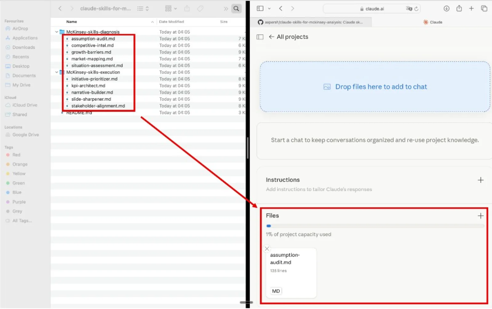
Download the skills pack
The zip contains all 14 skills, one folder per skill. Each skill is a single SKILL.md file. Unzip it anywhere. Keep the whole set, or pull out just the folders you need.
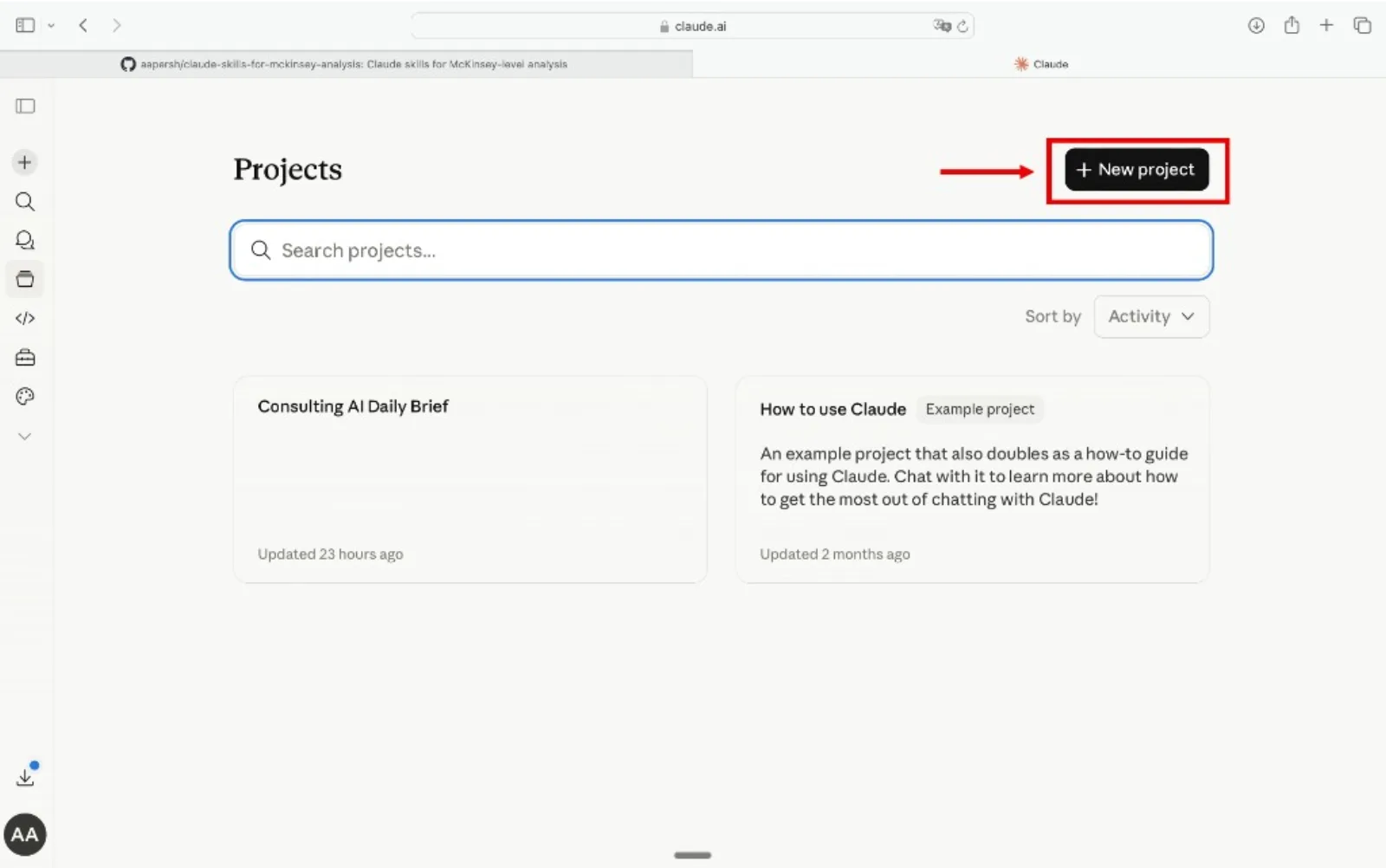
Create a Claude Project
Go to claude.ai, open the left sidebar, click Projects, then Create Project. Name it something like "Chart Builder" or "Data Viz Co-pilot" so you can reuse it across decks.
Add the skills as Project Knowledge
Inside your project, open Project Knowledge, click Add Content, and upload the .md files. Add as many as you want, one skill, one stage, or all 14. Claude will reference them automatically in every conversation inside that project.
Start building charts
Open a new conversation inside the project, paste your data, and name the skill you want Claude to run. Claude reads it from project knowledge and applies the charting method with the rules already loaded.
Tip
Refer to the skill by name in your prompt. Phrases like "Use the chart-type-selection skill" or "Run the waterfall-and-bridge-charts skill" point Claude at the right method instead of leaving it to guess.

Example prompts
- "Use the chart-type-selection skill to pick a chart for revenue by region."
- "Use the waterfall-and-bridge-charts skill to build an operating profit bridge."
- "Use the color-encoding-for-data skill to highlight the two products dragging the average down."
- "Use the excel-to-native-chart skill to turn this export into a native editable PowerPoint chart."
How to choose a chart skill
Skip the directory hunt. Pick the row that matches your need and use that skill. For two of the most common exhibits, see our walkthroughs on how to build a waterfall chart slide and a KPI dashboard slide.
The quality bar
Every skill pushes Claude toward charts that meet the same bar, the standard a partner would hold an exhibit to before it goes in the deck.