
How to Build a Football Field Valuation Slide in PowerPoint
What the valuation summary shows, the step-by-step build with the real gotchas, the prompts that make it sharp, and the one-line route that renders an editable native exhibit for you.
Free skills and prompts for Claude and strategy work
Templates for Claude, ChatGPT and Perplexity — from diagnostics to board-ready decks.

How to build a football field valuation slide in PowerPoint
To build a football field valuation slide in PowerPoint, list each valuation method as a row, then draw a horizontal floating bar for each method that spans its low to high value on a single shared value axis. Use a stacked bar chart with an invisible base series so each bar floats at the right position, add a thin vertical reference line at the offer or current price, shade the concluded range where the methods agree, and write an action title that states the value conclusion. Oria can render the whole exhibit as an editable native slide from one line of text.
This guide walks the manual build and its real gotchas, gives you the exact prompts to summarize each method and draft the chart, and shows the faster one-prompt route. Everything you need is here. You will not have to leave to get the substance.
What it is and when to use it
A football field is the banker's valuation summary on one page. It takes the output of several independent methods, a discounted cash flow, comparable companies, precedent transactions, a leveraged buyout, and a public trading range, and lays each one out as a floating bar across a shared value axis. The audience reads where the methods cluster, where they pull apart, and where the concluded range lands, all in a single glance.
Reach for it whenever a deal team needs to defend a price. It is the standard closing exhibit in pitch books, fairness opinions, board materials, and private equity investment memos, because it shows triangulation rather than a single point estimate. When the message is the size of the opportunity rather than its value, a market sizing slide is the better fit. Use the football field when the message is the worth of a business and how confident the range is.
The anatomy of the exhibit
Five parts carry the whole slide. Get these right and the chart reads itself, with no dollar figures needed to understand the structure.
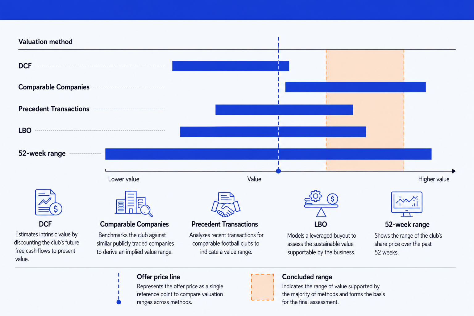
Method rows. One row per valuation method, ordered top to bottom in a consistent sequence so the audience always knows where to look. DCF, comparable companies, precedent transactions, LBO, and a 52-week range are the usual set.
Floating range bars. Each method's low-to-high value drawn as a horizontal bar across the shared axis. The width is the uncertainty in that method, and the position is where it lands relative to the others.
Shared value axis. A single horizontal scale that every bar sits on, so the methods are directly comparable. Hold one axis for all rows rather than rescaling per method.
Offer price line. A thin vertical reference line dropped across all the bars at the offer or current price, so the audience sees instantly which methods support it.
Concluded range. A shaded vertical band over the value range you are recommending, where the credible methods overlap. It is the answer the slide builds to.
The step-by-step build, with the real gotchas
The classic method uses a horizontal stacked bar chart and an invisible base series, the same floating-bar trick behind a waterfall chart slide. Each bar is built from a low value that you hide and a visible width that runs to the high value.
List the methods as rows. Put each valuation method in column A in the order you want it read, top to bottom. Keep the set to the methods that are relevant to the deal rather than forcing all five onto every chart.
Lay out a low value and a range width per method. Add a column for each method's low value and a second column for the width, the high value minus the low. The low value becomes the invisible base; the width becomes the visible bar.
Insert a horizontal stacked bar chart. Select the method labels, the low column, and the width column, and insert a stacked bar chart so each method shows the hidden base stacked under the visible range.
Make the base series invisible. Click the low-value series, set its fill to No Fill and its border to None. The visible bars now float at the right position on the axis, which is the whole trick of the chart.
Add the offer price reference line. Drop a thin vertical line across all the bars at the offer or current price, dashed so it reads as a reference rather than another bar. Label it once on the axis.
Shade the concluded range. Add a light vertical band over the value range you are recommending, where the credible methods overlap, and give it the emphasis color so the slide lands on the answer. Write an action title that states the conclusion, not a topic label.
Gotcha
Every bar must sit on the same axis. If you let PowerPoint auto-scale the chart per series, the bars stop being comparable and the whole point of the exhibit breaks. Lock the axis minimum and maximum so all methods share one scale, and order the rows the same way on every version of the slide.
The one-prompt route: describe the range, get an editable exhibit
The invisible base series, the locked axis, and the hand-placed reference line are exactly the kind of mechanical work that eats an evening before a pitch. Oria removes it. It is an AI add-in that runs in the PowerPoint task pane and produces fully editable native PowerPoint elements, including charts, in your corporate template. You describe the methods and their ranges in one line and Oria renders the football field valuation slide for you.
Because the output is native, every bar, label, and the reference line stays editable afterward. You can widen a range, reorder the methods, or move the offer line without rebuilding anything. The same approach works for any dense valuation exhibit, which is why Oria suits the decks bankers actually ship. See the Claude skills for investment banking for the analysis side of the workflow.
One-line football field prompt for Oria
The prompts that build the football field
These are the exact copy-paste prompts we use to summarize each method into one range, draft the chart from a valuation memo, and sanity-check the implied multiples. The first two are for Oria inside PowerPoint; the rest are for working the numbers in Claude before you build. Replace the bracketed parts with your own deal.
Build the exhibit in Oria
Spec the football field rows and ranges
Add the offer line and concluded range
Summarize the methods in Claude first
Summarize each method's output into one range
Draft the football field from a valuation memo
Sanity-check the implied multiples
Tip
Summarize the methods into clean low-high lines in Claude, then hand those straight to Oria to draw the bars. For the wider draft-to-deck method, see the consultant's guide to Claude.
Common mistakes to avoid
For the wider habits that make AI-built slides look board-ready rather than generic, the consultant's guide to Claude covers the end-to-end method from analysis to deck.
Frequently asked questions
What is a football field valuation slide?
A football field valuation slide is the one-page summary a banker uses to show what a company is worth across several methods at once. Each valuation method, such as a DCF or comparable companies, becomes a horizontal floating bar that spans its low-to-high value range. The bars stack on a shared value axis so the audience can see where the methods agree, where they diverge, and where the concluded range sits. The name comes from the way the stacked bars look like yard lines on a football field.
Which valuation methods belong on a football field?
The standard set is a discounted cash flow, comparable companies trading multiples, precedent transactions, and for a buyout context a leveraged buyout analysis. A 52-week trading range is often added for a public target to anchor the picture against where the stock has actually traded. You include the methods that are relevant to the deal and leave out the ones that do not apply, rather than forcing all five onto every chart.
Why is it called a football field chart?
Because the stacked horizontal range bars resemble the yard markings on a football field. The shared value axis runs across the bottom like the length of the field, and each method's bar is a band laid across it. The label is industry shorthand in investment banking and private equity, so a managing director will ask for the football field and mean this exact summary exhibit.
How do you show the offer price on a football field?
Draw a single vertical line across all the range bars at the offer or current price. It lets the audience read instantly which methods support the price and which sit above or below it. Keep the line thin and dashed so it reads as a reference, not as another bar, and label it once at the top or bottom of the axis.
What is the fastest way to build a football field valuation slide?
Describe the methods and their ranges in one line and let Oria render it. You list each method with its low and high value, the offer price for the reference line, and the concluded range, and Oria builds a fully editable native PowerPoint exhibit in your template, with the bars aligned on a shared axis. You skip the manual stacked-bar trick and the hand-drawn reference line entirely.