
How to Build a Scenario Analysis Slide in PowerPoint
What the exhibit shows, the step-by-step build with the real gotchas, the copy-paste prompts that make it sharp, and the one-line route that renders an editable native slide for you.
Free skills and prompts for Claude and strategy work
Templates for Claude, ChatGPT and Perplexity — from diagnostics to board-ready decks.

How to build a scenario analysis slide in PowerPoint
To build a scenario analysis slide in PowerPoint, lay out three equal columns in a fixed order, bear, base, bull, with the same key driver assumptions as rows down the left so each case is read like for like. Fill each column with that scenario's assumptions, end every column with one headline outcome metric in larger type, and add a tornado sensitivity strip that ranks the drivers by how much they move the result. Emphasize the base case with one accent color, write an action title that states the takeaway, and you have the exhibit. Oria can render the whole thing as an editable native slide from one line of text.
This guide walks the manual build and its real gotchas, gives you the exact prompts to define the cases and draft the slide, and shows the faster one-prompt route. Everything you need is here. You will not have to leave to get the substance.
What it is and when to use it
A scenario analysis slide shows how an outcome shifts across a small set of plausible futures. The classic set is three: a base case you actually expect, a bull case where the favorable drivers hold, and a bear case where they do not. Each case is built from the same handful of key driver assumptions, so the audience can see exactly which inputs separate a good year from a bad one and how wide the spread of outcomes really is.
Reach for it whenever a decision hangs on uncertainty rather than a single forecast. It is the standard exhibit in strategy reviews, investment memos, budget approvals, and board materials, because it replaces a false-precision point estimate with a defensible range. When the message is the worth of a business across methods rather than across futures, a football field valuation slide is the better fit. Use the scenario analysis slide when the message is how the answer changes as the world changes.
The anatomy of the exhibit
Five parts carry the whole slide. Get these right and the exhibit reads itself, with no narration needed to follow the structure.
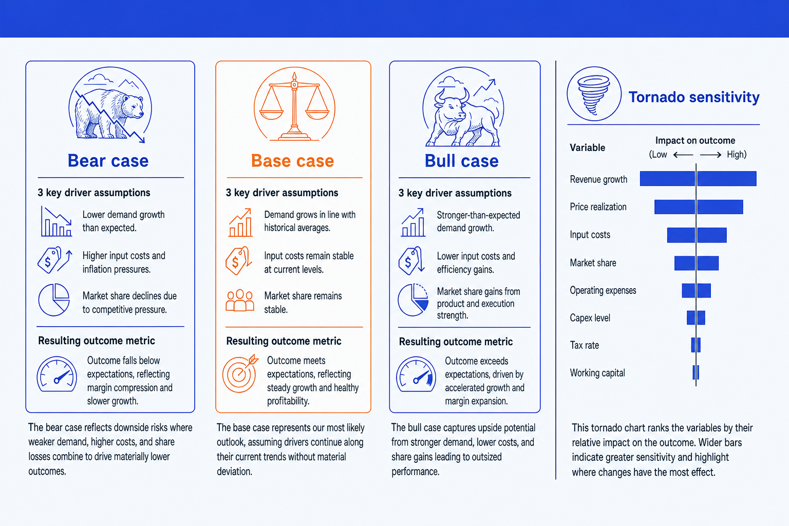
Three case columns. Bear, base, and bull in a fixed left-to-right order, equal width, so the audience always knows where the central view sits and which side is upside or downside.
Key driver assumptions. The same rows in every column, growth, price, margin, volume, or whatever moves your model, so each case is read like for like rather than as three unrelated forecasts.
Outcome metric. One headline number per column, revenue, EBITDA, or valuation, set in larger type at the foot of the column. It is the answer each scenario resolves to.
Tornado sensitivity. A bar strip that ranks the drivers by how much each moves the outcome, widest at the top. It answers which assumptions actually matter once the three cases are on the page.
Base case emphasis. One accent color reserved for the base column so the eye lands on your central estimate, plus an action title that states the takeaway, not the word scenarios.
The step-by-step build, with the real gotchas
The clean way to build a scenario analysis slide is a three-column grid for the cases plus a small floating-bar chart for the tornado, the same hidden-base bar trick behind a waterfall chart slide. Build the columns first, then the sensitivity strip beside them.
Fix the three cases and their order. Decide your bear, base, and bull definitions, then lock them left to right with bear on the left and bull on the right. Keep the base case as the view you genuinely expect, not a midpoint average of the other two.
List the driver assumptions as rows. Put the same handful of inputs down the left, growth, price, margin, volume, in one consistent order, and give every column the same rows so the cases compare cleanly.
Build three equal-width columns. Use a single table-free grid of aligned text boxes or a content placeholder split into thirds. Equal width is what makes the comparison fair, so size the three columns identically rather than eyeballing them.
Add the outcome metric to each column. End every case with its resulting number in larger type at the foot of the column. This is the payoff line, so it should be the most prominent value in each column.
Build the tornado sensitivity strip. Beside the columns, draw one horizontal bar per driver centered on the base case, ordered widest at the top for the most impactful variable. Use a stacked bar with an invisible base series so each bar floats around the center.
Emphasize the base case and title the takeaway. Give the base column one accent color so the eye finds your central view, then write an action title that states the conclusion, for example the range the board should plan against, not the label Scenarios.
Gotcha
Keep the driver rows identical across all three columns. The moment one case lists a different set of assumptions than the others, the columns stop being comparable and the audience cannot trace what actually changed between cases. Same rows, same order, every column, with only the values differing.
The one-prompt route: describe the cases, get an editable exhibit
The equal-width columns, the aligned driver rows, and the hand-built tornado bars are exactly the kind of mechanical work that eats an evening before a review. Oria removes it. It is an AI add-in that runs in the PowerPoint task pane and produces fully editable native PowerPoint elements, including charts, in your corporate template. You describe the three cases and their driver assumptions in one line and Oria renders the scenario analysis slide for you.
Because the output is native, every column, value, and the tornado bars stay editable afterward. You can flex an assumption, swap an outcome metric, or reorder the drivers without rebuilding anything. The same approach works for any dense decision exhibit, which is why Oria suits the strategy and finance decks teams actually ship. See the consultant's guide to Claude for the analysis side of the workflow.
One-line scenario analysis prompt for Oria
The prompts that build the scenario analysis slide
These are the exact copy-paste prompts we use to define the three cases, rank the sensitivities, and draft the slide from a model. The first two are for Oria inside PowerPoint; the rest are for working the numbers in Claude before you build. Replace the bracketed parts with your own case.
Build the exhibit in Oria
Spec the three case columns
Add the tornado sensitivity and base emphasis
Define the cases in Claude first
Define base, bull, and bear from a model
Rank the drivers for the tornado chart
Stress-test the bear case
Tip
Define and stress the three cases in Claude first, then hand the clean per-case values straight to Oria to draw the columns and the tornado. For the wider draft-to-deck method, see the market sizing slide guide.
Common mistakes to avoid
For the wider habits that make AI-built slides look board-ready rather than generic, the consultant's guide to Claude covers the end-to-end method from analysis to deck.
Frequently asked questions
What is a scenario analysis slide?
A scenario analysis slide is the one-page exhibit that shows how an outcome changes across a small set of plausible futures, usually a base case, a bull case, and a bear case. Each scenario is defined by a few key driver assumptions, such as growth rate, margin, and price, and resolves to one headline outcome metric like revenue, EBITDA, or valuation. Laying the three side by side lets the audience see the spread of outcomes and which assumptions separate the cases, rather than staring at a single point forecast.
How many scenarios should a scenario analysis slide show?
Three is the standard: a base case that you actually expect, a bull case where the favorable drivers hold, and a bear case where they do not. Three reads cleanly across a slide and maps to the way decision makers think about upside and downside around a central view. You can add a fourth stress case if a board specifically asks for a downside floor, but more than four columns makes the slide hard to scan and dilutes the contrast the exhibit exists to show.
What is a tornado chart on a scenario analysis slide?
A tornado chart is a sensitivity view that ranks the input variables by how much each one moves the outcome when flexed across its plausible range. Each variable is a horizontal bar centered on the base case, widest at the top for the most impactful driver and narrowing down the list, which is why the shape looks like a tornado. It answers the natural follow-up question to the three cases: of all these assumptions, which ones actually matter, so the discussion focuses on the drivers that change the answer.
How do you lay out base, bull, and bear cases cleanly on one slide?
Use three equal columns in a fixed left-to-right order, bear, base, bull, with the same row labels in each so the eye compares like with like. Put the shared driver assumptions as rows down the left, fill each column with that scenario's value, and end every column with the resulting outcome metric in larger type. Reserve one accent color for the base case so the audience knows which view is your central estimate, and write an action title that states the takeaway rather than the word scenarios.
What is the fastest way to build a scenario analysis slide?
Describe the three cases, their driver assumptions, and the outcome metric in one line and let Oria render it. You list each scenario with its key drivers and resulting number, note that you want a tornado sensitivity strip, and Oria builds a fully editable native PowerPoint exhibit in your template with the columns aligned and the base case emphasized. You skip the manual column alignment, the equal-width sizing, and the hand-built sensitivity bars entirely.