
How to Build a Stakeholder Map Slide in PowerPoint
How to draw the power-interest grid, name the four quadrants, plot your stakeholders into the right one, and the prompts that render an editable native slide for you.
Free skills and prompts for Claude and strategy work
Templates for Claude, ChatGPT and Perplexity — from diagnostics to board-ready decks.
How to build a stakeholder map slide in PowerPoint
To build a stakeholder map slide in PowerPoint, draw a power-interest grid: put influence on the vertical axis and interest on the horizontal axis, each running low to high, and cross them at the midpoint to form four quadrants. Name each quadrant with its engagement strategy, Manage Closely, Keep Satisfied, Keep Informed, and Monitor, then plot each stakeholder as a labeled dot in the quadrant their influence and interest put them in. Emphasize the top-right Manage Closely group so the eye lands on your priority stakeholders. Oria can render the whole stakeholder map slide as an editable native slide from one line of text.
This guide walks the build step by step, names the play for each quadrant, gives you the exact prompts to classify a stakeholder list and draft the engagement actions, and shows the faster one-prompt route. Everything you need is here. You will not have to leave to get the substance.
What a stakeholder map is and when to use it
A stakeholder map is a power-interest grid: two dimensions crossed to form four quadrants, with the people and groups touched by a project plotted by how much influence they hold and how much interest they have. It works because engagement effort should follow those two things at once. You place each stakeholder, and the picture tells you who needs hands-on attention and who needs a light touch.
Reach for it at the start of any project, transformation, or change programme, whenever you need a steering committee aligned on who to engage and how hard. It is a planning tool, not a data chart, so the value is in honest placement and a clear action per quadrant. Once the map sets the engagement plan, an editable RACI matrix slide nails down who is accountable on each workstream.
The four quadrants of the power-interest grid
Each quadrant is one combination of influence and interest, and each carries a different engagement strategy. Name the quadrants by their play, not by the axis reads, so the slide tells the reader what to do.
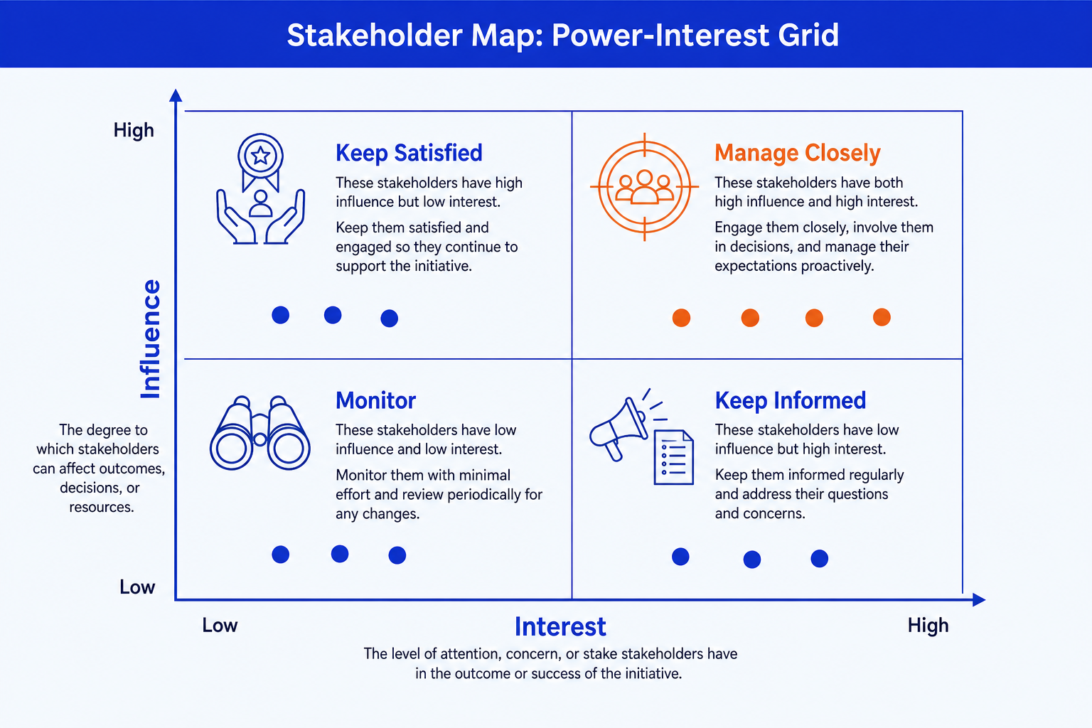
Manage Closely. High influence, high interest. Your priority group, top-right. Engage them often, involve them in decisions, and keep them as active sponsors. Give this quadrant the emphasis color.
Keep Satisfied. High influence, low interest. Top-left. They can shape the outcome but do not follow the detail, so keep them satisfied with concise updates and avoid surprises that turn them into blockers.
Keep Informed. Low influence, high interest. Bottom-right. They care and can become useful advocates, so keep them informed with regular detail and let them carry the message into their teams.
Monitor. Low influence, low interest. Bottom-left. A light touch with minimal effort. Watch for any change in their position, but do not spend scarce engagement time here.
The step-by-step build, with the real gotcha
PowerPoint has no stakeholder map chart type. You build it from two crossed lines plus plotted shapes. The steps below build the clean, presentable version that a steering committee can read in seconds.
Draw the 2x2. Place a horizontal line and a vertical line crossing at the centre to split the canvas into four equal quadrants. Add a light outer frame so the field is contained. Label the vertical axis Influence (or Power) low to high, and the horizontal axis Interest low to high.
Name the four quadrants and their play. Label top-right Manage Closely, top-left Keep Satisfied, bottom-right Keep Informed, and bottom-left Monitor. Put the engagement strategy in the label so the slide states the action, not just the position.
Plot the stakeholders as dots. List everyone touched by the project, give each a low or high read on influence and interest, and drop a labeled dot in the quadrant those two reads put them in. Keep dots one size and one color so the eye groups them.
Add the engagement action per quadrant. Beside or beneath each quadrant, write the one-line play: how often you engage and in what depth. This turns the picture into a plan the committee can act on.
Align, emphasize, and title. Nudge overlapping labels so none collide, give the Manage Closely quadrant the emphasis color, and replace the topic label with an action title that states the engagement priority the map supports.
Gotcha
Place stakeholders by their real influence and interest, not by seniority on the org chart. A senior name with low interest belongs in Keep Satisfied, not Manage Closely. Plotting by title rather than by behaviour is the fastest way to waste engagement effort on the wrong people and miss the quiet blocker who actually holds the power.
The one-prompt route: list the stakeholders, get an editable map
The crossed lines, the hand-placed dots, and the nudged labels are exactly the kind of mechanical work that eats an evening. Oria removes it. It is an AI add-in that runs in the PowerPoint task pane and produces fully editable native PowerPoint elements in your corporate template. You name the two axes and list the stakeholders with their reads in one line, and Oria renders the stakeholder map slide for you.
Because the output is native, every axis label, quadrant name, and plotted dot stays editable afterward. You can move a stakeholder, rename a quadrant, or recolor the Manage Closely group without rebuilding anything. The same approach works for any complex slide, from a power-interest grid to an org chart slide, which is why Oria suits the dense decks consultants and bankers actually ship.
One-line stakeholder map prompt for Oria
The prompts that make the stakeholder map slide sharp
These are the exact copy-paste prompts we use to classify the stakeholders, draft the engagement actions, and build the map. The first two are for Oria inside PowerPoint; the last three are for sorting your list and turning notes into a map in Claude before you build. Replace the bracketed parts with your own stakeholders.
Build the map in Oria
Spec the grid and quadrants
Plot the stakeholders into the right quadrant
Classify and draft in Claude first
Classify a stakeholder list into the four quadrants
Draft the engagement action per quadrant
Turn meeting notes into a stakeholder map
Tip
Settle the classification and the engagement actions in Claude, then hand the clean quadrant assignments and one-line plays straight to Oria. For the full draft-to-deck method, see the consultant's guide to Claude.
Common mistakes to avoid
When the message is a choice between options rather than who to engage, a 2x2 positioning matrix slide is the right tool. Match the framework to the message.
Frequently asked questions
What is a stakeholder map slide used for?
A stakeholder map slide plots the people and groups affected by a project against two dimensions, usually influence and interest, so the team can see who to engage and how. Programme leads, consultants, and change managers use it to set an engagement plan, surface hidden blockers, and align a steering committee on who matters most. The point is the quadrant a stakeholder lands in, which dictates the play.
What are the two axes on a stakeholder map?
The standard stakeholder map uses influence (or power) on the vertical axis and interest on the horizontal axis, each running from low to high. Influence is how much a stakeholder can shape the outcome; interest is how much they care about it. Crossing the two gives four quadrants, each with a clear engagement strategy.
What are the four quadrants of a power-interest grid?
High influence and high interest is Manage Closely, your priority group. High influence and low interest is Keep Satisfied, enough to avoid resistance. Low influence and high interest is Keep Informed, useful allies and advocates. Low influence and low interest is Monitor, a light touch with minimal effort. Each quadrant gets a different cadence and depth of engagement.
How is a stakeholder map different from a RACI matrix?
A stakeholder map answers who to engage and how hard, based on their influence and interest in the outcome. A RACI matrix answers who does what on specific tasks, assigning Responsible, Accountable, Consulted, and Informed roles. They complement each other: map the stakeholders first, then use RACI to nail down accountability on the workstream.
What is the fastest way to build a stakeholder map slide?
List your stakeholders with a high or low read on influence and interest, name the four quadrants, and let Oria render it. You get a fully editable native PowerPoint slide in your template, with the axes, the four quadrant labels, and the plotted stakeholders already placed. You skip the manual grid setup and the hand-aligned dots entirely.