
How to Build a Value Chain Analysis Slide in PowerPoint
What the primary and support activities are, the step-by-step manual build with the real gotchas, the prompts that make it sharp, and the one-line route that renders an editable native diagram for you.
Free skills and prompts for Claude and strategy work
Templates for Claude, ChatGPT and Perplexity — from diagnostics to board-ready decks.
Independent and unaffiliated. The skills and frameworks referenced on this page are not created by, endorsed by, or affiliated with McKinsey. They are built on publicly available frameworks and ways of working McKinsey is known for, and are inspired by how those approaches are used to tackle complex business problems.
How to build a value chain analysis slide in PowerPoint
To build a value chain analysis slide in PowerPoint, lay the five primary activities as a left-to-right arrow row: Inbound Logistics, Operations, Outbound Logistics, Marketing and Sales, and Service. Add the four support activities as horizontal bands above them: Firm Infrastructure, HR Management, Technology Development, and Procurement. Close the chain with a Margin wedge on the right, then write an action title that states where advantage sits. Oria can render the whole diagram as an editable native slide from one line of text.
This guide walks the manual build and its real gotchas, gives you the exact prompts to draft each activity and write the title, and shows the faster one-prompt route. Everything you need is here. You will not have to leave to get the substance.
What value chain analysis is and when to use it
Value chain analysis breaks a business into the activities that create value, from raw inputs through to after-sales service. The idea is that competitive advantage comes from doing one or more of these activities better or cheaper than rivals. The slide turns the whole operating engine into a single picture so a reader sees where cost and advantage sit.
Reach for it whenever the question is where a company makes or loses money across its operations. Operating model reviews. Cost reduction programs. Commercial due diligence on how a target actually competes. It pairs well with an industry view: use a Porter's Five Forces slide for the market around the company, and a value chain to judge the company's own activities. For the business model around it, the business model canvas slide is the companion view.
The activities on a value chain analysis slide
Nine activities and a margin wedge carry the whole slide. Get the layout right and the diagram reads itself, left to right along the primary row and top to bottom from the support bands.
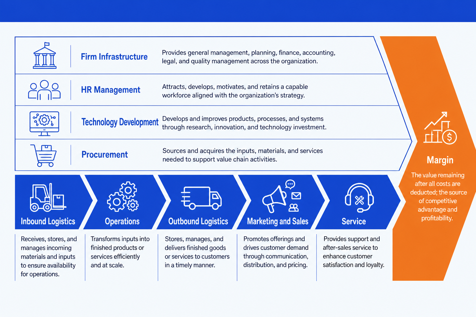
Primary activities (the arrow row)
Inbound Logistics. Receiving, storing, and moving inputs into the business. Think supplier intake, warehousing, and inventory control. It sets the starting cost base for everything downstream.
Operations. Turning inputs into the finished product or service. Manufacturing, assembly, or service delivery. This is usually where the largest share of cost and the clearest scope for advantage live.
Outbound Logistics. Getting the finished product to the buyer. Distribution, fulfillment, and delivery. Speed and reliability here shape both cost and customer experience.
Marketing and Sales. Persuading buyers to choose and pay for the product. Pricing, channels, promotion, and the sales force. It converts a good product into actual revenue.
Service. Supporting the product after the sale. Installation, support, repairs, and retention. Strong service protects margin and builds the repeat business that compounds value.
Support activities (the bands above) and Margin
Firm Infrastructure. The general management spine: finance, planning, legal, and quality. It runs across every primary activity rather than sitting in one of them.
HR Management. Recruiting, developing, and retaining the people who run the chain. It quietly shapes the quality and cost of every activity below it.
Technology Development. The systems, R&D, and process know-how that improve how activities are performed. Often the source of a durable cost or differentiation edge.
Procurement. How the firm buys the inputs each activity needs. Good procurement lowers the cost base across the whole primary row, not just inbound logistics.
Margin. The wedge on the right. The value a buyer pays minus the cost of every activity in the chain. Each activity either adds to it or eats into it.
The step-by-step manual build, with the real gotchas
The classic build uses an arrow row, four bands, and a margin wedge on a blank layout. It is simple in principle and fiddly in practice, because the alignment and the matching shape widths are what make it look professional rather than homemade.
Lay out the primary activities. Insert five chevron or arrow shapes in a row across the lower half of the slide and label them Inbound Logistics, Operations, Outbound Logistics, Marketing and Sales, and Service. Keep every chevron the same height.
Add the four support bands. Stack four full-width rectangles above the arrow row and label them Firm Infrastructure, HR Management, Technology Development, and Procurement. They run across the whole chain, so make them span all five primary activities.
Add the Margin wedge. Place a triangle or arrowhead on the right edge, after Service, labelled Margin. It signals that everything to its left builds the value it captures.
Align and distribute everything. Use the Align tools so the chevrons share one baseline and even spacing, and the support bands share equal heights. Uneven widths are what make a value chain look crooked.
Add the so-what under each activity. Write one short line of evidence or a cost figure under each primary activity, and emphasize the one or two activities where advantage really sits. The reader should see the source of advantage in one glance.
Write the action title. Replace the topic label with a full-sentence so-what, like which activities drive the company's edge. The title is the slide; the diagram is the proof.
Gotcha
The slide is a verdict on where advantage lives, not a labelled diagram of every box. If all nine activities read with equal weight and no emphasis, the slide says nothing. Pick the one or two activities that drive the company's edge, color them, and let the title state the conclusion.
The one-prompt route: describe the activities, get an editable diagram
Aligning an arrow row, four full-width bands, and a margin wedge is exactly the kind of mechanical work that eats an evening. Oria removes it. It is an AI add-in for complex professional slides that runs in the PowerPoint task pane and produces fully editable native PowerPoint elements, real shapes, text, and arrows, in your corporate template. You describe the value chain in one line and Oria renders the slide for you.
Because the output is native, every chevron, band, and label stays editable afterward. You can rename an activity, add a cost figure, or recolor the emphasis without rebuilding anything. The same approach works for any framework slide, which is why Oria suits the dense decks consultants and bankers actually ship. See how to make McKinsey-style slides with Claude for the storyline side of the workflow.
One-line value chain analysis prompt for Oria
The prompts that make the value chain analysis slide sharp
These are the exact copy-paste prompts we use to draft each lane, turn a memo into the slide, and write the title. The first three are for Oria inside PowerPoint; the last two are for drafting the analysis in Claude before you build. Replace the bracketed parts with your own company.
Build the slide in Oria
Lay out the value chain structure
Draft the bullets for each lane
Turn a value-chain memo into the slide
Draft the analysis in Claude first
Sort your notes into the value chain
Sharpen the action title
Tip
Draft the activities and evidence in Claude, then hand the clean nine lanes and the title straight to Oria. For the full analysis-to-deck pattern, see the complete guide to McKinsey presentations with Claude.
Common mistakes to avoid
For the industry view that pairs with the company view, the Porter's Five Forces slide guide walks the same build-and-prompt method for a different framework.
Frequently asked questions
What is a value chain analysis slide used for?
A value chain analysis slide breaks a business into the activities that create value and shows where margin is built or lost. Strategy teams, consultants, and bankers use it in operating model reviews, cost programs, and due diligence to find the activities worth investing in and the ones dragging on profit. The slide turns a company into a sequence of primary and support activities so a reader sees the whole operating engine at a glance.
What are the primary and support activities in Porter's value chain?
The five primary activities run left to right: Inbound Logistics, Operations, Outbound Logistics, Marketing and Sales, and Service. They sit under four support activities drawn as bands across the top: Firm Infrastructure, HR Management, Technology Development, and Procurement. A Margin wedge on the right captures the value left over once activity costs are covered.
How is a value chain different from a process flow?
A process flow shows the steps a task moves through in order. A value chain groups all of a firm's activities into the standard primary and support categories and asks which ones create or erode margin. Use a process flow to map how work happens, and a value chain to judge where competitive advantage and cost sit across the business.
Where does Margin go on the slide?
Margin sits as a wedge or arrowhead on the right edge, after the five primary activities. It represents the difference between the total value a buyer pays and the cost of every activity in the chain. Placing it at the end signals that each activity, primary and support, either adds to that margin or eats into it.
What is the fastest way to build a value chain analysis slide?
Describe the activities in one line and let Oria render them. You give the five primary activities, the four support bands, and the Margin wedge, and Oria builds a fully editable native PowerPoint diagram in your template, with the arrow row, the support bands, and the margin shape aligned. You skip the manual shape alignment and arrow drawing entirely.