

How to get a PowerPoint timeline template that does not look default
A PowerPoint timeline template stops looking default the moment you drop the built-in SmartArt gallery and pick a layout with real visual hierarchy. Five layouts do this reliably: the phased milestone band, the vertical narrative spine, the swimlane timeline, the serpentine path, and the now, next, later horizon. Build one from native shapes, or feed a rough draft to Oria's Improve Design and get back an on-brand, fully editable slide in a couple of minutes.
This guide walks through all five styles, the manual step-by-step build, the exact prompts for the Oria route, and the mistakes that leave a redesigned timeline looking default anyway.
Why the default PowerPoint timeline always looks the same
PowerPoint's built-in SmartArt timeline graphics come from a small, fixed library of shapes. Insert one and it locks every segment to the same width, every marker to the same identical circle, and every text box to a size meant for one or two words. Every deck built this way looks like every other deck built this way, because every user is drawing from the same handful of shapes.
The fix is not more effort inside the SmartArt editor. It is a different structure. A timeline is not the same thing as a strategy roadmap slide, either: a roadmap groups initiatives under phases, while a timeline is strictly chronological, one axis, milestones or dates in order.
Five PowerPoint timeline templates that break the default look
Each of these adds a structural idea the SmartArt gallery does not offer: unequal segment widths, real hierarchy, or timing grouped into horizons instead of forced onto exact dates.
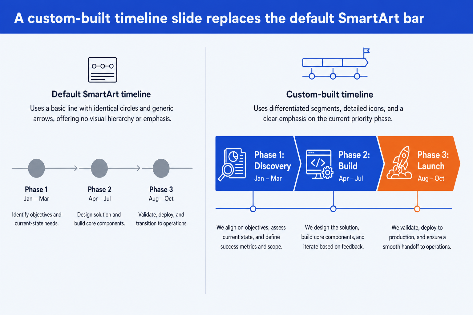
Phased milestone band. A single horizontal band split into unequal segments, one per phase, each carrying an icon, a name, a date range, and a one-line description. Unequal widths and a highlighted current phase are what SmartArt cannot do. Best for a program or transformation overview with three to six phases.
Vertical narrative spine. A vertical line down the middle of the slide with milestones alternating left and right along it. It reads top to bottom like a story rather than left to right like a schedule, so it suits a company-history or product-evolution slide more than a project plan.
Swimlane timeline. A horizontal axis with parallel rows underneath it, one row per workstream, so overlapping activity across teams is visible at a glance. It answers a different question than a Gantt chart: milestones per workstream over time, not task-level dependencies. See the companion now/next/later roadmap guide for the task-and-dependency version of the same idea.
Serpentine path. The milestone row snakes back and forth across two or three lines instead of running off the edge of the slide. It is the layout to reach for once a timeline has eight or more milestones and a single straight line would force the text too small to read.
Now, next, later horizon. Three or four wide columns grouped by rough timing instead of exact dates. It suits an early-stage roadmap where the sequence is agreed but the calendar is not, and it avoids the false precision of a dated timeline for work that has not been scoped yet.
What a custom-built timeline slide looks like next to the default
Same three-phase plan, two treatments. The exhibit below shows the default SmartArt timeline next to a custom-built PowerPoint timeline template with varied segment widths, icons, and one highlighted current phase.
Step-by-step: build a timeline slide that does not look default
This is the manual build with native PowerPoint shapes, no SmartArt gallery and no add-in required.
Pick the layout before you open PowerPoint. Match the shape of your content to one of the five styles above: a phased program picks the milestone band, an early roadmap picks the now/next/later horizon, a dense list of dates picks the serpentine path.
List every milestone with its date and a one-line description before you place a single shape. A timeline slide fails when the content gets figured out mid-build; decide the sequence and the wording first, then lay it out.
Draw the baseline as one line or one connected shape, not a series of separate segments. A single connected spine is what makes the slide read as one timeline instead of a scattered row of boxes.
Vary segment width or marker size to show relative duration or importance. A default SmartArt timeline forces every segment to the same width; a custom one does not have to, and that variation is most of the visual difference.
Add one icon and a short description under every milestone, not just a date. A bare date with no context asks the reader to remember what it means; a two-line description does not.
Apply your corporate template's fonts and colors last, and pick one accent color for the current or priority milestone. One consistent accent does more for readability than five different colors spread across the slide.
Gotcha
Grouping shapes in PowerPoint does not glue them for editing later. If you resize the baseline after grouping, disconnected segments drift out of alignment. Group only once every element is in its final position.
The Oria route: turn a default timeline into a custom one in minutes
Building a custom timeline by hand, sizing segments, aligning a baseline, sourcing icons, is exactly the kind of mechanical work that eats an evening. Oria removes it. It is an AI add-in that runs in the PowerPoint task pane. Text to Slide builds a new timeline from a written outline, and Improve Design takes an existing, default-looking timeline and redesigns it without losing a single milestone.
Because the output is native PowerPoint, every segment, icon, and date stays editable afterward. For a rough deck with more than one weak slide beyond the timeline, see the wider guide to improving ugly PowerPoint slides.
Improve Design prompt for a default SmartArt timeline
Prompts for PowerPoint timeline templates
Copy and adapt these directly in Oria. The first two build a new timeline from scratch with Text to Slide; the last two redesign a timeline you already have. Replace the bracketed parts with your own milestones.
Build a new timeline with Text to Slide
Phased milestone band from a list of dates
Now, next, later horizon for an early-stage roadmap
Redesign an existing timeline with Improve Design
Turn a straight line into a serpentine path
Split a single timeline into workstream swimlanes
Tip
List every milestone and its description in the prompt itself rather than "add appropriate milestones." Oria formats what you give it; it does not invent your plan.
Common mistakes that make a timeline slide look default anyway
Frequently asked questions
What makes a PowerPoint timeline template look default?
Three things: the built-in SmartArt timeline graphic itself, evenly spaced identical circles with a single thin connector line, and bare dates with no supporting description. Any slide built straight from the SmartArt gallery inherits all three, because every user of that gallery is working from the same handful of shapes.
Which of the five timeline templates should I use for a project plan with hard deadlines?
The phased milestone band, if the plan has three to six major phases, or the serpentine path if it has eight or more discrete milestones. Both keep dates visible and precise. Save the now/next/later horizon for work where the sequence is fixed but the calendar is not yet.
Can I build a custom PowerPoint timeline template without a design background?
Yes. The manual build in this guide only needs native PowerPoint shapes: one connected baseline, sized segments or markers, icons, and text boxes for the description under each milestone. Follow the six steps in order and the layout comes out consistent even without prior design experience.
How is a timeline slide different from a roadmap slide?
A timeline is strictly chronological: one axis, milestones or dates in order. A roadmap groups initiatives under phases and often shows what happens within each phase, not just when it starts. For the phased-initiative version, see the strategy roadmap slide guide.
What is the fastest way to redesign an old default timeline slide?
Open the existing slide in PowerPoint and run Oria's Improve Design on it. Oria keeps every milestone, date, and label you already have, aligns the baseline into one connected shape, varies the segment sizes, adds icons, and applies your corporate template's fonts and colors, in about the same couple of minutes it takes to generate a slide from scratch.