

Harvey Balls in PowerPoint: 4 Ways to Build Them
Harvey balls are circles filled to a set percentage, from empty to full, that rate several options against the same criteria in one grid. There are four ways to make them in PowerPoint: paste the Unicode characters ○ ◔ ◑ ◕ ●, draw a native Pie shape, download a ready-made set, or generate a whole grid from one prompt.
How to make Harvey balls in PowerPoint
Four routes are worth using, and they trade speed against control. Paste a Unicode circle character for a rating you need in the next five seconds. Draw a native Pie shape when the slide has to match a corporate template exactly. Download the ready made set below to skip the shape maths. Or describe the grid once and let an add-in build every cell. A fifth route, the doughnut chart, comes up constantly in search results and is in the table so you can see why it loses.
| Method | Time to first ball | Stays editable | Scales to a full grid | Survives a Google Slides paste | Best for |
|---|---|---|---|---|---|
| Unicode characters | About 5 seconds | As text, not as shapes | Yes, one character per cell | Yes, the glyphs travel | A quick rating inside a table or a text box |
| Native Pie shape | About 2 minutes | Yes, a real vector shape | Yes, once you copy the set | Yes, shapes convert on paste | Slides that have to match a corporate template exactly |
| Downloadable shape set | About 20 seconds | Yes, a real vector shape | Yes, copy and paste down the column | Yes, shapes convert on paste | Skipping the shape maths and starting from a finished scale |
| Doughnut chart | About 3 minutes | Only through a chart data sheet | Poorly, one chart object per cell | No, charts break on paste | Almost nothing, it is included so you can see why it loses |
| One prompt in the add-in | About 30 seconds | Yes, native editable shapes | Yes, the whole grid at once | Yes, shapes convert on paste | A full criteria-by-option grid on your own template |
What Harvey balls are and where the name comes from
A Harvey ball is a circle filled to a set percentage: empty, a quarter, half, three-quarters, or full. Analysts use a row of them to rate several options against the same criteria without writing out a score for every cell. A reader scans the fill level and reads the verdict in under a second.
The name comes from Harvey Poppel, the consultant who popularised the notation in the 1970s as a way of compressing a wide capability assessment onto one page. It stuck because it solves a specific problem: a grid of numbers invites an argument about the numbers, while a grid of filled circles keeps the conversation on the pattern. The notation is now standard alongside the other consulting frameworks a strategy team reaches for.
They show up most often in capability assessments, vendor comparisons, and competitive landscapes, wherever a grid compares several items across several dimensions. A finance team might rate five software vendors against ten requirements. A strategy team might rate a company's readiness across six capability areas. In both cases, the Harvey ball carries the judgment, and the surrounding text explains it. For a full worked example of that kind of grid, see our guide to building a competitive landscape slide.
Copy and paste the Unicode Harvey balls
Five Unicode characters already draw the exact fill levels. They are plain text, so they paste into a shape, a table cell, a text box, an Excel cell, a Google Slides text box, or a chat message, and they need no font install on Windows or macOS. Select the row below and copy it.
○ ◔ ◑ ◕ ●
Set them at roughly 20 to 24 points so the fill reads at a glance, and keep them in one colour. The one thing they cannot do is change size independently of the surrounding text, which is why a slide that has to match a template exactly is better served by the shape route below.
Build Harvey balls with PowerPoint's Pie shape
The Pie shape is the most flexible native method. It is a real vector shape, so it resizes cleanly, takes any fill color, and groups into a set you can copy down a whole column. Here is the four-step build.
Insert the shape. Go to Insert, Shapes, and choose Pie from the Basic Shapes group. Draw it while holding Shift so the width and height match exactly, giving you a true circle.
Set the fill angle. Drag the shape's small yellow adjustment handle around the circle's edge. A quarter turn fills 25 percent, a half turn fills 50 percent, and a full turn fills 100 percent.
Recolor to match your palette. Select the shape, open Shape Format, and set the fill to your accent color. Leave the outline a thin, neutral gray so every circle in the row reads as one consistent set.
Build the full set and lock it. Repeat for 0, 25, 50, 75, and 100 percent, align the five on one horizontal guide, then group them and save the group to your personal shape library.
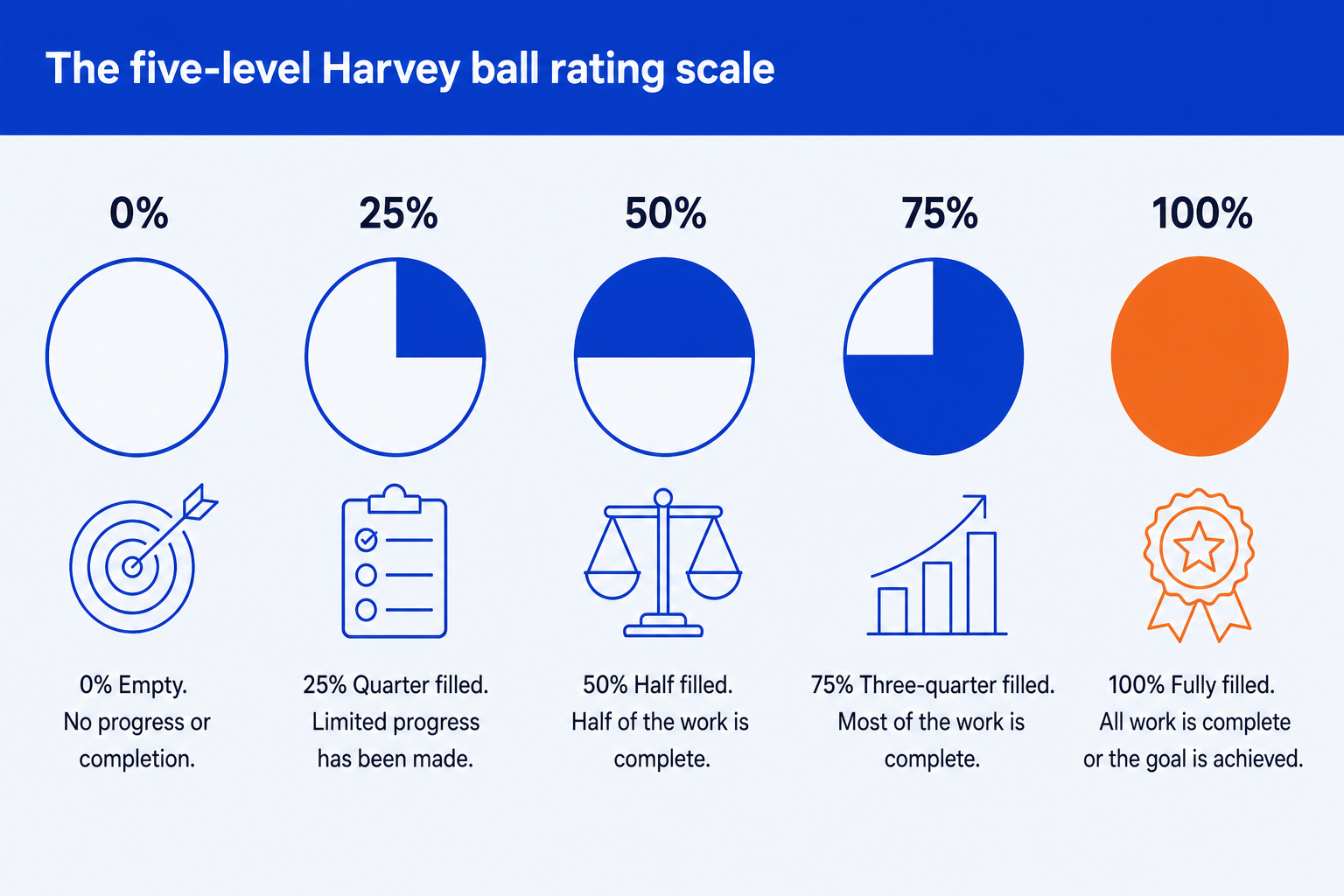
The standard five-level Harvey ball scale: 0, 25, 50, 75, and 100 percent fill.
If you would rather not draw them at all, the same five states are in the free PowerPoint file below as native shapes.
Download the Harvey ball shapesA 2-slide .pptx: the five fill states, and a worked comparison grid with a legend. No email, no sign-up.
What each fill level means
Fill carries the whole rating. Colour carries nothing on its own, which is the point people most often get wrong: a blue set and a green set say exactly the same thing, and using two colours in one grid makes a reader hunt for a meaning that is not there. Pick one accent, keep it, and put this legend on any slide a reader sees cold.
Building a full Harvey ball comparison grid
A single Harvey ball rarely appears alone. Most decks use a full grid: criteria down the rows, options across the columns, one Harvey ball per cell. Three habits keep that grid readable.
Keep every circle the same size, since one that drifts larger or smaller looks unfinished and makes small differences hard to compare. Fill in one direction only, starting at 12 o'clock and moving clockwise, the convention most readers already recognize. Cap the scale at five levels. Empty, quarter, half, three-quarter, full is enough resolution for almost any rating, and a finer scale just forces the reader to squint at fill angles instead of scanning the pattern.
A generic three-by-three example. Swap in your own criteria and options; the fill pattern is what a reader actually scans.
When the grid is really about position rather than score, a different chart carries it better. Our walkthrough of the 2x2 positioning matrix slide covers that case.
Harvey balls in Excel
Excel has no Pie adjustment handle inside a cell, so the Unicode route is the practical one. Paste the five characters into a lookup range next to the scores 0 to 4, then let a formula return the right glyph per row, so the rating updates when the underlying number does. Set the cell font to Segoe UI Symbol, centre it, and use a single font colour rather than conditional colours.
The one thing worth avoiding is Excel's own five-star and four-bar icon sets under conditional formatting. They look like Harvey balls until the grid is pasted into a deck, at which point they arrive as a picture. When the numbers behind the grid are the real story, a chart usually beats a rating scale altogether, which is what our chart-selection skills for PowerPoint are for.
Harvey balls in Google Slides
Google Slides has no Pie shape with an adjustment handle either, and its Special characters picker is slow to search. Both practical routes are imports: paste the Unicode row straight into a text box, or paste a native PowerPoint Pie shape, which converts to an editable Google Slides shape and keeps its fill angle within a degree or two. Check one circle after the paste, then copy it down the column.
What does not survive is a chart-based ball, which arrives as a flat image. If the deck's final home is PowerPoint anyway, build it there first: our guide to using Claude in PowerPoint covers the round trip.
A Harvey ball rates a single option against a criterion, but when the real numbers are a market or budget split into segments with a further breakdown inside each one, a marimekko chart is built for that two-proportion case instead.
Alternatives to Harvey balls
Harvey balls are the right notation for a judgement on a small ordinal scale. When the rating is not that, something else reads better.
Traffic-light dots
Three states instead of five, in red, amber and green. Faster to read, but colour alone excludes anyone with a colour vision deficiency, so pair it with a label.
A heat map
Better when every cell is a real number rather than a judgement, and when the grid runs past about eight rows.
Star or block ratings
Familiar from consumer reviews, and easier to read at small sizes, but they carry a consumer tone that sits oddly in a board pack.
A plain score column
The honest choice when the rating is genuinely quantitative. A number invites a challenge on the method, which a filled circle quietly hides.
On the heat map question specifically, we have a piece on when a heat map beats a rating scale and a build walkthrough for the prioritisation heat map slide. The wider set of notations sits in the consulting methods toolkit.
One prompt that builds the whole grid
Some teams solve the consistency problem by buying a dedicated Harvey ball add-in: a separate license, a separate icon library, and a separate menu to learn just to keep circles the same size and color. That is a lot of structure for five shapes and a fill percentage. Oria removes the extra step. It is an AI add-in that runs in the PowerPoint task pane and builds a Harvey ball rating grid as native, fully editable shapes on your corporate template in one prompt, so there is nothing extra to install and nothing extra to license.
Because the output is native PowerPoint, every circle stays a real shape afterward. You can nudge one rating up half a level, recolor the accent, or add a row for a new criterion the morning of the review, all inside the same file, without reopening an add-in or reworking the whole grid by hand.
One-prompt Harvey ball comparison grid
The same prompt runs from a chat window once the Claude PowerPoint skill for slide design is installed. For the wider case on when an in-PowerPoint add-in beats a separate tool or plugin, see our breakdown of the best AI for PowerPoint.
Common Harvey ball mistakes to avoid
Most of these come down to consistency: one fill direction, one accent color, one scale, applied identically down every row and across every column. That consistency is also the first thing a shape-by-shape build starts to drift on by the third or fourth column.
Frequently asked questions
How do I get a Harvey Ball in PowerPoint?
The fastest route is Insert, Symbol, the Segoe UI Symbol font, and a search for "circle": the five fill states are already there as characters. For a shape you can recolour and resize, use Insert, Shapes, Pie, then drag the yellow adjustment handle to set the fill angle. Both take under a minute and neither needs an add-in.
Is there a Harvey Ball symbol in PowerPoint?
There is no symbol called a Harvey ball, but five Unicode circle characters do the job exactly: ○ U+25CB, ◔ U+25D4, ◑ U+25D1, ◕ U+25D5 and ● U+25CF. They live in the Segoe UI Symbol font on Windows and render on macOS too, so a deck built with them opens correctly on either.
How can I create Harvey Balls in Excel?
The same five Unicode characters paste straight into a cell, so a formula can return one. A nested IF, or a lookup against the rating, writes the right character per row, and conditional formatting can colour it. Excel has no Pie adjustment handle in a cell, so the character route is the practical one there.
What is a Harvey ball?
A Harvey ball is a circle filled to a set percentage, usually in five steps from empty to full, used to score an option against a criterion. A grid of them lets a reader compare several options across several criteria at a glance. They are named after Harvey Poppel, the consultant who popularised them in the 1970s.
What do the fill levels and colours mean?
Fill carries the rating: empty is not met, a quarter is partly met, half is workable with gaps, three-quarters is largely met, and full is best in the set. Colour carries nothing on its own. Use one accent colour for every circle so fill stays the only variable, and add a legend on any slide a reader sees cold.
Where can I download a Harvey balls font or icon set?
You do not need a font. The five Unicode characters are already in the system fonts on Windows and macOS, and this page offers a free PowerPoint file with the five fill states as native editable shapes, so you can copy them onto your own template and recolour them in one click.
Do Harvey balls survive a paste into Google Slides?
Yes, in both routes. Unicode characters travel as text. Native PowerPoint shapes, including the Pie, convert to Google Slides shapes on paste and stay editable, although the pie fill angle can shift by a degree or two and is worth checking. Chart-based Harvey balls are the ones that break.
What can I use instead of Harvey balls?
Traffic-light dots when three states are enough, a heat map when every cell is a real number, star ratings when the audience is consumer rather than boardroom, and a plain score column when the rating is genuinely quantitative and you want the method challenged rather than hidden.