

Marimekko Charts: What They Show and When to Use One
Two axes, two proportions, one chart. Here is what a marimekko chart's width and height each encode, a worked example with the arithmetic shown, and when it beats (and loses to) a stacked bar chart.
A marimekko chart is a rectangle split into columns of varying width, then split again into stacked bands of varying height inside each column. Column width shows one proportion, typically how big each segment is. Band height shows a second proportion inside that segment, typically how it breaks down. Read the two axes together and you get size and composition in a single chart.
What a marimekko chart shows
The name comes from Marimekko, a Finnish textile company known for bold rectangular prints. Early versions of the chart, blocked out in flat colors, reminded people of that fabric pattern, and the name stuck. The chart itself has nothing to do with textiles. It is a way to show two proportions on one grid.
Read the horizontal axis first. Each column is a segment, and its width is that segment's share of a total, so every column width adds up to 100 percent of the chart's width. A wide column is a big segment. A narrow one is small.
Read the vertical axis one column at a time. Each column splits into bands, and each band's height is a share of that specific column, so the band heights inside one column add up to 100 percent of that column's height. Two columns are read separately on the vertical axis. A 40 percent band in a wide column carries more real weight than a 40 percent band in a narrow one, because the block's true size is its area, width times height, not its height alone.
How to read a marimekko chart
Two axes carrying two different meanings is easy to misread on a first look. Work through it in this order.
Scan the widths first. Look across the bottom of the chart before you read a single band. The widest column is the biggest segment, the narrowest is the smallest, and that ranking is the first fact the chart gives you.
Read one column's bands top to bottom. Inside a single column, the stacked bands show that segment's internal split, for example which vendor holds the largest share of that one segment alone.
Compare the same band color across columns. Follow one color across every column to see whether its share inside each segment rises or falls as the segments themselves get bigger or smaller.
Judge by area, not height alone. A tall band in a narrow column can hold less absolute weight than a shorter band in a wide one. The block's area, width times height, is the real number, not its height by itself.
A worked example: three segments, three vendors
Take a hypothetical market split into three segments, held by the same three vendors in different proportions inside each one.
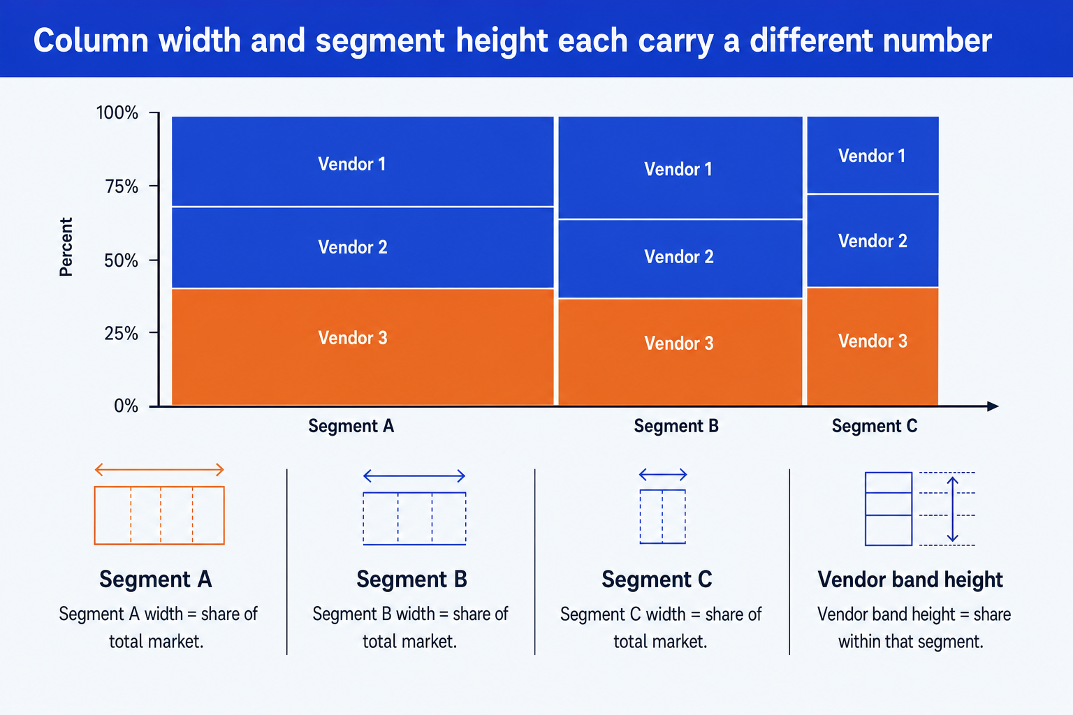
Column width is each segment's share of the total market. Band height is each vendor's share inside that one segment.
Segment A, 45% of the market. Vendor 1 holds 35% of this segment, Vendor 2 holds 25%, Vendor 3 holds 40%.
Segment B, 35% of the market. Vendor 1 holds 20% of this segment, Vendor 2 holds 30%, Vendor 3 holds 50%.
Segment C, 20% of the market. Vendor 1 holds 50% of this segment, Vendor 2 holds 30%, Vendor 3 holds 20%.
The chart reads faster than the arithmetic, but the arithmetic is what it is showing you. To get Vendor 3's real share of the whole market, multiply its share inside each segment by that segment's width, then add the three results:
(0.45 × 0.40) + (0.35 × 0.50) + (0.20 × 0.20) = 0.18 + 0.175 + 0.04 = 0.395
Vendor 3 holds just under 40 percent of the whole market, more than its share in two of the three individual segments would suggest on its own, because its strongest positions sit inside the two largest segments. Reading the chart's areas gives you that answer at a glance. Reading only the column widths, or only the band heights, would not.
Marimekko chart vs. stacked bar chart
The two formats look similar at a glance, stacked colored blocks, but they answer different questions. Here is when each one earns its place on the slide.
| Criterion | Marimekko chart | Stacked bar chart |
|---|---|---|
| Column width | Varies by segment, encoding a second proportion | Fixed, usually equal, for every bar |
| What it adds | Shows how a whole splits into segments and how each segment splits internally, in one chart | Shows how each category splits into parts, but every category gets equal visual weight regardless of size |
| Best for | Market structure: how big each segment is, and who holds it | Comparing composition across categories of similar size, or when exact values matter more than area |
| Common pitfall | Thin columns collapse their labels past six to eight segments | Drops the size dimension entirely when segment size is actually part of the story |
| Reader familiarity | Lower. Explain the two axes once, up front | Higher. Most audiences read a stacked bar with no explanation |
When to use a marimekko chart
A marimekko chart is not the only structured format worth knowing. Score several criteria across a handful of options with no shared total, and a color-graded grid reads faster. Rate completion or maturity level with no percentages involved at all, and Harvey balls are the simpler pick.
When a marimekko chart misleads
Too many segments or bands. Past roughly six to eight columns, or five bands inside one column, labels stop fitting and thin slivers become unreadable. Combine the smallest segments into one "other" column before that happens.
Numbers that are not real proportions. If a data set is not genuine parts of a whole, independent counts or scores with no shared total, forcing it into width and height invents a proportion that is not really there.
A reader seeing the format for the first time. Two axes carrying two different meanings is not obvious on first look. An audience that has never seen one before tends to read height alone and misses what width is telling them, unless you say so once at the top of the slide.
A question that needs an exact number, not a shape. If the real question is a single precise value, write the number. A marimekko chart is built to be scanned for pattern and relative weight, not for a precise lookup.
How to build a marimekko chart
Neither PowerPoint nor Excel ships a marimekko chart type out of the box. In Excel, the common method builds a stacked bar chart with a hidden helper series that varies each bar's gap width, then pastes the result into the slide. In PowerPoint, you can draw it directly from rectangles, sizing each column to its segment's share of the total width, then stacking colored bands inside it sized to each vendor's share of that column. Both routes are manual, and both need resizing whenever a number changes. For the broader set of chart types worth having on hand, see this data visualization skill set.
If you already have the segment and band numbers, describing them in one line to Oria skips the manual sizing. Oria is an AI add-in that runs in the PowerPoint task pane and turns that description into a fully editable native marimekko chart on your template, with every column and band sized correctly and still adjustable afterward.
Frequently asked questions
What is a marimekko chart?
A marimekko chart is a rectangle split into columns of different widths, then split again into stacked bands of different heights inside each column. Column width shows one proportion, usually the size of each segment, and band height shows a second proportion inside that segment, usually how it breaks down. It is also called a Mekko chart or a mosaic plot.
What is a marimekko chart used for?
It is used to show market structure: how big each segment of a market is, and who holds each one. Budget and headcount allocation across departments, with a further split inside each department, and portfolio composition, where holding size and internal makeup both matter, are the other common uses.
What is the difference between a marimekko chart and a stacked bar chart?
A stacked bar chart gives every bar the same width and only shows how each bar splits into parts. A marimekko chart varies the column width too, so it also shows how big each column is relative to the others. That second dimension is the entire reason to reach for a marimekko chart instead of a plain stacked bar.
Why is it called a marimekko chart?
It is named after Marimekko, a Finnish textile company known for bold rectangular prints. Early versions of the chart, blocked out in flat colors, reminded people of that fabric pattern, and the name stayed even though the chart itself has nothing to do with textiles.
How do you make a marimekko chart in PowerPoint or Excel?
Neither tool has a built-in marimekko chart type. In Excel, the common method builds a stacked bar chart with a hidden helper series that varies each bar's gap width, then pastes the result into the slide. In PowerPoint, you can draw it directly from rectangles sized to each segment's width and each band's share of that column. Both routes are manual, and both need resizing whenever a number changes.
What are the downsides of a marimekko chart?
Past roughly six to eight segments, or five bands inside one column, the labels stop fitting and thin slivers become unreadable. It also assumes the underlying numbers are genuine proportions of a shared total. If they are independent counts or scores instead, forcing them into width and height invents a proportion that is not really there.