

Heat Map Slides: When to Use Them and How to Build Them
When a comparison outgrows a 2x2 matrix, a heat map slide is the format that keeps it readable. Here is when to reach for one, how to build it in native PowerPoint, and the color rules that keep the grid honest.
How to build a heat map slide in PowerPoint
A heat map slide plots two dimensions on a grid and fills each cell with a color that shows the score, so a reader spots the pattern instead of reading every number. Build it as a native table, score every cell to one rubric, apply an ordered color scale, then add a one-line legend and a headline that states the finding.
What a heat map slide is and when to use one
A heat map slide is a grid, rows against columns, where each cell carries a score and a fill color instead of a bare number. This guide covers that grid format, the kind used for capability assessments, risk registers, and KPI trackers, not a geographic heat map of a physical region.
Reach for one once a comparison outgrows a simple grid. A capability or maturity assessment scoring six areas across five business units, a risk register scoring likelihood against a dozen individual risks, or a KPI performance grid tracking ten metrics across four quarters are all natural fits. The common thread is more rows or columns than a reader can hold in working memory, where the point is to spot the outlier cells at a glance rather than to read every value precisely.
Building a heat map slide in PowerPoint, step by step
A heat map slide is a native table under the hood. No add-in is required to build one, just a consistent rubric and a disciplined color scale. Here is the five-step build.
Define the rows and columns. List the two dimensions you are grading, for example capability areas as rows and business units as columns. Cap each axis at what fits one slide, roughly 8 to 12 rows and 4 to 6 columns.
Score every cell to one rubric. Agree a single scoring scale, such as 0 to 3 or red, amber, green, before you fill in a single cell. Apply it identically down every row so a score of 3 means the same thing in row one and row eight.
Build the grid as a native table. Insert a table sized to rows plus one, by columns plus one, the extra row and column carrying the labels. Lock the column widths so every cell renders as a clean square, not a stretched rectangle.
Apply the color scale cell by cell. Select each cell and set an individual solid fill from your scale, lightest tint at the low score, your accent color at the top. Turn off default table banding, since alternating row stripes fight the fill for attention.
Add a legend and a takeaway headline. Below the grid, a one-line legend maps each color back to its score. Title the slide with the finding, such as "Three of five capability areas trail benchmark," not the generic label "Heat map."
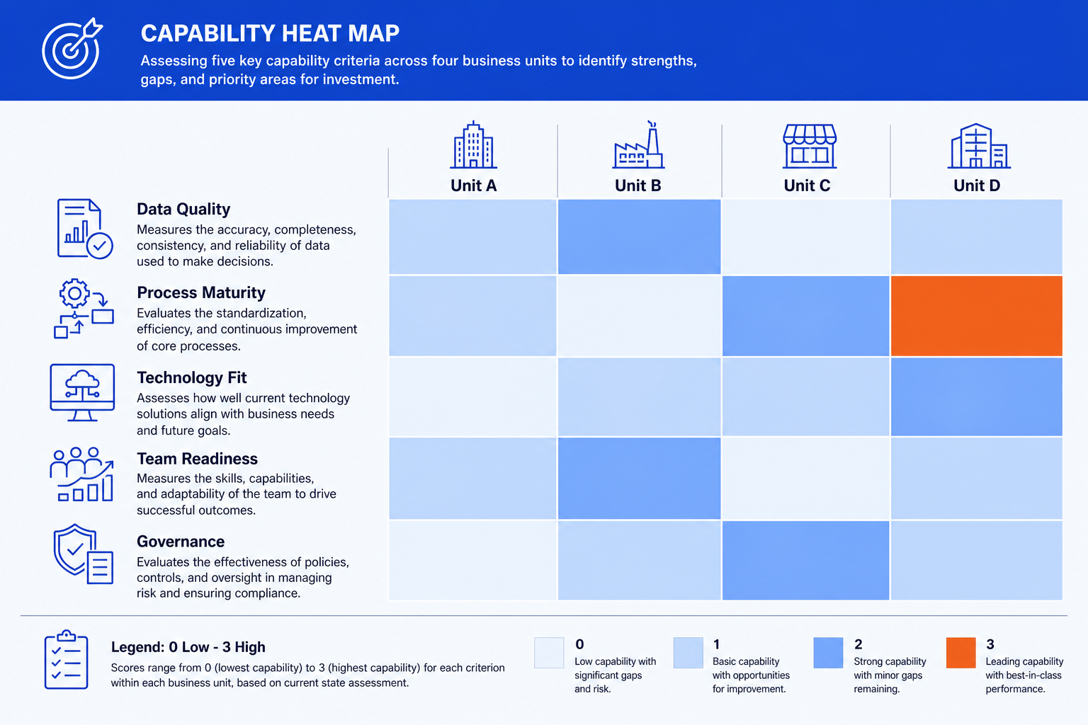
A generic capability heat map: five criteria down the rows, four units across the columns, one score per cell.
Choosing a color scale that reads in three seconds
The color scale carries as much meaning as the scores themselves. Get it wrong and the grid becomes decoration instead of an answer.
Default to a single-hue sequential scale. Light tint at the lowest score, your accent color at the highest, is the safest choice for a plain "how strong is this" question, and it reads as ordered without a second thought.
Reserve a diverging scale for a real threshold. A red, amber, green scale earns its place on a risk register or a status tracker, where there is a genuine below-threshold and above-threshold split. Do not default to it just because it looks familiar.
Skip the rainbow palette. A full spectrum has no built-in order, so a reader has to stop and check the legend before they can tell whether purple means better or worse than blue.
Check it reads for a colorblind reviewer. A blue-to-orange scale carries the same ordered meaning as red-to-green for a much wider audience, and it costs nothing to swap in.
Heat map vs. table, bar chart, and a 2x2 matrix
A heat map slide is not always the right call. Three alternatives cover most of the cases where it is not.
A plain table beats a heat map when precision matters more than pattern, for example a finance appendix where the reader needs the exact figure, not a color cue. A bar chart beats it when you are ranking items along a single measure. A heat map earns its keep once you add a second dimension, many criteria against many items, that a set of separate bar charts would need one chart per criterion to cover.
A 2x2 matrix beats a heat map when you genuinely have two dimensions and the result clusters cleanly into four quadrants. Our guide to a 2x2 positioning matrix slide covers that case. Once you have more than two or three rows or columns, a matrix loses detail that a grid keeps, which is exactly the case walked in our guide to building a prioritization heatmap slide. For a KPI grid specifically, pair this guide with our KPI dashboard slide walkthrough, since the two formats often sit on adjacent slides in the same deck.
Where the cells hold a judgement on a five-point scale rather than a measured number, a filled-circle rating usually reads better than a colour ramp. Our guide to Harvey balls in PowerPoint covers that notation and when it beats a heat map.
Common heat map slide mistakes to avoid
Nearly every one of these traces back to the same root cause: a color scale applied inconsistently. Fix the rubric and the palette before touching a single cell, and the rest of the build takes minutes.
The one-prompt route: build a heat map slide with Oria
A wide heat map slide can mean dozens of individual cell fills before you even reach the legend. Oria is an AI add-in that runs in the PowerPoint task pane and builds the whole grid, rows, columns, scored cells, and an ordered color scale, as native, fully editable shapes on your corporate template from a single prompt.
Because the output stays native PowerPoint, you can re-score one cell, swap the accent color, or add a row for a criterion the review board raises, all inside the same file, without redoing the fills by hand.
One-prompt heat map slide
For more prompts covering charts, grids, and other data-heavy exhibits, see our guide to Claude skills for data visualization.
Frequently asked questions
What is a heat map slide?
A heat map slide is a grid that scores two dimensions, rows and columns, and fills each cell with a color that communicates the score. A reader scans the pattern of color across the grid instead of reading every number, which makes it the right format for comparing many items against many criteria on one slide.
How many rows and columns should a heat map slide have?
Roughly 8 to 12 rows and 4 to 6 columns is the comfortable ceiling for a single slide. Beyond that, labels shrink past a readable size and the pattern gets harder to scan. Split a larger grid across two slides, or drop the weakest rows or columns, rather than shrinking the type to fit everything on one.
Should a heat map slide use a red-green scale or a single color?
Use a single-hue sequential scale, light to your accent color, for a plain "how strong is this" question. Reserve a three-color diverging scale, such as red, amber, green, for grids with a genuine below-threshold and above-threshold split, like a risk register or a status tracker. Avoid a full rainbow palette, since it has no built-in order for a reader to follow.
What is the difference between a heat map slide and a 2x2 matrix?
A 2x2 matrix plots items into four quadrants across exactly two dimensions and suits a smaller set of items. A heat map slide earns its place once you have more rows or columns than a 2x2 can hold, for example five capability areas scored across six business units, where a quadrant view would lose too much detail.
What is the fastest way to build a heat map slide?
Describe the rows, the columns, the scoring rubric, and the color scale in one prompt to Oria. It builds the grid as a native, fully editable PowerPoint table on your template directly in the task pane, so there is no manual cell-by-cell shading to get through.