

How to Make an Executive Summary Slide With KPI Tiles
Executive summaries open every board deck, and most of them lean on a row of KPI tiles to back the recommendation. Here is how to give that row real hierarchy with Improve Design, plus the exact prompts.
How to make an executive summary slide with KPI tiles
To make an executive summary slide with KPI tiles that actually reads, start from whatever rough version already exists, a working draft with three numbers bolted on, and run Oria's Improve Design on it. Improve Design aligns the tiles into one evenly sized row, sizes the number larger than its label so the hierarchy is obvious at a glance, applies your corporate template's fonts and colors, and emphasizes the one tile that most directly supports your recommendation.
This guide covers what gives a KPI tile real hierarchy, the cleanup workflow with Improve Design, the exact prompts, and the mistakes that leave a tile row flat. Everything you need is here.
Why the KPI tile row needs its own hierarchy pass
Executive summaries open every board deck, and almost all of them lean on the same device to back the recommendation: three small tiles along the bottom, each carrying one number. The problem is rarely the numbers themselves. It is that a rough draft gives all three tiles the same size, the same font weight, and the same color, so a reader has to work to figure out which metric actually matters to the decision on the page.
This guide focuses on that hierarchy pass: sizing, spacing, and emphasis on a tile row you already have. For the full SCR narrative that sits above the tiles, situation, complication, resolution, see how to build an executive summary slide. If the metrics belong on their own tracking view rather than backing a single recommendation, they belong on a separate dashboard slide with its own action title, not in this three-tile row.
What gives a KPI tile real hierarchy
The exhibit below shows the same executive summary slide once its KPI tile row has the hierarchy fixed: one tile emphasized, the other two consistent but quieter.
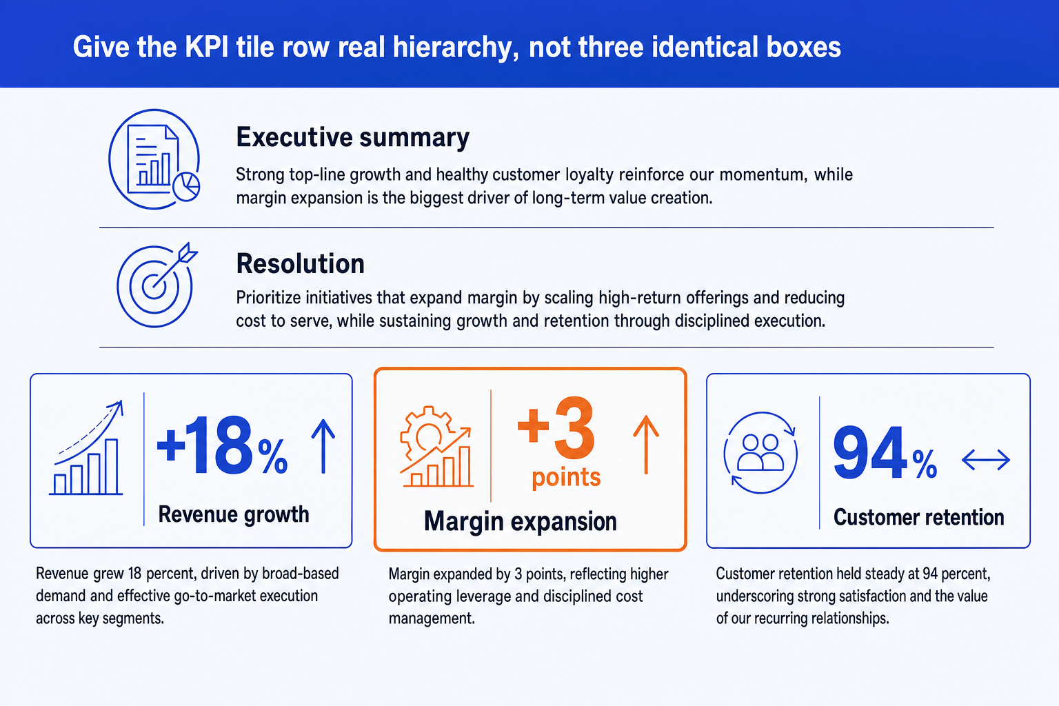
Number over label. The number is the largest element in the tile, set well above the label in size and weight. The label is short and quiet underneath it, naming the metric without competing with it.
A delta or trend arrow. A small arrow or a plus or minus sign next to the number tells the reader whether it is good news before they even reach the label. Skip it and a reader has to guess what 94 percent means.
One emphasized tile. The tile that most directly backs the recommendation gets the orange accent, a slightly bolder frame, or both. It is the visual answer to the question of which number matters most.
Even sizing and spacing. All three tiles share the same height, the same internal padding, and the same gap between them, so the row reads as one glued unit rather than three boxes placed near each other.
A one-line rationale, if there is room. A short sentence under the number, explaining why it moved, turns a bare statistic into evidence for the recommendation above it.
The step-by-step cleanup workflow with Improve Design
Most KPI tile rows for an executive summary slide do not start as a designed exhibit. They start as three numbers dropped in during a late edit. Improve Design is built for exactly that starting point: it takes the slide you already have and refines it, rather than asking you to rebuild the row from a blank page.
Get the rough tiles into a PowerPoint slide. It can be three text boxes, a set of shapes, or a paste from another deck, as long as the numbers and labels are already in place. Improve Design refines formatting; it does not invent your figures.
Decide which metric backs the recommendation most directly. Before you clean up the visuals, pick the one number the resolution actually rests on, since Improve Design will emphasize whichever tile you point it to.
Run Improve Design on the slide. Oria aligns the three tiles into one evenly sized row, sets the number clearly larger than the label, and applies your uploaded corporate template's fonts and colors.
Ask it to emphasize the tile you chose. A follow-up prompt in the same session moves the orange accent onto the right tile without touching the other two or the numbers themselves.
Check that every number and label survived intact. Improve Design preserves your original content by design, but it is worth a scan to confirm nothing shifted between tiles in the reformat.
Write the action title. Replace a leftover label like "Key Metrics" with a full-sentence so-what that states the recommendation the tiles support. The title is the slide; the tiles are the proof.
Gotcha
Improve Design cleans up formatting, not judgment. It will emphasize whichever tile you tell it to just as neatly as the right one. Decide which metric actually backs the recommendation before you clean up the slide, not after.
The Improve Design route: rough tiles in, board-ready row out
Resizing three tiles by hand, matching their padding, and recoloring them to match a template is exactly the kind of mechanical work that eats an evening before a board readout. Oria removes it. It is an AI add-in that runs in the PowerPoint task pane, and Improve Design is the workflow built specifically to take an existing, imperfect slide and turn it into a clean, on-brand version without a design brief. Point it at the rough executive summary slide you already have, and it hands back a fully editable native slide.
Because the output is native PowerPoint, every number, label, and accent color stays editable afterward. You can swap a metric, reword a label, or move the emphasis to a different tile without rebuilding the row. For a rough deck with more than one weak slide, see the wider guide to improving ugly PowerPoint slides with AI redesign tools.
Improve Design prompt for a rough KPI tile row
The prompts that make the KPI tile row sharp
These are the exact copy-paste prompts we use to clean up a rough tile row, move the emphasis to the right metric, and write the action title. The first three are for Oria inside PowerPoint; the last two are for checking the numbers in Claude before you polish the slide. Replace the bracketed parts with your own metrics.
Clean up with Improve Design in Oria
Full cleanup pass on an existing tile row
Emphasize the tile that backs the recommendation
Write the action title on the cleaned-up slide
Check the numbers in Claude first
Pick the three metrics that actually back the recommendation
Write the one-line rationale under each number
Tip
Pick the metrics and the rationale in Claude, then hand the tile row to Improve Design for the visual pass. For the narrative that sits above the tiles, see how to build an executive summary slide.
Common mistakes to avoid
For the wider habits that make AI-assisted slides look board-ready rather than generic, the consultant's guide to Claude covers the end-to-end method from analysis to deck.
Frequently asked questions
What is a KPI tile on an executive summary slide?
A KPI tile is a small, self-contained block that carries one metric: a large number, a short label naming what it measures, and usually a delta or trend arrow. Three tiles in a row along the bottom of an executive summary slide are the standard way to back a recommendation with evidence without turning the slide into a data table.
How many KPI tiles should an executive summary slide have?
Three is the standard count. Three tiles fit cleanly in a row at a size a board reader can actually read, and three metrics is usually enough to back one recommendation without diluting the point. If you have more than three numbers that matter, that is a sign the recommendation itself may need to be split across more than one slide.
Should every KPI tile look the same?
No. Give the metric that most directly supports your recommendation more visual weight, typically the orange accent color and a slightly bolder frame, while the other two stay in the standard blue. Three identical tiles force the reader to decide which number matters most. One emphasized tile does that work for them.
What is the difference between this and a KPI dashboard slide?
A KPI dashboard slide is a standalone tracking view built for reporting a wider set of metrics, and it typically carries more than three figures. A KPI tile row on an executive summary slide is narrower by design: three metrics only, chosen specifically because they back the one recommendation the slide is making. If the metrics belong on their own tracking view, give them a separate dashboard slide with its own action title and full metric set rather than stretching the summary row to hold them.
What is the fastest way to fix a KPI tile row that already looks messy?
Get the rough version into PowerPoint with the numbers, labels, and any delta arrows already in place, then run Oria's Improve Design on it. Oria aligns the tiles into an evenly sized row, sizes the number larger than the label, applies your corporate template's colors, and emphasizes the tile you point it to, in about the same couple of minutes it takes to generate a slide from scratch.