

Executive Summary Slide Examples: 8 Slides, Word for Word
Eight executive summary slide examples for eight real situations, each written out band by band with the sentences that would sit on the slide, why it works, and the trade-off it carries.
Nobody searching for executive summary slide examples is short of layouts. The search result is full of them, sold by the hundred, and they all look fine until you try to put a real argument inside one.
The decision is narrower than it looks: given the room you are presenting to on Thursday, which of four structures should carry your recommendation, and what should the words on the page actually say. So the eight examples below are written out in full. Each names a situation, a reader and a structure, then shows the sentences that would sit on the slide, band by band, why it works, and what it costs you. Copy the wording, change the numbers, keep the shape.
What does a good executive summary slide look like?
Four structures cover almost everything a corporate or consulting deck needs, and the audience settles which one you use.
Quick answer
A good executive summary slide states the recommendation in the title as a full sentence, then carries it in two to four bands built on one of four structures. Use SCR, situation then complication then resolution, for a board approving a recommendation backed by numbers. Use SCQA, which adds an explicit question before the answer, for a single open decision. Use a so what stack, three ranked statements with no setup, for a recurring update to an audience that has the background. Use a 3 box, context then tension then ask, when the reader has under a minute. One visual at most: a KPI tile row, a bridge or a milestone bar.
How we chose these executive summary slide examples
The bar was set by how badly the artifact usually performs. In Board Packs: The Elephant in the Boardroom, the 2024 study by the National Association of Corporate Directors and Board Intelligence, just 17 percent of directors called their board pack "extremely effective" at conveying key messages, against 39 percent who rated it not, slightly or only moderately effective (n=380). Four filters were applied to each example here, and one category was deliberately ignored.
One real situation per example, not one template shown eight ways
Each example is a different situation with a different reader. Two share a structure only where the situation calls for the same one.
The actual words, not placeholder text
Every example is written out band by band. A layout full of Lorem ipsum tells you nothing about whether it can carry a real argument.
The title has to state the recommendation
Any example titled Executive Summary was rewritten. A title naming the topic wastes the one line guaranteed to be read.
Numbers only where they back the recommendation
Tiles, bridges and milestone bars had to earn their place by answering the reader's next question. Visuals that only illustrate background came off.
What we ignored
Visual styling, stock imagery, icon sets, animation, template library size, and any example that looked good only for carrying no real content.
Key takeaways
Pick the structure from who is in the room, not from taste. A board wanting a recommendation backed by numbers reads SCR. A committee making one open call reads SCQA. A sponsor who was here last month reads a so what stack. A reader with sixty seconds reads a 3 box.
Design for how it is read, not how it is presented. Most of these pages are read alone, on a screen, before the meeting. Reading order is a decision: vertical bands for narrative logic, horizontal boxes when the ask should land last.
Numbers should settle an objection, not decorate the page. A KPI row, a bridge or a milestone bar earns its place when it answers the question the recommendation provokes. If you cannot name the objection it defeats, it belongs on a supporting slide.
Budget the read to under a minute and cut to fit. Two to four bands, one lead line each, one supporting sentence underneath. A page that needs five bands is carrying a second message that deserves its own slide.
Know the failure mode before you commit to a layout. Every structure breaks somewhere: SCR without settled numbers, SCQA without a real question, a so what stack in front of a newcomer, a 3 box on a recommendation needing nuance.
The four executive summary slide structures compared
The five columns are the five decision rules above. Read across your own row: the structure you want is the one whose failure mode your situation does not trigger.
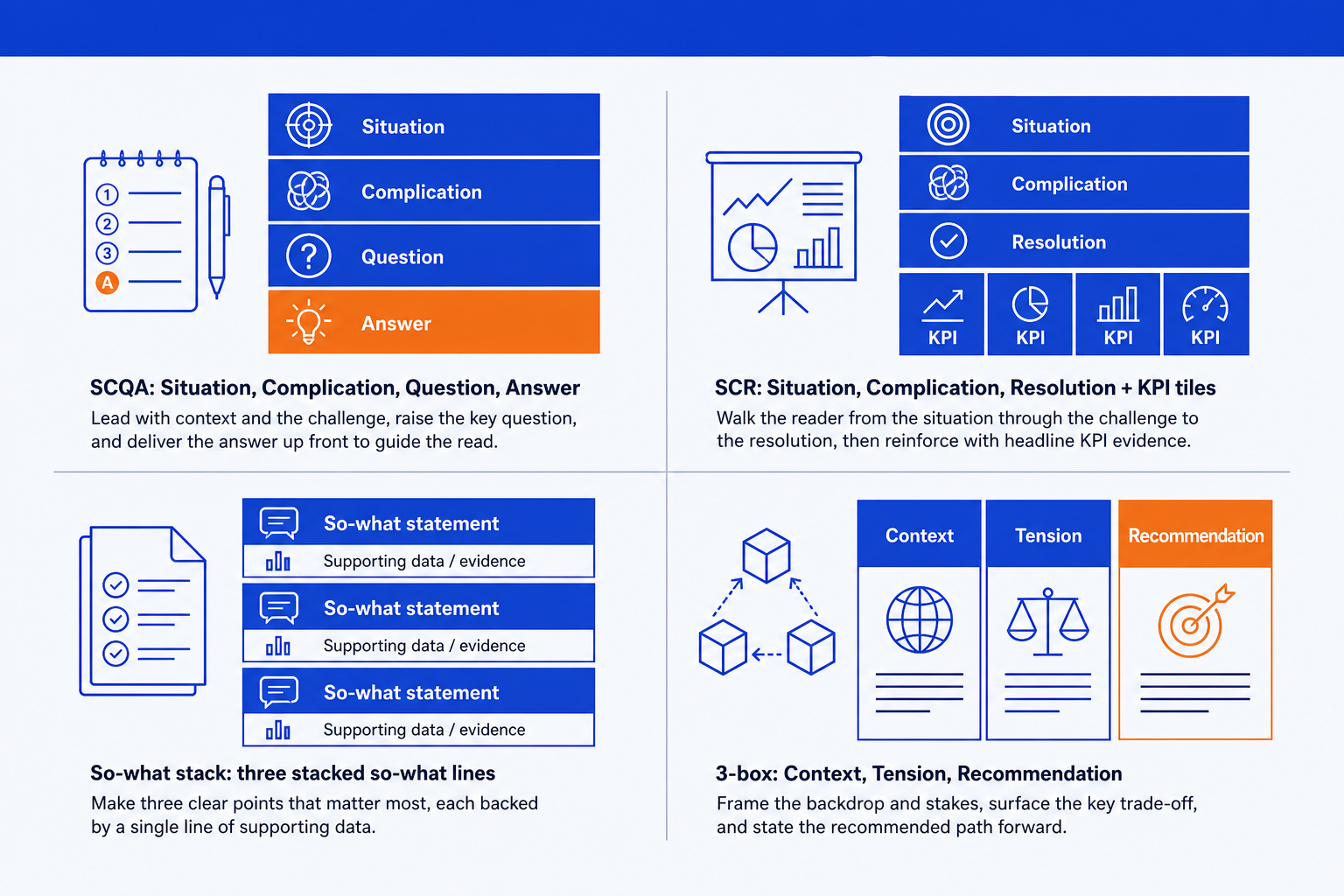
| Structure | Who is in the room | How it is read | What the numbers do | Time to read | Where it breaks |
|---|---|---|---|---|---|
| SCR | A board or committee approving a recommendation | Three vertical bands, narrative order | A KPI or economics row behind the resolution | 45 to 60 seconds | When the numbers are not final and the tiles keep moving |
| SCQA | A committee making one genuinely open decision | Four bands; the question precedes the answer | Usually none; evidence sits behind the answer | 60 to 75 seconds | When the call is made and the question reads as theatre |
| So what stack | A sponsor who already has the background | Three ranked statements, no setup | One data line each, plus a trend arrow | 30 to 45 seconds | In front of anyone new, who needs the context you cut |
| 3 box | A reader skimming a memo or teaser under time pressure | Left to right, context to ask | One compact visual replacing a box | Under 30 seconds | When the recommendation needs conditions or caveats |
Read times are working budgets, not measured averages. Jakob Nielsen's 2008 Nielsen Norman Group analysis of how little users read found that on an average web page "users have time to read at most 28% of the words during an average visit; 20% is more likely", from Weinreich and colleagues' study of 45,237 page views. For a before-and-after, Storytelling with Data rebuilds one, and the SCR build guide covers the method.
None of the four is universally correct. Match it to the decision and to how much background the audience carries, then hold it steady across the deck.
Eight executive summary slide examples, with the wording
These pages carry more weight than their page count suggests. The same NACD and Board Intelligence study found that 72 percent of US public company board packs run past 200 pages (n=200), and that half of every board pack consists of slides to be presented in the meeting (n=382). Its own prescription is to "summarize the three-to-five key messages up front, on the first page of each report", which is the job of the slide below.
The numbers are illustrative; the sentence shapes are not. These are the constructions that survive a hostile read: a diagnosis rather than a restatement, a named criterion, an ask with a date on it.
Board update: what goes on the executive summary slide?
SCR with three KPI tiles
A quarterly trading update to a board that has already seen the numbers. The page says what the quarter means, not what happened.
The diagnosis is the content. A 4 point miss caused by price demands a different decision from one caused by volume, and the page draws that distinction before anyone asks. The KPI row gives a sceptic something specific to challenge.
The trade-off: this needs a closed month. If the tiles are still moving, the meeting becomes a debate about the numbers, not the recommendation.
Consulting readout: what goes on a consulting executive summary slide?
Governing thought with three supporting arguments
The opening page of a final report, where a whole engagement has to be defensible at once. This is what most people mean by a consulting executive summary slide.
The governing thought is the whole answer, so a reader who stops after one line has still read the report. The three supports are the three separate grounds for disagreeing, and each can be attacked without collapsing the others.
The trade-off: a pyramid reads as rigorous only when the supports are independent. Overlapping ones read as a single argument told three times.
Due diligence: what goes on the executive summary slide?
SCQA, proceed or pass
A commercial diligence readout to an investment committee with an exclusivity clock running, deciding whether the next tranche of fees gets spent.
The Question band is what most diligence summaries leave out, and it is what makes the page auditable: a reader can check the Answer resolves the question actually asked. Naming the walk away condition sets it now, in the calm.
The trade-off: SCQA earns its fourth band only when the question is open. If the deal team has decided, a plain SCR page is more honest.
Project status: what goes on the executive summary slide?
So what stack with a milestone bar
A monthly update to a steering committee that sat in the same room four weeks ago. Re explaining the background is how you lose them.
Three ranked so whats put the biggest change where it gets read, and the bar answers the next question without a chart. Cutting the Situation band is the point: an audience handed its own context back stops reading.
The trade-off: swapping a written answer for a timeline removes the recommendation. If this month needs a decision, add it back as a fourth line.
The four that follow swap one band to fit a deal, a cost programme or a review. The diligence example pairs with the commercial due diligence report structure , and the quarterly review is the opening page of a full QBR deck.
Investment case: what goes on the executive summary slide?
SCR with three economics tiles
A capital request to a committee that approves a dozen of these a year from a finite pot. It competes against the other eleven.
A committee compares proposals on three numbers, so those numbers are on the page rather than in an appendix. The low case beside the base case pre empts the first question a finance director asks.
The trade-off: economics tiles invite an argument about assumptions rather than the decision. Bring the sensitivity table as a backup slide.
Cost programme: what goes on the executive summary slide?
3 box with a savings bridge
A half year readout to an audience that will read the bridge before a word around it. The layout accepts that rather than fighting it.
The bridge sits where the recommendation box usually goes, so reading order survives while the audience gets the visual it came for. Colouring only the at risk bar holds the eye on the number under debate.
The trade-off: a bridge assumes a room that can read one. To a mixed audience it reads as decoration and the 17m question disappears.
Go or no go: what goes on the executive summary slide?
SCQA with an explicit decision criterion
A launch readiness review four weeks out. The meeting exists to produce one word, and the page should make it hard to leave without saying it.
Writing the decision criterion onto the page stops the same argument reopening in six weeks on a different gate. A committee choosing between three stated paths also moves faster than one asked whether it feels comfortable.
The cost of burying the decisive line is documented. The Columbia Accident Investigation Board's 2003 report examines the contractor briefing slide used in the debris assessment: it built six levels of hierarchy to carry what the Board counted as 11 simple sentences, and only at the bottom did engineers state that one debris estimate was 640 times larger than the data calibrating their damage model. Dr Edward Tufte of Yale University, whom the report identifies as an expert in information presentation, judged the honest headline would have been "Review of Test Data Indicates Irrelevance of Two Models". The Board's own verdict: "When engineering analyses and risk assessments are condensed to fit on a standard form or overhead slide, information is inevitably lost."
The trade-off: a binary frame forces a yes or a no, and some answers are honestly yes but later. Say so in the Answer band.
Quarterly review: what goes on the executive summary slide?
So what stack with trend arrows
The opening page of a customer review, read by somebody deciding whether to keep paying.
Putting the slipped commitments on the summary page, rather than slide 14, is what makes the other two lines believable. An arrow does in one glyph what a clause needs ten words for.
The trade-off: arrows hide magnitude. An up arrow on a metric that moved 0.4 points reads like one that moved 17, so keep the number beside it.
Adding a KPI row, a bridge or a milestone bar is the move described in this guide to KPI tiles on an executive summary slide: pick three numbers that back the recommendation and drop the rest. The independence test behind the consulting example is the MECE principle and its slide applications.
Where do you actually build an executive summary slide?
Four routes, cheapest first, which is not the same as best first. Each is right for somebody and none for everybody. A fifth answer is worth naming: in his 2017 letter to shareholders, Jeff Bezos wrote that "we don't do PowerPoint (or any other slide-oriented) presentations at Amazon", describing narratively structured six-page memos read silently at the start of each meeting. If your organisation can hold that line, the best executive summary slide is a memo.
Building it by hand: who is it built for?
Drawing the bands, aligning the tiles and setting the emphasis colour yourself. For one slide that really matters this is the most controllable option and the only free one.
The trade-off: total control, no cost, and the slowest path if you produce these weekly. It degrades under deadline, because alignment is the first thing to go.
A slide template pack: who is it built for?
Marketplaces such as SlideModel, SlideUpLift and SlideKit sell editable executive summary layouts by the hundred, and they dominate this search result for a reason: the layout is already drawn.
The trade-off: the fastest route to a decent shape, and no help with the hard part. Retrofitting one into a locked corporate master is often slower than building the bands yourself.
Oria: who is it built for?
Oria is an AI slide tool aimed at corporate and consulting output: board packs, steering committee decks, diligence exhibits and dense frameworks held to an enforced company template. It reaches you two ways, as a PowerPoint add in running in the task pane on Windows, macOS and PowerPoint for the web, and as a connector for Claude and ChatGPT over MCP, so a slide can be built from the chat you are already in. It returns native, editable PowerPoint shapes in your own template rather than an image or a web embed, which is what lets these layouts survive being handed on. Customer content is not used for training, Professional and Team do not persist presentation content after delivery, and Enterprise adds private cloud deployment.
The trade-off: it is built for the corporate environment and only that. Where the job is visual impact rather than defensible content, a founder pitch, a launch deck, a keynote, a design led tool will beat it and look better doing it.
A design led AI deck builder: who is it built for?
Gamma, Beautiful.ai, Pitch and Canva generate a whole deck from a prompt and apply a coherent visual system across it. They suit people whose slides look amateur, and on that problem they are the best answer here. For a founder deck or a launch narrative, start there.
The trade-off: the best looking output of anything here, and the hardest to force into someone else's corporate master. Check how the file exports before committing a board pack to one.
On the Oria route the request is one line, and the structure name does the work. For the drafting side, before layout, see these Claude skills for executive summary writing.
One-line prompt for any of these structures
For the wider method, from raw findings to a full deck, see the consulting toolkit methods hub.
Which executive summary slide should you build?
Routed by what is in your way. Most of these rows send you elsewhere, including off this site.
Four of those rows have a page here: the SCR method, KPI tiles, fixing an ugly deck and the AI for PowerPoint comparison.
Frequently asked questions
What should an executive summary slide include?
Four things: a title stating the recommendation rather than the words Executive Summary, two to four bands carrying the argument in a named structure such as SCR or SCQA, one lead line per band that works on its own, and a specific ask with an owner or a date on it. Numbers belong only where they back the recommendation.
What does a good executive summary slide look like?
Like one readable page rather than a dense one. Expect a single recommendation across the top as a full sentence, two to four short bands underneath with one lead line each, and at most one visual: a KPI tile row, a savings bridge or a milestone bar. The eye should travel title, lead lines, visual, and stop.
What are the 5 parts of an executive summary?
The five part version usually given for written documents is purpose, problem, findings, recommendation and next steps. On a slide that is a part or two too many. SCR compresses it to situation, complication and resolution; SCQA adds an explicit question before the answer. Converting a written summary, fold purpose into the title.
What is the 5-5-5 rule for presentations?
A rule of thumb, not a research finding: no more than five words per line, five lines per slide, five text heavy slides in a row. It is a useful brake on wall of text slides and a poor fit for an executive summary, deliberately the densest page in the deck. Treat it as a reminder to keep lead lines short.
How many bullet points should an executive summary slide have?
As few as the structure needs, and usually none in the traditional sense. The examples here use lead lines inside two to four bands rather than a bullet list, because five or six bullets read as a status update rather than a recommendation. Past four items under one heading, the page carries a second message.
What is a consulting executive summary slide?
The opening page of a final report or readout, built as a governing thought with two to four supporting arguments beneath it. The distinguishing feature is that the supports are independent, so a reader can reject one without the answer collapsing. It runs denser than a board pre read, because it stands up without the author in the room.
Is there a free executive summary slide template?
Yes, several. Adobe Express, SlideChef and SlideEgg publish free editable executive summary layouts, and most paid marketplaces release a handful at no cost. They solve the blank page and nothing else. The wording, the structure choice and which three numbers earn a place decide whether the slide works.