

Best Fonts for PowerPoint: 6 Picks for Corporate Decks
The best font for PowerPoint is Aptos for a new Microsoft 365 deck and Arial for a file that has to open the same way on any machine. Four more picks cover titles, small text and chart labels, each with the trade-off stated.
Disclosure: Oria publishes this page and makes an AI add-in for Microsoft PowerPoint.
Quick answer: what are the best fonts for PowerPoint?
The decision is rarely which font looks best on your screen. It is which font will still look the way you chose on the screen of the person who opens the file, and whether you can set it once instead of fixing it slide by slide.
The best fonts for PowerPoint in a corporate deck are Aptos, Calibri, Arial, Georgia, Verdana and Segoe UI. Use Aptos, Microsoft's current default, for new files inside Microsoft 365. Use Arial or Calibri when a file must open identically on older machines. Use Georgia for titles, Verdana for small text that must stay legible, and Segoe UI for chart labels. Pick one family, set it as the theme font in the slide master, and use its weights for hierarchy instead of adding a second typeface.
How we chose these PowerPoint fonts
Legibility on a projected slide. Whether the letterforms stay distinct at small sizes and across a room: the difference between a capital I and a lowercase l, the shape of a numeral 1, the width of the spacing.
Whether it is already on the reader’s machine. A font that exists only on your laptop is a font that gets swapped on the partner’s. We checked each one against Microsoft’s own typography documentation.
Weight range for hierarchy. A corporate slide needs a title, a subtitle, body text, a footnote and a number callout. We asked whether the family gives you enough weights to build that without a second font.
How the font behaves in a shared file. Embedding rules, cloud-font behaviour and what happens on a machine that lacks the font, taken from Microsoft support pages.
What we ignored: novelty, trend-driven display faces, and any font that needs a separate purchase or download to be on the reader's machine. We also did not rank the six. They are ordered by how widely we would recommend them as a default for corporate work, and every fact about a font is taken from Microsoft's own typography and support pages, listed at the end.
Key takeaways
Pick one family and use its weights. Most dense corporate slides need hierarchy, not variety. A family with a real weight range lets you build five text levels from one font and keeps the page calm.
Availability beats beauty. A font that renders on every reader’s machine will look better than a better font that gets substituted. Check where each face ships before you commit your template to it.
Set fonts in the slide master, never slide by slide. Theme fonts defined once flow into every layout. Local overrides are what make a deck look assembled by five people.
Serif for emphasis, sans serif for density. A serif title over sans serif body text is a classic pairing. A dense table or chart label is almost always better in a clean sans serif.
Embed or confirm before you send. Microsoft states that not all fonts can be embedded. If the file leaves your organisation, confirm the font travels with it or choose one that does not need to.
Best PowerPoint fonts compared
One row per font. Designers, dates and where each font ships come from Microsoft Learn's typography pages, checked on November 8, 2026.
| Font | Type | Designer | Where it ships | Best for |
|---|---|---|---|---|
| Aptos | Sans serif | Steve Matteson | Microsoft 365, as a cloud font | New Microsoft 365 decks |
| Calibri | Sans serif | Lucas de Groot | Windows and Office, default font since 2007 | Decks that must open the same everywhere |
| Arial | Sans serif | Robin Nicholas and Patricia Saunders, Monotype | Windows since version 3.1 in 1992 | Neutral body text and external files |
| Georgia | Serif | Matthew Carter | Windows, and Office applications | Titles with character |
| Verdana | Sans serif | Matthew Carter, hinted by Tom Rickner | Windows, and Office applications | Small text on a big screen |
| Segoe UI | Sans serif | Steve Matteson | Windows, and Office on non-Windows devices since 2022 | Labels, captions and chart text |
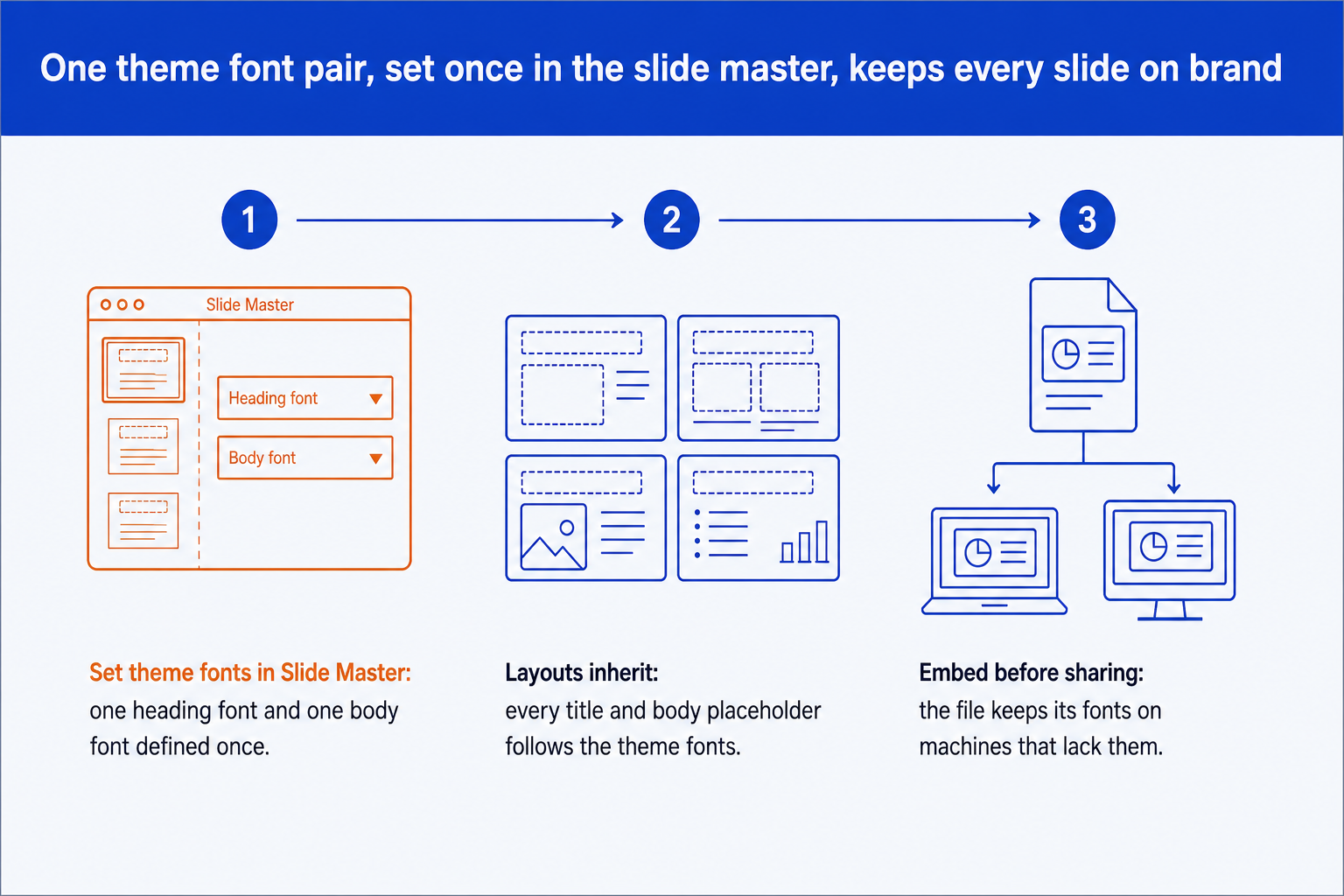
The same three moves apply whichever font you choose.
Aptos: should it be your default PowerPoint font?
Aptos is the font to pick when the deck lives inside Microsoft 365 and nobody is forcing a house typeface on you. Microsoft’s typography page says Steve Matteson designed it as a new default Office font to replace Calibri. The family has six weights from Light to Black, plus Display and Condensed variants, which is enough to build a full hierarchy from one name.
Matteson’s own description, quoted on that page, is that Aptos has "the austerity and directness that is required in huge variety of Office documents created every day." That is a fair brief for a board pack. It is neutral, readable and does not draw attention to itself.
It is listed as available within Office applications, which Microsoft documents as cloud fonts. That makes it the lowest-friction choice for a current Microsoft 365 user. If a recipient is on an older Office version, confirm the font renders for them before you rely on it.
Verdict: Pick it for new decks in a Microsoft 365 organisation that has no mandated typeface.
The trade-off: the most current default, and the one most likely to be substituted on an older install.
Calibri: is it still a safe PowerPoint font?
Calibri is the safe choice when the file has to open the same way on every machine it reaches. Microsoft records that Lucas de Groot designed it in 2004, that it was published in 2007 as part of the ClearType collection, and that it became the default font in Office the same year. Nearly every PowerPoint user has had it installed for well over a decade.
Microsoft describes it as "an extremely readable sans serif text typeface" with rounded stroke ends that give it a "comfortable, friendly feel that works well in long texts." The same softness reads as a little informal on a formal slide, and because it was the default for so long, a Calibri deck can look like nobody chose a font at all.
That is the real argument against it. The font is fine. The signal it sends is "unchanged defaults."
Verdict: Pick it when compatibility with older machines matters more than looking current.
The trade-off: universal availability, bought with the look of an unmodified template.
Arial: the neutral PowerPoint font for external decks?
Arial is the right pick when the deck goes to people outside your organisation and you cannot know what they have installed. Microsoft’s page records that Monotype’s Robin Nicholas and Patricia Saunders developed it from a 1982 design, and that Microsoft licensed it as one of the core fonts for Windows 3.1 in 1992. Few typefaces have had that long to spread.
Microsoft calls it "extremely versatile," usable for "text setting in reports, presentations, magazines." It is plain, and plain is the point: Arial takes on the character of the slide around it instead of adding its own.
Its limit is range. The family on the Microsoft page has four styles: regular, bold, and an italic of each. There is no Light and no Black, so a title that needs weight contrast has to rely on size and colour.
Verdict: Pick it for decks that circulate widely, especially to clients and partners on unknown machines.
The trade-off: the most predictable rendering, with only four styles to build hierarchy from.
Georgia: when does a serif belong on a slide?
Georgia belongs on a slide when the title should carry a point of view and the body can stay out of its way. Matthew Carter designed it for screens and Microsoft first made it available in September 1996. The documentation notes an increased x-height and lightened capitals, tuned so the face holds up at low resolution.
Microsoft also notes the bold is designed to always be heavier than the regular weight, "an important consideration at small sizes on the screen." On a slide that matters, because a bold lead-in inside a bullet has to read as bold from the back of a room.
Use it for titles and pull quotes, and pair it with a sans serif for the body. A whole dense slide set in Georgia looks like a printed report, which is sometimes exactly right and often not.
Verdict: Pick it for titles and key messages, paired with a plain sans serif body.
The trade-off: the most character of the six, and the weakest fit for numbers-heavy tables.
Verdana: is it the best PowerPoint font for small text?
Verdana is the one to try when text has to stay readable at small sizes on a large or poor screen. Matthew Carter designed it, Tom Rickner hand-hinted it, and Microsoft first made it available on July 8, 1996. Its documentation says the bold weight was designed to be heavy enough "even at sizes as small as 8 ppem."
The characters are wide and generously spaced by design. Microsoft says commonly confused characters, such as the lowercase i, j and l, the uppercase I, J and L, and the numeral 1, were drawn for "maximum distinctiveness." In a financial table where a 1 and an l must never be mistaken for each other, that is a real feature.
The cost is space. Wide letters take more room per line, so a slide that fits in Arial may run onto a second line in Verdana. Plan for fewer words per box instead of shrinking the type.
Verdict: Pick it for tables, footnotes and anything that will be read on a screen at a distance.
The trade-off: the clearest small text here, and the widest, so it makes dense slides longer.
Segoe UI: is it a good font for labels and charts?
Segoe UI is a good choice for the small text around a chart: axis labels, legends, callouts and captions. Microsoft describes it as "especially clear and readable" for screen information, and "especially appropriate for labels, captions, signs, and subtitles." It has a wide weight range, from Light to Black.
The caveat is reach. Microsoft’s documentation says it was Microsoft’s default user interface font from Windows Vista in 2007 but was not added to Office for non-Windows devices until 2022. A deck sent to a Mac user on an older Office build may therefore render in a substitute font.
Check the recipient before relying on it. If you cannot, embed it or fall back to Arial for the file you send out.
Verdict: Pick it for chart text and captions on decks that stay inside a current Microsoft environment.
The trade-off: the best weight range for small labels, with the narrowest history of cross-platform support.
How to set one font across a whole PowerPoint deck
Microsoft's support page gives the route: open Slide Master view from the View tab, select the master or layout that uses the font, then open the Fonts menu on the Slide Master tab and choose one. Close Master view to return to your slides. Because the layouts inherit the theme fonts, every title and body placeholder follows.
Two limits from the same page. The method is not available in PowerPoint for the web. And if more than one template has been applied, so the file has several slide masters, you must change the font on each master. A deck stitched together from other decks is the usual cause of that.
The fuller mechanics, including how layouts and placeholders relate to the master, are in our guide to PowerPoint slide masters. If the problem is that pasted slides keep their old fonts, converting AI-generated slides into brand decks covers the clean-up. Font size interacts with slide dimensions too, so check which slide size settings matter before you set a body size.
Rule of thumb
Our own working rule, not a published standard: keep body text no smaller than 18 point, and if a slide forces you below that, cut words before you shrink type.
Can you embed fonts in a PowerPoint file?
Yes, with conditions. Microsoft's support page states that "not all TrueType fonts can be embedded", because the font's creator sets the permission. It recommends OpenType or TrueType fonts and advises avoiding PostScript fonts. Embedding is supported in PowerPoint for Microsoft 365 for Mac, and in PowerPoint 2024 and 2021 for Mac.
Two practical points from the same page. Fonts differ widely in size, so a heavy family makes a heavier file. And it advises against the option to embed only the characters used, because the recipient then cannot edit the text in that font. For a deck other people will edit, embed all characters. Cloud fonts such as Aptos need no embedding in Office.
How to keep a corporate font on every generated slide
Choosing a font is the easy half. The hard half is that AI-generated slides often arrive in a default font and have to be fixed by hand. Oria is an AI tool for corporate documents and consulting presentations, and it works through two surfaces: a PowerPoint add-in, and a connector for Claude and ChatGPT over MCP, so a deck can be built from the chat you are already in. It applies your corporate template, fonts included, and produces native editable PowerPoint objects.
It is built for the corporate environment only. For a fundraising, launch or student deck where visual impact is the job, a design-led tool will beat it. To see how the wider field handles templates, read the guide to the best AI for PowerPoint.
Which PowerPoint font fits your deck?
Find the situation on the left. One row sends you out of this list on purpose.
Frequently asked questions
What is the best font for PowerPoint?
For most corporate decks the best font is a clean sans serif that every reader has installed. Aptos is Microsoft’s current default for new Microsoft 365 files, while Arial and Calibri are the safest when a file has to open the same way on older machines. The best choice also depends on whether your company already owns a brand typeface.
What font should I use for a professional PowerPoint?
Use one sans serif family for body text and, if you want contrast, one serif such as Georgia for titles. Keep to two fonts at most and build hierarchy from weight and size. Set them as theme fonts in the slide master so every slide inherits them and none is overridden by hand.
Is Calibri still a good font for PowerPoint?
Yes. Microsoft describes it as extremely readable, and it has been the Office default since 2007, so it renders the same on nearly every machine. The only argument against it is that it can look like an unchanged default, which makes a deck read as unstyled.
What fonts are safe to use in PowerPoint so they do not change on another computer?
Fonts that ship with Windows and Office, such as Arial, Calibri, Georgia and Verdana, are the safest. For anything else, embed the font in the file. Microsoft notes that not all fonts can be embedded, so check the font’s embedding permission first.
How do I change the font for the whole PowerPoint presentation?
Open View, then Slide Master, and choose a font from the Fonts menu on the Slide Master tab. Every layout that uses theme fonts will update. Microsoft states that this is not available in PowerPoint for the web, and that a file with several slide masters needs the change on each one.
How many fonts should a PowerPoint presentation use?
Two at most, and one is often enough. A single family with several weights gives you title, subtitle, body, footnote and number callout without the mismatch that a third typeface introduces.
Sources (checked on November 8, 2026)
- Aptos font family, Microsoft Learn Typography
- Calibri font family, Microsoft Learn Typography
- Arial font family, Microsoft Learn Typography
- Georgia font family, Microsoft Learn Typography
- Verdana font family, Microsoft Learn Typography
- Segoe UI font family, Microsoft Learn Typography
- Change the fonts in a presentation, Microsoft Support
- Benefits of embedding custom fonts, Microsoft Support