

How to Build an Org Chart Slide for Executives in PowerPoint
Draft the hierarchy from a plain list with Text to Slide, then align every box and apply your template with Improve Design. Here is the two-step workflow, the exact prompts, and how to keep a leadership chart readable as the org grows.
How to build an org chart slide for executives, in short
To build an org chart slide for executives, write the leadership structure as a plain text list, one line per person with their title and who they report to, and run it through Oria's Text to Slide. That returns a native hierarchy of boxes and connectors on your corporate template. Then run Improve Design on it to align every box to a shared grid, apply consistent sizing, and add a legend for any dotted or matrixed line.
The two workflows solve different problems. Text to Slide gets the structure onto the slide fast. Improve Design keeps it board-ready as titles change and the chart scales past one screen. This guide covers both, the anatomy of a clean chart, the copy-paste prompts, and the mistakes that make a leadership chart look unfinished.
Why an org chart slide for executives is a recurring, high-stakes build
Org charts are a recurring high-stakes slide type. A leadership deck, a reorganization proposal, a board governance page, and a diligence pack all need one, and the audience for each is senior enough to notice a misaligned box or an ambiguous dotted line immediately. Unlike a one-off analysis slide, an executive org chart also gets reused and revised for months as titles change and reporting lines shift, so it needs to be easy to update, not just easy to build once.
That combination, a senior audience plus a slide that keeps getting revised, is why the workflow matters as much as the layout. For the reporting relationships a chart like this sets up, the companion view is a RACI matrix slide that shows who does what, not just who reports to whom. For the broader build including SmartArt versus a one-prompt route, see how to build an org chart slide.
The anatomy of a clean executive org chart
Whichever tool builds it, an org chart slide for executives follows the same structure. Get these five parts right and the hierarchy reads in seconds, without a walkthrough.
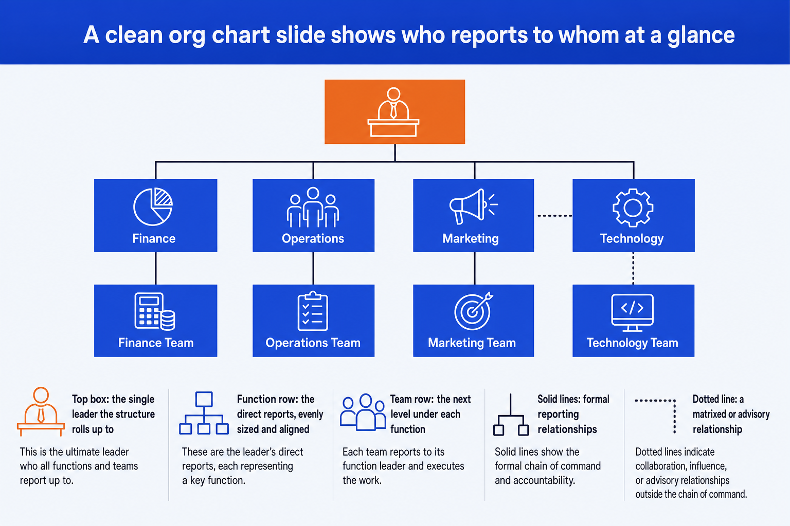
One top box. The single executive the whole structure rolls up to. Resist adding a second box at this level even when two roles feel co-equal; pick the actual reporting line.
An evenly sized function row. The executive's direct reports, each the same width and height as the others in that row. Uneven sizing implies a seniority difference that may not exist.
A consistent team row. The next level under each function, sized the same as its peers. Stop adding rows once you reach the depth an executive audience actually needs.
Lines that mean one thing. Solid for formal reporting, dashed for matrixed or advisory, with a small legend. Never let a viewer guess what a connector means.
One chosen depth. Show the same number of levels under every leader. A chart with full depth under one executive and a single box under another looks unfinished.
Draft the structure with Text to Slide
Most executive org charts start life as a list, not a slide: names and titles from an HR system export, a reorganization memo, or notes from a leadership meeting. Text to Slide is built for exactly that starting point.
Write the reporting structure as a plain text list, one line per person, with their title and who they report to. You do not need to lay out boxes or think about layout yet.
Run it through Oria's Text to Slide. It reads the list, infers the levels, and returns a native hierarchy of boxes and connectors already applied to your corporate template.
Check that every level landed where it should. Text to Slide infers hierarchy from the list, so a report that skips a level in your notes can land one row off; fix it in the source list and regenerate rather than dragging boxes.
Refine in PowerPoint: rename a role, add a matrixed line, or nudge spacing, exactly as you would with any slide you built by hand.
Align the boxes and scale it with Improve Design
An org chart rarely stays clean once a second reorganization adds boxes, a title changes, or someone inherits a slide from a previous team. Improve Design takes that existing, drifted slide and refines it without asking you to rebuild the structure.
Point Improve Design at the org chart slide you already have, misaligned boxes, inconsistent sizes, and all. It works on what is there; it does not invent roles.
Improve Design aligns every box to a shared grid, makes boxes at the same level identical in size, and straightens the connecting lines so nothing crosses unnecessarily.
It applies your corporate template's fonts, colors, and logo, so the chart matches the rest of the deck instead of looking like a separate export.
Ask it to group a level that has grown past six or seven boxes into a single counted box per function, so the slide stays readable as the org grows.
Check that every name, title, and reporting line survived. Improve Design preserves your original content; it changes formatting and layout, not who reports to whom.
Gotcha
Improve Design cleans up layout, not the underlying reporting logic. It will align a box that is one level off just as neatly as a correct one. Fix any real reporting question with the team before you run the cleanup pass, not after.
Copy-paste prompts for an executive org chart slide
These are the exact prompts we use to draft a leadership chart from a list, align and scale it once it exists, and add the finishing touches an executive audience expects. Replace the bracketed parts with your own names, titles, and reporting lines.
Draft the hierarchy with Text to Slide
Turn a flat list into a hierarchy
Add a matrixed or dotted-line relationship
Align and polish with Improve Design
Full alignment pass on an existing chart
Add the finishing touches
Scale it for a large organization
Condense a large org onto one slide
Rebuild after a title change
Tip
Draft with the first two prompts, then use the alignment and scaling prompts as follow-ups in the same session rather than starting over. For the manual, box-by-box build and a SmartArt comparison, see how to build an org chart slide.
Common mistakes to avoid
For the wider field guide to when a chart like this earns its place in an engagement alongside other operating-model views, see the consulting frameworks field guide.
Frequently asked questions
What is the fastest way to build an org chart slide for executives?
Write the reporting structure as a plain text list, one line per person with their title and who they report to, and run it through Oria's Text to Slide. It returns a native, editable hierarchy of boxes and connectors on your template in a couple of minutes, which is faster and more consistent than placing boxes by hand or fighting PowerPoint's SmartArt.
How do I keep an org chart slide for executives readable as the team grows?
Pick one level of depth and hold it across the whole slide. Show the executive team and their direct reports, then group anything below that into a single counted box per function, for example one box reading 180 people across Operations. One consistent depth reads in seconds. A chart that shows full depth under one leader and a single box under another looks unfinished, even if every number is correct.
Should I use PowerPoint's SmartArt for an executive org chart?
SmartArt works for a small, static chart of three or four boxes. It gets rigid fast: adding a dotted line, resizing one box, or matching your corporate template usually means fighting the tool instead of building the chart. For a leadership structure with any complexity, drafting it as a plain-text list and generating the boxes gives you a cleaner result in less time.
How do I show a dotted-line or matrixed reporting relationship on an executive chart?
Add a separate dashed connector for the matrixed relationship and keep every solid line reserved for formal reporting. Include a short legend, since a board or leadership audience should not have to guess what a dotted line means. Improve Design can add this legend and the dashed connector to an existing slide without disturbing the boxes you already placed.
Will the org chart stay editable after Oria generates or cleans it up?
Yes. Both Text to Slide and Improve Design hand back native PowerPoint shapes, text boxes, and connectors rather than a flat image. You can rename a role, resize a box, or restyle a line afterward exactly as you would on any slide you built manually, which matters the moment a title changes the week before the board meeting.