

How to build a 2x2 matrix slide in PowerPoint
To build a 2x2 matrix slide in PowerPoint, pick two independent dimensions for the axes, cross them at the midpoint into four quadrants, label each quadrant with what landing there means, and plot your items as sized bubbles so a third variable, like revenue or headcount, comes through without a second chart. PowerPoint has no native 2x2 or bubble-chart quadrant tool, so the fastest route is Oria's Text to Slide: describe the axes, the quadrant names, and the bubbles in one paragraph, and it renders a fully editable native slide in your template.
This guide covers when a bubble-style 2x2 beats a plain dot matrix, the anatomy of a clean one, the manual build and its real gotcha, the exact Text to Slide prompt, and the mistakes that make a matrix unreadable. Everything you need is here.
Why a 2x2 matrix slide with bubbles, not just dots
A 2x2 is the consulting favourite for sorting options: two independent dimensions crossed to form four quadrants, with each option placed by where it falls on each axis. A plain version plots every item as an identical dot. A bubble version keeps the same two axes but resizes each item by a third number, so a reader sees not just which quadrant an initiative lands in but also how much is riding on it.
Reach for the bubble version whenever the size of the opportunity matters as much as its position, for example initiatives by effort versus impact, sized by expected revenue, or segments by growth versus fit, sized by current headcount. If every option is roughly the same size on that third measure, skip the bubbles and use the plain 2x2 positioning matrix instead. For the wider field guide to when this framework earns its place in an engagement, see the consulting frameworks field guide.
The anatomy of a 2x2 matrix slide with editable axes and bubbles
Five parts carry the whole slide. Get these right and the matrix reads itself without a verbal walkthrough.
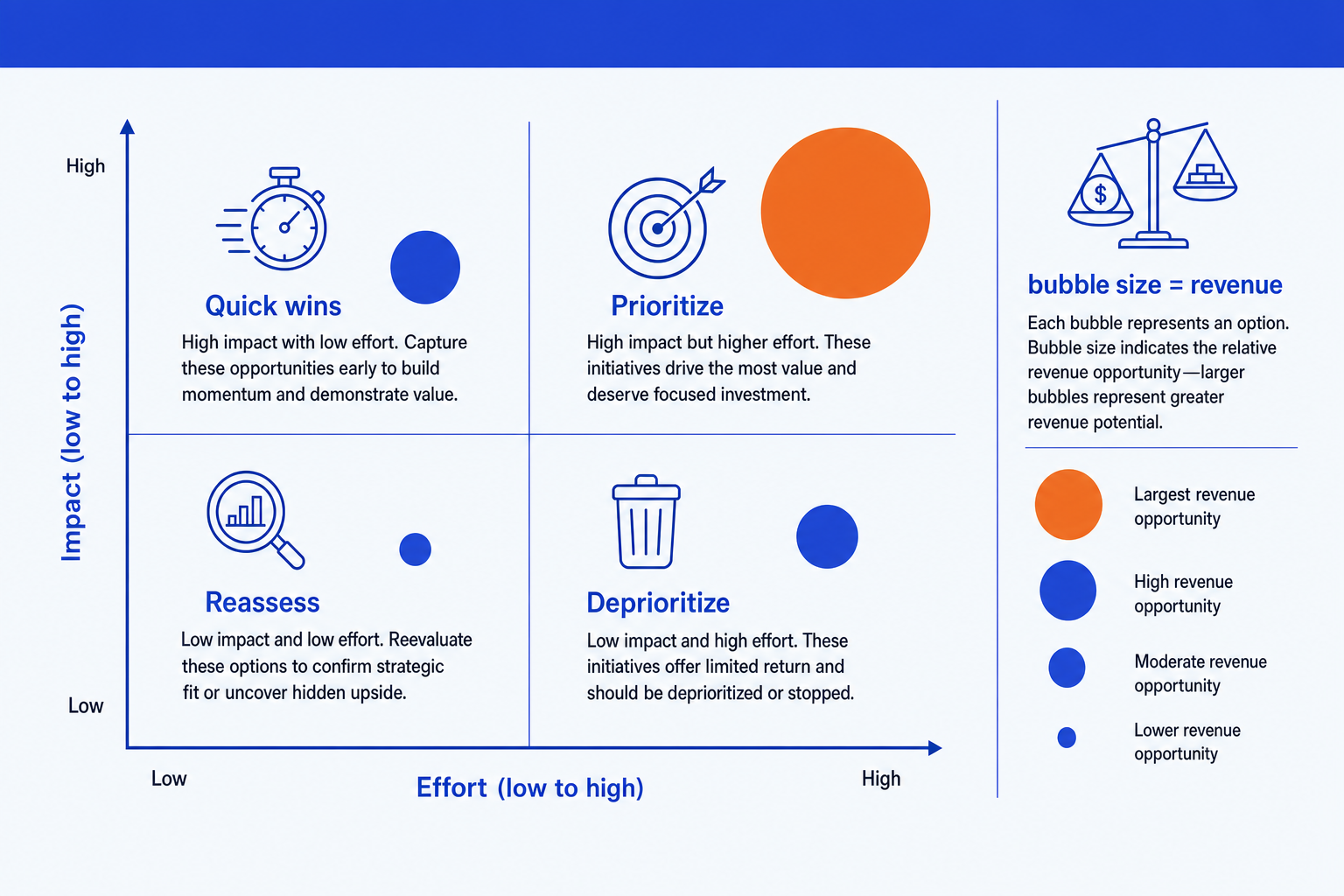
Two axes. A horizontal X axis and a vertical Y axis, each one decision dimension running from low to high. Name them in plain words so the reader knows what high means.
Four quadrants. Each combination of high and low on the two axes. Give each a short label that states what an item landing there means, like invest, protect, fix, or exit.
Sized bubbles. The options you are comparing, placed by their read on each axis and sized by a third variable such as revenue, budget, or headcount at stake.
Bubble-size legend. A compact key that shows what a small, medium, and large bubble represent in real units, so the third variable is not just decoration.
Target quadrant. The top-right, where both dimensions are high and the biggest, most attractive bubbles sit. Give it the emphasis color so the slide lands on the recommendation.
The step-by-step manual build, and the real gotcha with bubble sizing
PowerPoint has no 2x2 chart type and no quadrant-aware bubble chart. For a label-only matrix, two crossed lines plus circles you size by hand are quickest. For a data-driven version, an XY scatter chart with bubble sizing turned on gives you precise placement and consistent scaling.
Choose the two axes. Pick the two dimensions that actually drive the decision, for example effort and impact. Write each as a low-to-high scale and confirm the two are independent before going further.
Draw the cross and the frame. Place a horizontal line and a vertical line crossing at the centre to split the canvas into four equal quadrants. Add a light outer frame so the field is contained.
Label the axes and the quadrants. Put the axis names at the ends of each line, low at one end and high at the other. Name each quadrant with a short action word that says what an item there means.
Plot the items as bubbles, sized by area. Drop a circle for each option in the quadrant its two reads put it in, and scale each circle's radius to the square root of its size metric, not the raw value, so the visible area tracks the number honestly.
Add a size legend and label every bubble. Show a small, medium, and large reference circle with the real values next to them, then label each plotted bubble so a reader is not left guessing which option is which.
Emphasize the target and write the title. Recolor the top-right target quadrant and give the biggest bubbles there the emphasis color. Replace the topic label with an action title that states the recommendation the matrix supports.
Gotcha
The eye reads a circle by its area, not by the length across it. Double the diameter and the area actually quadruples, which makes a bigger item look far more dominant than the underlying number supports. Always scale the radius to the square root of the value, and always ship the size legend next to the matrix, not in a footnote nobody reads.
The Text to Slide route: describe the matrix once, get an editable slide
The crossed lines, the area-scaled circles, and the legend are exactly the kind of mechanical work that eats an evening. Oria removes it. Text to Slide is the Oria workflow built for this: you type a paragraph describing the axes, the quadrant names, and the items with their bubble sizes, and Oria designs the whole 2x2 matrix slide as one custom layout rather than forcing your content into a fixed template. The output is fully editable native PowerPoint, in your corporate template, ready in about the time it takes to write the description.
Because the output is native, every axis label, quadrant name, and bubble stays editable afterward. You can rename an axis, resize one bubble, or recolor the target quadrant without rebuilding the layout. The same approach works for any complex slide, from a bubble matrix to a process flow, which is why Oria suits the dense decks consultants and bankers actually ship.
Text to Slide prompt for a bubble-style 2x2 matrix
The prompts that make the 2x2 matrix slide sharp
These are the exact copy-paste prompts we use to build the matrix, size the bubbles, and set the emphasis. The first three are for Oria inside PowerPoint; the last two are for choosing the axes and the bubble metric in Claude before you build. Replace the bracketed parts with your own options.
Build it with Text to Slide in Oria
Spec the axes and quadrants
Plot the items as bubbles sized by a third variable
Emphasize the target and set the title
Choose axes and the bubble metric in Claude first
Choose two independent axes and a bubble metric
Place the items, size the bubbles, name the quadrants
Tip
Settle the axes and the bubble metric in Claude, then hand the clean axis names, quadrant labels, and sized items straight to Oria's Text to Slide. For the full draft-to-deck method, see the consultant's guide to Claude.
Common mistakes to avoid
For a structured framework that lists strengths and risks instead of plotting sized options, a SWOT analysis slide is the better fit. Match the framework to the message.
Frequently asked questions
What is a 2x2 matrix slide used for?
A 2x2 matrix slide plots a set of options against two independent dimensions so a reader can see, at a glance, which options are most attractive. Consulting and strategy teams use it to compare initiatives, segments, or investments on two criteria at once and to make a single recommendation obvious. Adding sized bubbles lets a third variable, like revenue or headcount, come through without a second chart.
When should the bubbles be sized instead of using plain dots?
Size the bubbles when a third number genuinely matters to the decision, such as how much revenue or budget sits behind each option. If every option is roughly the same size on that third measure, plain dots are cleaner and a bubble-size legend just adds clutter for no payoff.
Does PowerPoint have a native 2x2 or bubble-chart quadrant tool?
No. PowerPoint has no built-in 2x2 layout and no quadrant-aware bubble chart. The manual route is an XY scatter chart with bubble sizing, with the axes crossed at the midpoint, or two crossed lines plus circles sized by hand for a label-only version. Oria's Text to Slide builds the whole thing, axes, quadrants, and sized bubbles, from one paragraph of text.
Why does bubble size need to scale by area, not diameter?
The eye reads a circle by its area, not by the length across it. If you double a bubble's diameter to represent double the underlying value, the area actually quadruples, which makes the bigger item look far more dominant than the data supports. Scale the radius to the square root of the value so the area, not the diameter, tracks the number.
What is the fastest way to build a 2x2 matrix slide with bubbles?
Name the two axes, list the items with a high or low read on each, and give the size metric for the bubbles, then hand that to Oria's Text to Slide. You get a fully editable native PowerPoint slide in your template, with the axes, the four quadrant labels, and the correctly sized bubbles already placed, in about the time it takes to type the description.