

How to make a waterfall chart slide in PowerPoint
To make a waterfall chart slide in PowerPoint, lay out a start total, each labeled driver as a signed value, and an end total, then build a stacked bar chart with an invisible base series so the middle bars float at the right height. Add thin connector lines between steps, color increases and decreases consistently, and check that the steps actually sum to the reported ending total before you call it done. Modern PowerPoint also ships a native Waterfall chart type, and Oria can render the whole bridge as an editable native chart from one line of text.
This guide covers the finance-analyst version of this chart, the EBITDA bridge, the revenue bridge, and the budget-to-actual variance bridge, plus the manual build, the gotcha that trips up most first drafts, the exact prompts, and the one-prompt route. Everything you need is here.
When finance analysts reach for a waterfall chart slide
A waterfall chart slide, also called a bridge chart, shows how a starting value moves to an ending value through a sequence of increases and decreases. For a finance analyst, the starting and ending values are almost always reported figures: EBITDA, revenue, gross margin, or headcount, and the steps in between are the operating or accounting drivers that explain the move. The message is never the two totals alone. It is the story of what happened between them.
The four bridges finance teams build most often are the EBITDA bridge from one period to the next, the revenue bridge broken out by volume and price, the budget-to-actual variance bridge for a monthly or quarterly review, and the headcount bridge from opening to closing count. Reach for this chart whenever a reviewer's first question will be why the number moved, not just what the number is. For the summary view the bridge usually sits next to, see how to build a P&L summary slide. When the bridge is between two deal values rather than two reporting periods, the closer fit is a synergy bridge slide.
The anatomy of a finance waterfall chart slide
Six parts carry an EBITDA-style bridge. The exhibit below shows the pattern with a start total, four drivers, and an end total.
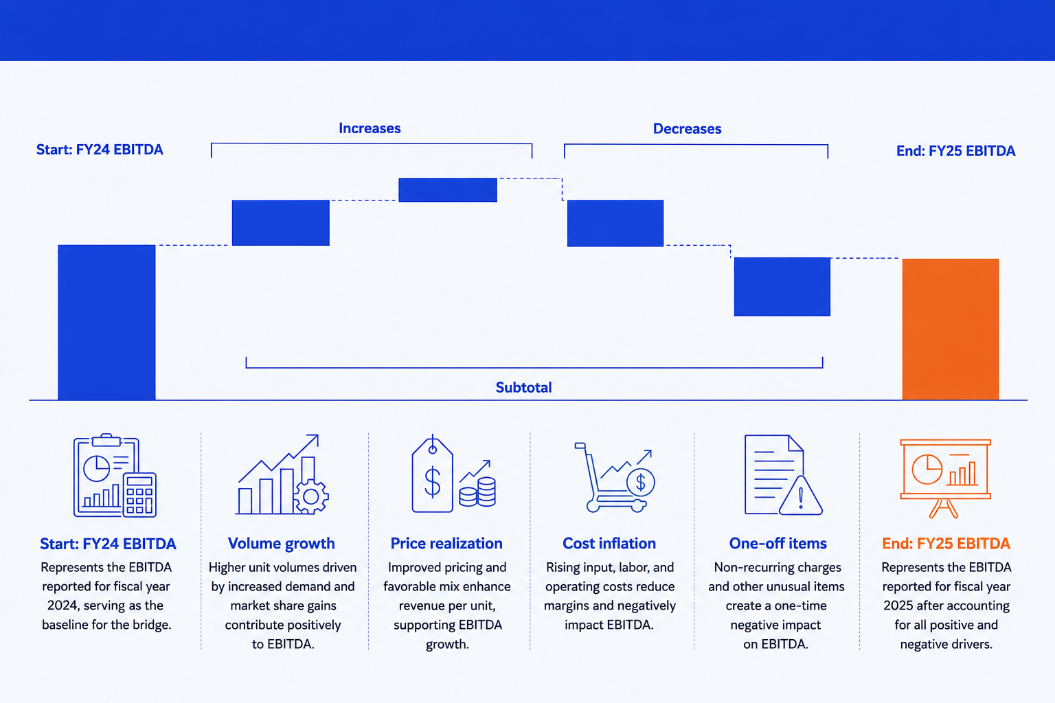
Start total. The opening figure the bridge begins from, anchored to the baseline. For an EBITDA bridge this is last period's reported EBITDA.
Increases. Positive drivers such as volume growth or price realization, held to one consistent color so the eye groups every favorable step instantly.
Decreases. Negative drivers such as cost inflation or one-off items, in a second consistent color so favorable and unfavorable are never ambiguous.
Connectors. Thin lines linking the top of each step to the base of the next, so the bridge reads as one continuous move rather than floating blocks.
Reconciliation check. The start total plus every signed driver must equal the end total exactly. This is the check most first drafts skip and reviewers always run.
End total. The closing figure the audience actually cares about, given the emphasis color so the slide lands on the answer.
The step-by-step manual build in PowerPoint
The classic method uses a stacked bar chart with an invisible base series so the middle bars float. PowerPoint also has a native Waterfall type under Insert, Chart, Waterfall, which is quicker for a rough internal check. Use the manual method when the slide is going in front of a partner or a board and needs full control over connectors, subtotal placement, and color emphasis.
Build a three-column data table. Categories in column A, signed step values in column B, and an invisible base column C that holds the running total each floating bar should sit on top of. The start and end totals sit on a base of zero.
Reconcile before you chart anything. Sum the start total and every signed driver and confirm it equals the reported end total. Fixing a rounding gap in a spreadsheet takes a minute; fixing it after the chart is built takes much longer.
Insert a stacked column chart. Select the base column and the value column together and insert a stacked bar chart so every category shows the invisible base stacked under the visible driver.
Hide the base series. Click the base series, set its fill to No Fill and its border to None. The visible bars now float at the height the running total puts them at, which is the entire trick of a manual waterfall.
Color drivers and totals consistently. One color for every increase, a second for every decrease, and the emphasis color for the start and end totals. Consistency across periods is what lets a reviewer compare this month's bridge to last month's at a glance.
Add connector lines and the action title. Draw thin connectors between each step, or enable the native chart's connector option, then replace the topic label with a full-sentence so-what naming the ending total and its single biggest driver.
Gotcha
A finance waterfall lives or dies on the reconciliation check. If the start total plus every driver does not land exactly on the reported end total, the slide is wrong even if it looks clean, and a reviewing analyst will find the gap before anyone gets to the story. Reconcile the numbers first, then build the chart.
The one-prompt route: describe the bridge, get an editable chart
Building the invisible base series and hand-checking the reconciliation is exactly the kind of mechanical work that eats a closing week. Oria removes it. It is an AI add-in that runs in the PowerPoint task pane and produces fully editable native PowerPoint elements, including real charts, in your corporate template. Describe the start total, the drivers, and the end total in one line, and Oria renders the waterfall chart slide for you.
Because the output is a native chart, every bar, label, and connector stays editable afterward. You can rename a driver, recolor the emphasis, or update a value for next period without rebuilding the slide. For the wider set of finance-analyst workflows Oria supports beyond a single bridge, see the ultimate guide to Claude for finance.
One-line EBITDA bridge prompt for Oria
The prompts that make the waterfall chart slide sharp
These are the exact copy-paste prompts we use to spec the bridge, choose the color emphasis, and write the action title. The first three are for Oria inside PowerPoint; the last two are for reconciling the numbers and drafting the title in Claude before you build. Replace the bracketed parts with your own figures.
Build the chart in Oria
Spec the bridge data and labels
Build a budget-to-actual variance bridge
Write the action title on the slide
Reconcile and draft the title in Claude first
Reconcile the drivers before you chart them
Sharpen the action title
Tip
Reconcile the drivers in Claude first, then hand the clean start, drivers, and end straight to Oria. For the general non-finance build steps and the native PowerPoint Waterfall chart type in more detail, see how to build a waterfall chart slide.
Common mistakes to avoid
For the wider habits that make AI-built finance slides look board-ready rather than generic, the consultant's guide to Claude covers the end-to-end method from analysis to deck.
Frequently asked questions
What is a waterfall chart slide, and how is an EBITDA bridge different from a generic bridge?
A waterfall chart slide shows how a starting value becomes an ending value through a sequence of labeled steps. An EBITDA bridge is a specific, finance-flavored version of that same chart: the start and end totals are EBITDA figures for two periods, and the steps are the operating drivers, volume, price, cost, and one-off items, that explain the move. The mechanics of the chart are identical; only the labels and the level of financial precision change.
How do you build a budget-to-actual variance bridge instead of a period-over-period bridge?
Swap the start and end totals for budget and actual instead of last year and this year, and label each step as a variance rather than a driver, for example volume variance, price variance, or FX variance. Keep the same rule for color: favorable variances in one color, unfavorable in a second, and the actual total emphasized at the end. The stacked-bar build underneath does not change.
Does modern PowerPoint have a native waterfall chart tool finance analysts can use directly?
Yes. Recent PowerPoint versions include a native Waterfall chart type under Insert, Chart, Waterfall, and you can mark any point as a total with a right-click. It is a fast way to get a rough bridge on screen, but it gives limited control over connector styling and color emphasis for a board-ready deck. The manual stacked-bar method in this guide gives full control; Oria gives you a clean editable native chart from a one-line prompt.
How do you keep a waterfall chart slide readable with more than five or six drivers?
Group the smaller drivers into a single labeled step, such as other operating items, rather than showing every line from the underlying model. A finance waterfall slide is a summary exhibit, not the full variance schedule. If a driver is genuinely material enough to warrant its own bar, keep it separate; everything else belongs in the appendix, not the headline bridge.
What is the fastest way to make a waterfall chart slide from raw variance data?
Paste the opening total, the closing total, and the labeled drivers with their signed values into Oria's Text to Slide. Oria renders a fully editable native PowerPoint chart in your template, including the connectors and the color emphasis on the ending total, so you skip the invisible base series and the manual connector lines entirely.