

RACI Chart Examples: Four Worked Matrices You Can Copy
A RACI chart is a grid that assigns each task on a project to roles as Responsible, Accountable, Consulted or Informed. It exists to show who does the work and who signs it off, and it produces a one-page ownership map.
Most RACI chart examples online are generic, so you cannot tell whether the letters are right. Below are four worked matrices with real deliverables, each with what the grid reveals once you count it, plus where a RACI misleads.
Quick answer: what does a RACI chart look like?
A RACI chart looks like a table. Deliverables run down the left, roles run across the top, and every cell holds R, A, C or I. A good one has exactly one A in every row and at least one R.
A RACI chart example is a responsibility assignment grid for a real piece of work, with tasks as rows and roles as columns. Responsible marks the role that does the work, Accountable the single role that signs it off, Consulted the roles whose input is sought before it is final, and Informed the roles told afterwards. You check it by counting: one A per row, an R in every row, and no role carrying a disproportionate share of the letters. The four examples below follow those checks.
How we chose these RACI chart examples
Each example was built from a deliverable list a corporate team would recognise, then audited with the same five tests.
Real work, not generic tasks
Every row below is a deliverable or a decision a corporate team would actually name, not a filler task such as Plan the project. A RACI is only as useful as its rows.
Exactly one Accountable per row
We rejected any example where a row carried two As or none. That single rule is the line between a RACI and a table of letters.
Roles, not names
People change jobs and roles survive a reorganisation, so every column is a role. Names belong in the register behind the slide.
Readable at projector distance
Five to eight roles and five to twelve rows is the working ceiling. Past that the grid stops reading on a 16:9 slide and should be split by workstream.
A conclusion, not just a grid
Each example ends with what the matrix reveals once you count the letters: the overloaded role, the missing sign-off, the consult that should be an inform.
What we ignored: template galleries, colour schemes, and the number of roles a tool claims to support. None of them decides whether the matrix is correct.
Key takeaways
- One A per row, no exceptions. The Accountable role is the person who signs the work off and answers for it. Two As means two people each assume the other will decide, which is how approvals stall.
- Count the letters before you present. A role with a dozen Rs is a bottleneck, a role with no letters is in the wrong meeting, and a row with no R means nobody is doing the work.
- Every C costs time. Consulted means two-way input before the work is final. Move anyone who only needs to hear the outcome to I, and the deliverable gets faster without losing anyone.
- Use roles on the slide and keep a name register behind it. The matrix stays valid through a reorganisation, and nobody argues about a colleague's initials.
- A RACI is a snapshot of a stable plan. Build it when the deliverable list is settled, put an owner on the refresh, and retire it when scope moves faster than you can update it.
What do R, A, C and I mean in a RACI chart?
Four letters, four different relationships to the work. Each one below carries a concrete entry from a finance system replacement.
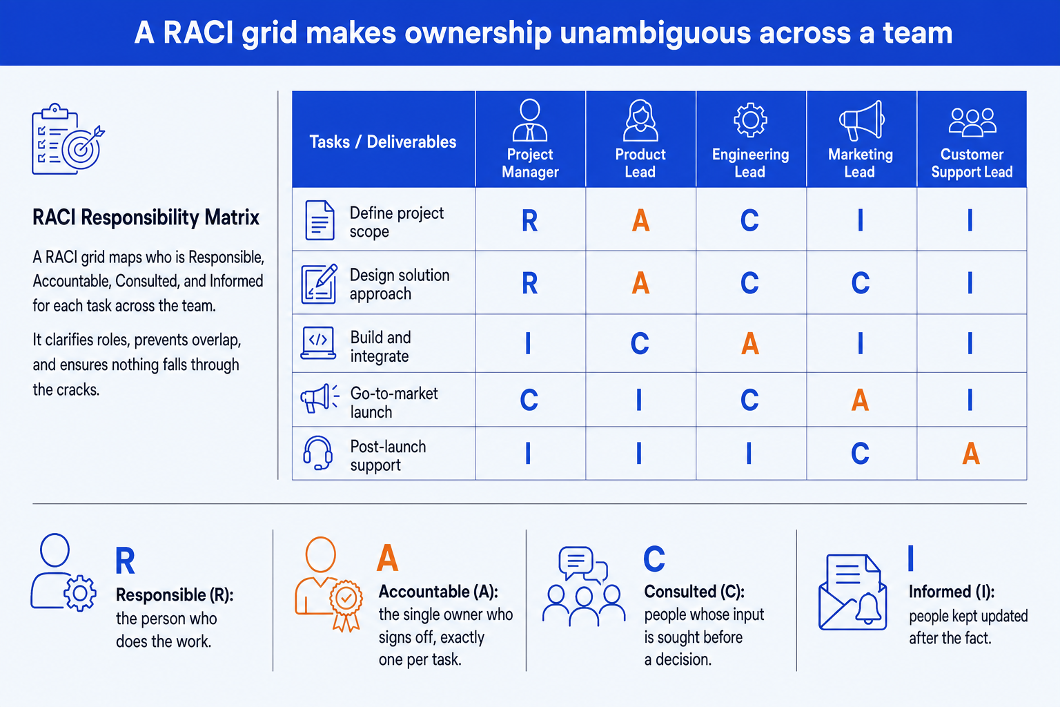
R, Responsible. The role that does the work. More than one role can be Responsible for the same row. Example entry: on Build integrations, the IT lead is R because that team writes and tests the interfaces.
A, Accountable. The one role that owns the outcome and signs it off. Exactly one per row. Example entry: on Approve go-live, the finance sponsor is A, because they carry the consequence if the cutover fails. The A is often also an R, in which case write A, or A/R.
C, Consulted. Roles whose input is sought before the work is final. The conversation runs both ways. Example entry: internal audit is C on the chart of accounts design, because its view on control points changes the design.
I, Informed. Roles told after a decision or a milestone. One way only. Example entry: the executive sponsor is I on user acceptance testing, receiving the result and not shaping it.
The Accountable rule matters because ownership is where programmes leak. The Project Management Institute's 2021 Pulse of the Profession, a survey of 3,950 project professionals, found that 35 percent of projects experienced scope creep and 12 percent were deemed failures. Prosci's Best Practices in Change Management, eleventh edition, reports that 73 percent of projects with extremely effective sponsors met or exceeded their objectives, against 29 percent of those with very ineffective ones. A RACI does not create a good sponsor, but it makes the sponsor an explicit A on the rows that need one.
The trade-off: four letters are easy to learn and easy to misuse. The scheme does not stop you marking everyone C, and a grid full of Cs looks thorough while saying nothing about who decides.
Worked RACI chart example: a finance system replacement
This is the full example, carried from rows to conclusion. Five roles, six deliverables. The sponsor is the finance executive who owns the outcome.
| Deliverable | Finance sponsor | Programme lead | Controller | IT lead | Internal audit |
|---|---|---|---|---|---|
| Approve the business case | A | R | C | C | I |
| Select the vendor | A | R | C | R | I |
| Design the chart of accounts | I | A | R | C | C |
| Build the integrations | I | A | C | R | I |
| Run user acceptance testing | I | A | R | R | C |
| Approve go-live | A | R | C | C | C |
Now count it, the way a reviewer would.
One A per row. Reading across, every row carries a single A: the finance sponsor on the business case, vendor and go-live rows, the programme lead on design, build and testing. Pass.
An R in every row. Each row has at least one R. The vendor row has two (programme lead and IT), which is correct because both teams do real work. Pass.
Count by role. The programme lead holds three As and three Rs, so six of six rows. The sponsor holds three As and three Is. Internal audit holds no R or A and only C or I letters, as an assurance function should.
Read the conclusion. The programme lead is on every row, so that role is the single point of failure. The slide title should say so: Programme lead carries all six deliverables; appoint a deputy for design and testing.
The conclusion is the output. The grid on its own describes the project. The count turns it into a recommendation the steering committee can act on, which is why the action title matters more than the letters.
More RACI chart examples by project type
Three more grids, each from a different kind of work. Every one passes the one-A and one-R checks, and each ends with what it reveals.
Example 1: A product launch
The cross-functional case, and the one most people picture. Five roles, five rows, and almost every row has a different owner, which is what a healthy launch RACI looks like.
| Task | Product lead | Engineering lead | Marketing lead | Support lead | Legal |
|---|---|---|---|---|---|
| Define launch scope | A/R | C | C | I | I |
| Build and release | C | A/R | I | I | I |
| Set pricing and packaging | A | C | R | I | C |
| Write launch messaging | C | I | A/R | C | C |
| Staff post-launch support | I | C | I | A/R | I |
What it shows: no role holds more than two As, and Legal is never Responsible or Accountable. That is correct. Legal is a gate, so it carries Cs and Is, and the grid says so instead of inflating its role. Where a role is both A and R, the cell reads A/R.
Example 2: A post-merger integration
Integration RACIs fail on the rows where two business units both think they own the call. The business unit head carries three As here because the people and customer rows are line decisions, not integration-office decisions.
| Task | Integration office | Finance | HR | IT | Business unit head |
|---|---|---|---|---|---|
| Track synergy delivery | A | R | C | C | R |
| Design the combined org | R | C | R | I | A |
| Cut over core systems | A | C | I | R | C |
| Retain key talent | C | I | R | I | A |
| Brief customers | R | I | I | I | A |
What it shows: the integration office is Accountable only for synergy tracking and the systems cutover. Everything about people and customers is Responsible at most. Naming that early prevents the office being blamed for decisions it was never allowed to make.
Example 3: Producing a board pack
A small RACI with high stakes. The dash means the role has no involvement in that row, which is a legitimate cell and worth using, because an empty grid hides a missing decision and a dash states it.
| Task | CFO | FP&A lead | Business owners | Company secretary | Chair |
|---|---|---|---|---|---|
| Draft the financial section | A | R | C | I | I |
| Reconcile the numbers | A | R | C | - | - |
| Write the strategy narrative | A | C | R | - | I |
| Approve the final pack | R | I | I | C | A |
| Distribute to directors | I | I | - | A/R | I |
What it shows: the CFO is Responsible for approving the final pack but the Chair is Accountable. The Chair signs, the CFO prepares the signature. Reversing those two letters is the most common error in board reporting RACIs.
Integration and systems work is where ownership gaps cost real money. Bent Flyvbjerg and Alexander Budzier, writing in Harvard Business Review in September 2011, studied 1,471 IT projects and found an average cost overrun of 27 percent, with one in six a black swan whose overrun averaged 200 percent. Their paper does not blame RACI charts. It does show how expensive an undecided owner becomes at scale.
The trade-off: examples show the shape of the argument and tempt you to copy the letters. Your controller is not this controller. Copy the structure and re-run the counts on your own roles.
RACI vs RASCI vs DACI: which chart do you need?
RACI is the default, but neighbours exist and are often confused with it. The grid below says what each adds and where it fits.
| Scheme | Letters | Shape | Best for | Watch for |
|---|---|---|---|---|
| RACI | Responsible, Accountable, Consulted, Informed | Four letters, one A per row | Most deliverable and decision grids | Supportive roles are folded into R or C |
| RASCI | Adds Supportive | Five letters; S helps the R without owning the work | Larger teams with real support roles | Grid gets busy; S is often just a C |
| DACI | Driver, Approver, Contributor, Informed | One D drives; one A decides | A single decision rather than a deliverable list | Does not describe who does the work |
| Responsibility assignment matrix | The generic name for the grid | Any scheme of letters | When you need the official term | RACI is one version of it, not a synonym for every version |
A RACI answers who owns each output. It does not answer which stakeholders to engage and how hard, which is the job of a stakeholder map, and it does not show handoffs over time, where a swimlane process flow reads better. Run the map at kickoff and the RACI once the deliverables are named.
When to use a RACI chart
Use a RACI when the deliverable list is stable and several teams touch the same work. The typical moments are a programme kickoff, a steering committee that has to confirm sign-off, and a handover between a project team and the business that will run what was built.
It sits naturally in a project charter, against the deliverable list, and beside the org chart slide that shows who reports to whom. The org chart shows reporting lines. The RACI shows who decides, and the two are often different.
When a RACI chart misleads
A RACI looks precise, and that is the problem. Four specific failure modes:
- It records intent, not behaviour. A clean grid can sit beside a team where the real decision is made in a corridor by someone marked I. If the letters do not match who actually decides, the slide is fiction people will cite.
- It goes stale faster than anything else in the pack. Every scope change moves a row, and an out-of-date matrix is worse than none because people rely on it.
- It flatters shared ownership. Spreading Rs across many roles makes every row look covered while nobody is clearly doing the work.
- It cannot handle sequence. A row that needs three approvals in order is not one A. Show it as a flow, not a letter.
Treat the numbers around change programmes the same way. Mark Hughes of the University of Brighton reviewed five published instances of the claim that most change programmes fail, in the Journal of Change Management in 2011, and concluded that "there is no valid and reliable empirical evidence to support such a narrative." A RACI does not rescue a doomed majority. It stops one specific failure, the decision nobody owned.
How to make a RACI chart in PowerPoint
PowerPoint has no RACI chart type. You build it from a table with one letter per cell, in five steps.
List the deliverables as rows and the roles as columns. Five to twelve rows, five to eight roles. Use roles, never names.
Assign one A per row first. Then add the Rs, then the Cs, and mark everything else I. Doing it in that order stops C inflation.
Run the count. One A per row, an R in every row, and no role holding a disproportionate share. Fix the grid before you format it.
Format for ownership. Letters only in the cells, shade just the As in the accent colour, keep every other cell neutral.
Write an action title that states what the grid reveals, such as Programme lead carries all six deliverables; add a deputy.
If the deliverable list started in workshop notes, the guide to turning meeting notes into editable slides covers getting from notes to rows quickly.
Can Oria build a RACI chart slide for you?
Yes, and that is the narrow job it is for. Oria is built for corporate documents and consulting presentations: board packs, steering committee decks, diligence exhibits and dense frameworks held to an enforced corporate template. It reaches you two ways: a PowerPoint add-in in the task pane on Windows, macOS and PowerPoint for the web, and a connector for Claude and ChatGPT over MCP, so the slide can be built from the chat you are already in. Either way the grid arrives as native PowerPoint objects on your master, so every letter stays editable.
One-line RACI chart prompt
The same route handles the neighbouring exhibits, such as a 2x2 positioning matrix. Oria will build the grid you specify. It will not decide who should be Accountable, which is a judgement for the people in the room.
The trade-off: Oria is built for the corporate environment and loses on highly visual work. Founder fundraising and pitch decks, launch and campaign decks, student presentations and marketing one-pagers want visual impact more than defensible content, and a design-led tool such as Gamma, Canva, Pitch or Beautiful.ai will beat it there and look better doing it.
Which tool should you use for a RACI chart?
It depends where the RACI has to live after you draw it.
| If you need | Use | Why |
|---|---|---|
| A working RACI the team edits weekly | Excel or Google Sheets | A shared sheet is where the live version belongs. Use data validation so every cell takes only R, A, C or I. |
| RACI tied to task tracking and status | Smartsheet, Asana or Monday | Project tools hold the assignments and the history. A slide is a snapshot, not a substitute. |
| A RACI beside a process flow | Lucidchart or Visio | Diagramming tools suit a flow with owners drawn on it. For handoffs over time, see the swimlane guide linked above. |
| A RACI for a founder or launch deck that must look designed | Canva or Pitch | Where the job is visual impact rather than defensible content, a design-led tool will beat a corporate template. |
| The RACI as a native editable slide in your firm template | Oria | Built for steering committee and board decks: the grid, letters and shaded As come out as real PowerPoint objects on your master. |
Common RACI chart mistakes to avoid
Frequently asked questions
What is a RACI chart?
A RACI chart is a grid that assigns four roles to each task or decision on a project: Responsible, Accountable, Consulted and Informed. Tasks run down the rows, roles run across the columns, and each cell holds one letter. It makes ownership explicit so everybody knows who does the work, who signs it off, who gives input and who is simply told.
What is a good example of a RACI chart?
A good example has real deliverables as rows, roles as columns, exactly one A per row and at least one R. A finance system replacement is a clear case: the finance sponsor is Accountable for approving the business case and go-live, the programme lead is Accountable for design and build, and IT is Responsible for the integrations.
Can one person be both Responsible and Accountable?
Yes, and on small tasks it is common. Write A, or A/R, in the cell. The rule that matters is that exactly one role is Accountable per row, not that Accountable and Responsible must be different people. If the same role is A and R on most rows, check that the work is not too concentrated in one place.
How many people should be Consulted?
As few as the work genuinely needs. Consulted means two-way input before the work is final, so every C adds a conversation and delay. If a role only needs the outcome, mark it I. Review each C and ask whether the deliverable would change if that role disagreed. If not, it is an I.
What is the difference between RACI and RASCI?
RASCI adds an S for Supportive, a role that helps the Responsible role without owning the work. RACI folds that into R or C. Use RASCI when a project has real support roles that would otherwise inflate the R column. Otherwise RACI is simpler and reads better on a slide.
How do you make a RACI chart in PowerPoint?
Build a grid with one row per deliverable and one column per role, put one letter in each cell, shade only the Accountable cells and write an action title above it. PowerPoint has no RACI chart type, so it is a table or a set of aligned shapes. The guidance below covers the steps in order.